Components
NativeBase is made from effective building blocks referred to as components. The Components are constructed in pure React Native platform along with some JavaScript functionality with rich set of customisable properties. These components allow you to quickly build the perfect interface.
NativeBase includes components such as anatomy of your app screens, header, input, buttons, badge, icon, form, checkbox, radio-button, list, card, actionsheet, picker, segment, swipeable list, tabs, toast, drawer, thumbnail, spinner, layout, search bar etc. You can style these components with StyleSheet objects.
This docs have limited examples. For more examples go through NativeBase-KitchenSink
- Anatomy
- Accordion
- ActionSheet
- Badge
- Button
- Card
- Check Box
- Date Picker
- Deck Swiper
- FABs
- Footer Tabs
- Form
- Header
- Icon
- Layout
- List
- Picker
- Radio Button
- Search Bar
- Segment
- Spinner
- Swipeable List
- Tabs
- Thumbnail
- Toast
- Typography
- Drawer
- Ref
1. anatomy-headref
2. Anatomy
Automatically animates view to its new position.
A common way to use NativeBase screen structure is to have all the components within <Container>


General Syntax
import React, { Component } from 'react';
import { Container, Header, Title, Content, Footer, FooterTab, Button, Left, Right, Body, Icon, Text } from 'native-base';
export default class AnatomyExample extends Component {
  render() {
    return (
      <Container>
        <Header>
          <Left>
            <Button transparent>
              <Icon name='menu' />
            </Button>
          </Left>
          <Body>
            <Title>Header</Title>
          </Body>
          <Right />
        </Header>
        <Content>
          <Text>
            This is Content Section
          </Text>
        </Content>
        <Footer>
          <FooterTab>
            <Button full>
              <Text>Footer</Text>
            </Button>
          </FooterTab>
        </Footer>
      </Container>
    );
  }
}
<template>
<nb-container>
<nb-header>
<nb-left>
<nb-button transparent>
<nb-icon :name="menu" />
</nb-button>
</nb-left>
<nb-body>
<nb-title>Header</nb-title>
</nb-body>
<nb-right />
</nb-header>
<nb-content padder>
<nb-text>Content goes here</nb-text>
</nb-content>
<nb-footer>
<nb-footer-tab>
<nb-button active full>
<nb-text>Footer</nb-text>
</nb-button>
</nb-footer-tab>
</nb-footer>
</nb-container>
</template>- NativeBase provides its own frame component, named after
<Container>. - All the components should be included within the Container.
- Container takes mainly three components:
<Header>,<Content>and<Footer>. - Container comes with its predefined stylesheet, with an added advantage of accepting user-defined styles.
- Usage of Container's
Headercomponent is very similar to your HTML <head>. So is withFooter. - The
Contentcomponent of Container is nothing but the body section of your screen.
Configuration
| Property | Default | Option | Description |
|---|---|---|---|
| Header | - | - | Renders as Header (navbar) of your screen. Input values: Button, Title (Text). |
| Content | - | - | Represents the main content of your screen. There can be only one <Content> component in a screen.
|
| Footer | - | - | Renders as Footer of your screen. Input values: FooterTab |
2.0.1. Header Anatomy
import React, { Component } from 'react';
import { Container, Header, Title, Button, Left, Right, Body, Icon } from 'native-base';
export default class HeaderExample extends Component {
  render() {
    return (
      <Container>
        <Header>
          <Left>
            <Button transparent>
              <Icon name='menu' />
            </Button>
          </Left>
          <Body>
            <Title>Header</Title>
          </Body>
          <Right />
        </Header>
      </Container>
    );
  }
}
<template>
<nb-container>
<nb-header>
<nb-left>
<nb-button transparent>
<nb-icon :name="'menu'" />
</nb-button>
</nb-left>
<nb-body>
<nb-title>Header</nb-title>
</nb-body>
<nb-right />
</nb-header>
</nb-container>
</template>2.0.2. Content Anatomy
- This is a NativeBase component which renders as body element of your screen.
- Each screen can have only one
Contentcomponent and can be defined anywhere within the Container. - Content takes in the whole collection of React Native and NativeBase components.
- Content provides you with stylesheet.
- User can add custom styles while defining
Contentwithin their app. - Replacing Component: React Native Keyboard Aware Scroll View's KeyboardAwareScrollView
import React, { Component } from 'react';
import { Container, Header, Content, Footer, Text } from 'native-base';
export default class ContentExample extends Component {
  render() {
    return (
      <Container>
        <Header />
        <Content padder>
          <Text>
            This is Content Section
          </Text>
        </Content>
        <Footer />
      </Container>
    );
  }
}
<template>
<nb-container>
<nb-header/>
<nb-content padder>
<nb-text>Content goes here</nb-text>
</nb-content>
<nb-footer/>
</nb-container>
</template>| Property | Default | Option | Description |
|---|---|---|---|
| padder | true | boolean | Applies margin at all sides to Content section. Can be used with NativeBase View as well. |
| disableKBDismissScroll | false | boolean | Disables automatic scroll on focus. |
| contentContainerStyle | - | style | Lets the user style the Content component. |
| enableResetScrollToCoords | true | boolean | Lets the user enable or disable automatic resetScrollToCoords. |
2.0.3. Footer Anatomy
- NativeBase component that renders as footer, include your favourite apps for your screen.
- There can be only a single Footer component into your Container.
- To have Footer for your screen, include
Footercomponent withinContainer. - NativeBase gives you flexibility to define your Footer component anywhere in the bounds of Container.
- Footer takes input as: FooterTab.
- The components those are defined within
Footerwill be rendered in the same order that you define them. - Footer provides you with stylesheet.
- User can add custom styles while defining
Footerwithin their app. - Replacing Component: React Native View.
import React, { Component } from 'react';
import { Container, Header, Content, Footer, FooterTab, Button, Text } from 'native-base';
export default class FooterExample extends Component {
  render() {
    return (
      <Container>
        <Header />
        <Content />
        <Footer>
          <FooterTab>
            <Button full>
              <Text>Footer</Text>
            </Button>
          </FooterTab>
        </Footer>
      </Container>
    );
  }
}
<template>
<nb-container>
<nb-header/>
<nb-content />
<nb-footer>
<nb-footer-tab>
<nb-button full>
<nb-text>Footer</nb-text>
</nb-button>
</nb-footer-tab>
</nb-footer>
</nb-container>
</template>
3. accordion-def-headref
4. Accordion
Toggle the visibility of content across items of your screen. Accordion toggle through a number of text blocks with a single click.
NativeBase Accordion renders with pre-defined icons on toggle of text block, header and content style.


Contents:
- Icon and Expanded Icon
- Icon and Expanded Icon style
- Header and Content style
- Custom Header and Content
General Syntax
import React, { Component } from "react";
import { Container, Header, Content, Accordion } from "native-base";
const dataArray = [
  { title: "First Element", content: "Lorem ipsum dolor sit amet" },
  { title: "Second Element", content: "Lorem ipsum dolor sit amet" },
  { title: "Third Element", content: "Lorem ipsum dolor sit amet" }
];
export default class AccordionExample extends Component {
  render() {
    return (
      <Container>
        <Header />
        <Content padder>
          <Accordion dataArray={dataArray} expanded={0}/>
        </Content>
      </Container>
    );
  }
}
<template>
<nb-container>
<nb-header />
<nb-content>
<nb-accordion :dataArray="dataArray" expanded={0}/>
</nb-content>
</nb-container>
</template>
<script>
export default {
data: function() {
return {
dataArray: [
{ title: "First Element", content: "Lorem ipsum dolor sit amet" },
{ title: "Second Element", content: "Lorem ipsum dolor sit amet" },
{ title: "Third Element", content: "Lorem ipsum dolor sit amet" }
],
};
},
};
</script>
Configuration
| Property | Default | Option | Description |
|---|---|---|---|
| dataArray | Array | - | Array of data chunks to render iteratively |
| expanded | - | - | Index of accordion set open |
| headerStyle | - | - | Style accordion header |
| contentStyle | - | - | Style accordion content |
| icon | arrow-down | user-defined | Icon when accordion is closed |
| expandedIcon | arrow-up | user-defined | Icon when accordion is open |
| iconStyle | - | user-defined | Icon style when accordion is closed |
| expandedIconStyle | - | user-defined | Icon style when accordion is open |
| renderHeader | - | - | Custom design of Accordion header |
| renderContent | - | - | Custom design of Accordion content |
| onAccordionOpen | Function | - | Callback that is executed when Accordion is opened. It provides two additional metadata: item and index |
| onAccordionClose | Function | - | Callback that is executed when Accordion is closed. It provides two additional metadata: item and index |
5. accordion-icon-headref
5.0.1. Icon and Expanded Icon
General Syntax
import React, { Component } from "react";
import { Container, Header, Content, Accordion } from "native-base";
const dataArray = [
  { title: "First Element", content: "Lorem ipsum dolor sit amet" },
  { title: "Second Element", content: "Lorem ipsum dolor sit amet" },
  { title: "Third Element", content: "Lorem ipsum dolor sit amet" }
];
export default class AccordionIconExample extends Component {
  render() {
    return (
      <Container>
        <Header />
        <Content padder>
          <Accordion dataArray={dataArray} icon="add" expandedIcon="remove" />
        </Content>
      </Container>
    );
  }
}
<template>
<nb-container>
<nb-header />
<nb-content>
<nb-accordion :dataArray="dataArray" icon="add" expandedIcon="remove" />
</nb-content>
</nb-container>
</template>
<script>
export default {
data: function() {
return {
dataArray: [
{ title: "First Element", content: "Lorem ipsum dolor sit amet" },
{ title: "Second Element", content: "Lorem ipsum dolor sit amet" },
{ title: "Third Element", content: "Lorem ipsum dolor sit amet" }
],
};
},
};
</script>
6. accordion-icon-style-headref
6.0.1. Icon and Expanded Icon Style
General Syntax
import React, { Component } from "react";
import { Container, Header, Content, Accordion } from "native-base";
const dataArray = [
  { title: "First Element", content: "Lorem ipsum dolor sit amet" },
  { title: "Second Element", content: "Lorem ipsum dolor sit amet" },
  { title: "Third Element", content: "Lorem ipsum dolor sit amet" }
];
export default class AccordionIconStyleExample extends Component {
  render() {
    return (
      <Container>
        <Header />
        <Content padder>
          <Accordion
            dataArray={dataArray}
            icon="add"
            expandedIcon="remove"
            iconStyle={{ color: "green" }}
            expandedIconStyle={{ color: "red" }}
          />
        </Content>
      </Container>
    );
  }
}
<template>
<nb-container>
<nb-header />
<nb-content>
<nb-accordion
:dataArray="dataArray"
icon="add"
expandedIcon="remove"
:iconStyle="{ color: 'green' }"
:expandedIconStyle="{ color: 'red' }"
/>
</nb-content>
</nb-container>
</template>
<script>
export default {
data: function() {
return {
dataArray: [
{ title: "First Element", content: "Lorem ipsum dolor sit amet" },
{ title: "Second Element", content: "Lorem ipsum dolor sit amet" },
{ title: "Third Element", content: "Lorem ipsum dolor sit amet" }
],
};
},
};
</script>
7. accordion-header-content-headref
7.0.1. Header and Content Style


General Syntax
import React, { Component } from "react";
import { Container, Header, Content, Accordion } from "native-base";
const dataArray = [
  { title: "First Element", content: "Lorem ipsum dolor sit amet" },
  { title: "Second Element", content: "Lorem ipsum dolor sit amet" },
  { title: "Third Element", content: "Lorem ipsum dolor sit amet" }
];
export default class AccordionHeaderContentStyleExample extends Component {
  render() {
    return (
      <Container>
        <Header />
        <Content padder>
          <Accordion
            dataArray={dataArray}
            headerStyle={{ backgroundColor: "#b7daf8" }}
            contentStyle={{ backgroundColor: "#ddecf8" }}
          />
        </Content>
      </Container>
    );
  }
}
<template>
<nb-container>
<nb-header />
<nb-content>
<nb-accordion
:dataArray="dataArray"
:headerStyle="{ backgroundColor: '#b7daf8' }"
:contentStyle="{ backgroundColor: '#ddecf8' }"
/>
</nb-content>
</nb-container>
</template>
<script>
export default {
data: function() {
return {
dataArray: [
{ title: "First Element", content: "Lorem ipsum dolor sit amet" },
{ title: "Second Element", content: "Lorem ipsum dolor sit amet" },
{ title: "Third Element", content: "Lorem ipsum dolor sit amet" }
],
};
},
};
</script>
8. accordion-custom-header-content-headref
8.0.1. Custom Header and Content


General Syntax
import React, { Component } from "react";
import { Container, Header, Content, Icon, Accordion, Text, View } from "native-base";
const dataArray = [
  { title: "First Element", content: "Lorem ipsum dolor sit amet" },
  { title: "Second Element", content: "Lorem ipsum dolor sit amet" },
  { title: "Third Element", content: "Lorem ipsum dolor sit amet" }
];

export default class AccordionCustomHeaderContent extends Component {
  _renderHeader(item, expanded) {
    return (
      <View style={{
        flexDirection: "row",
        padding: 10,
        justifyContent: "space-between",
        alignItems: "center" ,
        backgroundColor: "#A9DAD6" }}>
      <Text style={{ fontWeight: "600" }}>
          {" "}{item.title}
        </Text>
        {expanded
          ? <Icon style={{ fontSize: 18 }} name="remove-circle" />
          : <Icon style={{ fontSize: 18 }} name="add-circle" />}
      </View>
    );
  }
  _renderContent(item) {
    return (
      <Text
        style={{
          backgroundColor: "#e3f1f1",
          padding: 10,
          fontStyle: "italic",
        }}
      >
        {item.content}
      </Text>
    );
  }
  render() {
    return (
      <Container>
        <Header />
        <Content padder style={{ backgroundColor: "white" }}>
          <Accordion
            dataArray={dataArray}
            animation={true}
            expanded={true}
            renderHeader={this._renderHeader}
            renderContent={this._renderContent}
          />
        </Content>
      </Container>
    );
  }
}
<br/>
<template>
<nb-container>
<nb-header />
<nb-content>
<nb-accordion
:dataArray="dataArray"
:renderHeader="_renderHeader"
:renderContent="_renderContent"
/>
</nb-content>
</nb-container>
</template>
<script>
import React from "react";
import { View, Text, Icon } from "native-base";
export default {
data: function() {
return {
dataArray: [
{ title: "First Element", content: "Lorem ipsum dolor sit amet" },
{ title: "Second Element", content: "Lorem ipsum dolor sit amet" },
{ title: "Third Element", content: "Lorem ipsum dolor sit amet" }
],
};
},
methods: {
_renderContent: function(content) {
return (
<Text style={{ backgroundColor: "#e3f1f1", padding: 10, fontStyle: "italic" }}>
{content}
</Text>
);
},
_renderHeader: function(title, expanded) {
return (
<View
style={{ flexDirection: "row", padding: 10, justifyContent: "space-between", alignItems: "center", backgroundColor: "#A9DAD6"}}
>
<Text style={{ fontWeight: "600" }}>
{" "}{title}
</Text>
{expanded
? <Icon style={{ fontSize: 18 }} name="remove-circle" />
: <Icon style={{ fontSize: 18 }} name="add-circle" />
}
</View>
);
}
}
};
</script>
9. actionsheet-def-headref
10. ActionSheet
NativeBase ActionSheet is a wrapper around the React Native ActionSheetIOS component.
For ActionSheet to work, you need to wrap your topmost component inside <Root> from native-base.
import { Root } from "native-base";
import { StackNavigator } from "react-navigation";
const AppNavigator = StackNavigator(
  {
    Page: { screen: Page },
  }
);
export default () =>
  <Root>
    <AppNavigator />
  </Root>;
<template>
<root>
<app-navigation></app-navigation>
</root>
</template>
<script>
import { Root } from "native-base";
import { StackNavigator } from "vue-native-router";
const AppNavigation = StackNavigator(
{
Page: { screen: Page },
}
);
export default {
components: { Root, AppNavigation }
};
</script>

Configuration
| Property | Default | Option | Description |
|---|---|---|---|
| options | - | Array of strings | List of button titles |
| cancelButtonIndex | - | int | index of cancel button in 'options' |
| destructiveButtonIndex | - | int | index of destructive button in 'options' |
| title | - | string | a title to show above the ActionSheet |
| show() | - | method | show ActionSheet |
| hide() | - | method | hide ActionSheet |
General Syntax
import React, { Component } from "react";
import { Container, Header, Button, Content, ActionSheet, Text } from "native-base";
var BUTTONS = ["Option 0", "Option 1", "Option 2", "Delete", "Cancel"];
var DESTRUCTIVE_INDEX = 3;
var CANCEL_INDEX = 4;
export default class ActionSheetExample extends Component {
  constructor(props) {
    super(props);
    this.state = {};
  }
  render() {
    return (
      <Container>
        <Header />
        <Content padder>
          <Button
            onPress={() =>
            ActionSheet.show(
              {
                options: BUTTONS,
                cancelButtonIndex: CANCEL_INDEX,
                destructiveButtonIndex: DESTRUCTIVE_INDEX,
                title: "Testing ActionSheet"
              },
              buttonIndex => {
                this.setState({ clicked: BUTTONS[buttonIndex] });
              }
            )}
          >
            <Text>Actionsheet</Text>
          </Button>
        </Content>
      </Container>
    );
  }
}
<template>
<nb-container>
<nb-header/>
<nb-content padder>
<nb-button :onPress="handleBtnPress">
<nb-text>Actionsheet</nb-text>
</nb-button>
</nb-content>
</nb-container>
</template>
<script>
import { ActionSheet } from "native-base";
export default {
data: function() {
return {
btnOptions: ["Option 0", "Option 1", "Option 2", "Delete", "Cancel"],
optionCancelIndex: 4,
optionDestructiveIndex: 3,
clicked: 0
};
},
methods: {
handleBtnPress: function() {
ActionSheet.show(
{
options: this.btnOptions,
cancelButtonIndex: this.optionCancelIndex,
destructiveButtonIndex: this.optionDestructiveIndex,
title: "Select An Option"
},
buttonIndex => {
this.clicked = this.btnOptions[buttonIndex];
}
);
}
}
};
</script>
11. actionsheet-icon-headref
11.0.1. Icon ActionSheet (Android only)
Syntax for Icon ActionSheet
import React, { Component } from "react";
import { Container, Header, Button, Content, ActionSheet, Text } from "native-base";
var BUTTONS = [
  { text: "Option 0", icon: "american-football", iconColor: "#2c8ef4" },
  { text: "Option 1", icon: "analytics", iconColor: "#f42ced" },
  { text: "Option 2", icon: "aperture", iconColor: "#ea943b" },
  { text: "Delete", icon: "trash", iconColor: "#fa213b" },
  { text: "Cancel", icon: "close", iconColor: "#25de5b" }
];
var DESTRUCTIVE_INDEX = 3;
var CANCEL_INDEX = 4;
export default class ActionSheetIconExample extends Component {
  constructor(props) {
    super(props);
    this.state = {};
  }
  render() {
    return (
      <Container>
        <Header />
        <Content padder>
          <Button
            onPress={() =>
            ActionSheet.show(
              {
                options: BUTTONS,
                cancelButtonIndex: CANCEL_INDEX,
                destructiveButtonIndex: DESTRUCTIVE_INDEX,
                title: "Testing ActionSheet"
              },
              buttonIndex => {
                this.setState({ clicked: BUTTONS[buttonIndex] });
              }
            )}
          >
            <Text>Actionsheet</Text>
          </Button>
        </Content>
      </Container>
    );
  }
}
<template>
<nb-container>
<nb-header/>
<nb-content padder>
<nb-button :onPress="handleBtnPress">
<nb-text>Actionsheet</nb-text>
</nb-button>
</nb-content>
</nb-container>
</template>
<script>
import { ActionSheet } from "native-base";
export default {
data: function() {
return {
btnOptions: [
{ text: "Option 0", icon: "american-football", iconColor: "#2c8ef4" },
{ text: "Option 1", icon: "analytics", iconColor: "#f42ced" },
{ text: "Option 2", icon: "aperture", iconColor: "#ea943b" },
{ text: "Delete", icon: "trash", iconColor: "#fa213b" },
{ text: "Cancel", icon: "close", iconColor: "#25de5b" }
],
optionCancelIndex: 4,
optionDestructiveIndex: 3,
clicked: 0
};
},
methods: {
handleBtnPress: function() {
ActionSheet.show(
{
options: this.btnOptions,
cancelButtonIndex: this.optionCancelIndex,
destructiveButtonIndex: this.optionDestructiveIndex,
title: "Select An Option"
},
buttonIndex => {
this.clicked = this.btnOptions[buttonIndex];
}
);
}
}
};
</script>
iconColor is optional. Icons default to black.
Note: The use cases similar to RN's ActionSheetIOS.
12. Badge
All of us must have seen notification badges somewhere, such as on smart phones or facebook. NativeBase is here to include this into your collection of readymade components. Badges are numerical indicators of how many items are associated with an element. Badges can notify you that there are new or unread messages or notifications. These can be very effective in alerting the user to new things on your app.
Syntax
import React, { Component } from 'react';
import { Container, Header, Content, Badge, Text, Icon } from 'native-base';
export default class BadgeExample extends Component {
  render() {
    return (
      <Container>
        <Header />
        <Content>
          <Badge>
            <Text>2</Text>
          </Badge>
          <Badge primary>
            <Text>2</Text>
          </Badge>
          <Badge success>
            <Text>2</Text>
          </Badge>
          <Badge info>
            <Text>2</Text>
          </Badge>
          <Badge warning>
            <Text>2</Text>
          </Badge>
          <Badge danger>
            <Text>2</Text>
          </Badge>
          <Badge primary>
          <Icon name="star" style={{ fontSize: 15, color: "#fff", lineHeight: 20 }}/>
          </Badge>
          <Badge style={{ backgroundColor: 'black' }}>
            <Text style={{ color: 'white' }}>1866</Text>
          </Badge>
        </Content>
      </Container>
    );
  }
}
<template>
<nb-container>
<nb-header/>
<nb-content padder>
<nb-badge>
<nb-text>2</nb-text>
</nb-badge>
<nb-badge primary>
<nb-text>2</nb-text>
</nb-badge>
<nb-badge success>
<nb-text>2</nb-text>
</nb-badge>
<nb-badge info>
<nb-text>5</nb-text>
</nb-badge>
<nb-badge warning>
<nb-text>2</nb-text>
</nb-badge>
<nb-badge danger>
<nb-text>2</nb-text>
</nb-badge>
<nb-badge primary>
<nb-icon name="star" class="icon-star" />
</nb-badge>
<nb-badge class="badge-custom-bg">
<nb-text>1866</nb-text>
</nb-badge>
</nb-content>
</nb-container>
</template>
<style>
.icon-star {
font-size: 15;
color: #fff;
line-height: 20;
}
.badge-custom-bg {
background-color: black;
}
</style>
- NativeBase spectrum of colors are compatible with Badge.
Replacing Component: React Native View
Configuration
Property Default Option Description primary - boolean Add a blue background color to your component success - boolean Add a green background color to your component info - boolean Add a light blue background color to your component as shown warning - boolean Add a yellow warning background color to your component danger - boolean Add a red background color to your component
13. button-def-headref
14. Button
Button is a pure NativeBase component.
Buttons are the integral part of an application. They are used for various purposes like, submit or reset a form, navigate, performing interactive actions such as showing or hiding something in an app on click of the button, etc.
Note: Always import and use Text from NativeBase with Buttons.
Contents:
- Button Theme
- Transparent Button
- Outline Button
- Rounded Button
- Block Button
- Full Button
- Icon Button
- Button Size
- Disabled Button
Syntax
import React, { Component } from 'react';
import { Container, Header, Content, Button, Text } from 'native-base';
export default class ButtonExample extends Component {
  render() {
    return (
      <Container>
        <Header />
        <Content>
          <Button>
            <Text>Click Me!</Text>
          </Button>
        </Content>
      </Container>
    );
  }
}
<template>
<nb-container>
<nb-header/>
<nb-content>
<nb-button>
<nb-text>Click Me!</nb-text>
</nb-button>
</nb-content>
</nb-container>
</template>- Supports React Native app on both iOS and Android devices.
- Button component takes input such as: Text, Icon, Text with Icon.
- NativeBase gives you privilege to customize the props of this component.
Example: To have custom style for button, include them instyleprop of button. - Intakes user-defined styles.
- You can change the default button text case(in Android) from variables file after ejecting.
- NativeBase has provided its users with enormous list of
propsthat can be used with Button. - Replacing Component:
- React Native TouchableOpacity for iOS
- React Native TouchableNativeFeedback for Android
Configuration
| Property | Default | Option | Description |
|---|---|---|---|
| active | - | boolean | State of button |
| transparent | true | boolean | Renders child element of button |
| bordered | - | - | Applies outline button style |
| rounded | - | - | Renders button with slightly round shaped edges |
| block | - | - | Block level button |
| full | - | - | Full width button |
| disabled | true | boolean | Disables click option for button |
| small | - | - | Small size button |
| large | - | - | Large size button |
| iconRight | - | - | Right padding for the icon |
| iconLeft | - | - | Left padding for the icon |
| light | - | boolean | Light white background color for button |
| primary | - | boolean | Blue background color for button |
| success | - | boolean | Green background color for button |
| info | - | boolean | Light blue background color for button |
| warning | - | boolean | Yellow background color for button |
| danger | - | boolean | Red background color for button |
| dark | - | boolean | Black background color for button |
15. button-theme-headref
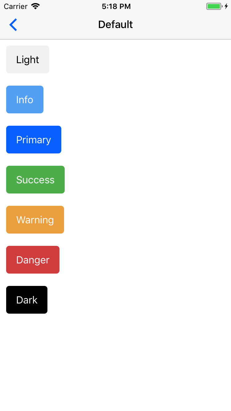
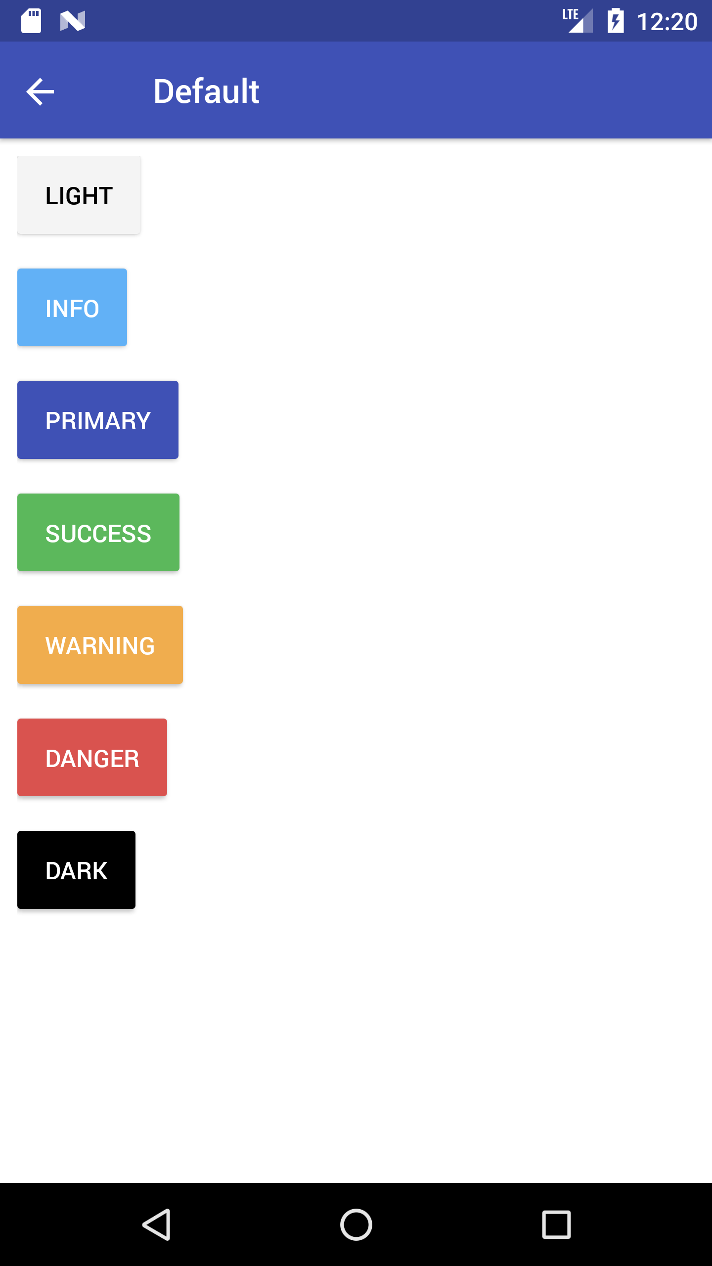
15.0.1. Button Theme
NativeBase provides button with wide range of colors.
NativeBase provides following color themes:
- Primary (default)
- Success
- Info
- Warning
- Danger
- Light
- Dark
Syntax
import React, { Component } from 'react';
import { Container, Header, Content, Button, Text } from 'native-base';
export default class ButtonThemeExample extends Component {
  render() {
    return (
      <Container>
        <Header />
        <Content>
          <Button light><Text> Light </Text></Button>
          <Button primary><Text> Primary </Text></Button>
          <Button success><Text> Success </Text></Button>
          <Button info><Text> Info </Text></Button>
          <Button warning><Text> Warning </Text></Button>
          <Button danger><Text> Danger </Text></Button>
          <Button dark><Text> Dark </Text></Button>
        </Content>
      </Container>
    );
  }
}
<template>
<nb-container>
<nb-header />
<nb-content>
<nb-button light><nb-text>Light</nb-text></nb-button>
<nb-button info><nb-text>Info</nb-text></nb-button>
<nb-button primary><nb-text>Primary</nb-text></nb-button>
<nb-button success><nb-text>Success</nb-text></nb-button>
<nb-button warning><nb-text>Warning</nb-text></nb-button>
<nb-button danger><nb-text>Danger</nb-text></nb-button>
<nb-button dark><nb-text>Dark</nb-text></nb-button>
</nb-content>
</nb-container>
</template>
16. button-transparent-headref
16.0.1. Transparent Button
Include transparent prop with Button. This will render button with no border and no background color.

 Syntax
import React, { Component } from 'react';
import { Container, Header, Content, Button, Text } from 'native-base';
export default class ButtonTransparentExample extends Component {
  render() {
    return (
      <Container>
        <Header />
        <Content>
          <Button transparent light>
            <Text>Light</Text>
          </Button>
          <Button transparent>
            <Text>Primary</Text>
          </Button>
          <Button transparent success>
            <Text>Success</Text>
          </Button>
          <Button transparent info>
            <Text>Info</Text>
          </Button>
          <Button transparent warning>
            <Text>Warning</Text>
          </Button>
          <Button transparent danger>
            <Text>Danger</Text>
          </Button>
          <Button transparent dark>
            <Text>Dark</Text>
          </Button>
        </Content>
      </Container>
    );
  }
}
<template>
<nb-container>
<nb-header/>
<nb-content padder>
<nb-button transparent light>
<nb-text>Light</nb-text>
</nb-button>
<nb-button transparent info>
<nb-text>Info</nb-text>
</nb-button>
<nb-button transparent primary>
<nb-text>Primary</nb-text>
</nb-button>
<nb-button transparent success>
<nb-text>Success</nb-text>
</nb-button>
<nb-button transparent warning>
<nb-text>Warning</nb-text>
</nb-button>
<nb-button transparent danger>
<nb-text>Danger</nb-text>
</nb-button>
<nb-button transparent dark>
<nb-text>Dark</nb-text>
</nb-button>
</nb-content>
</nb-container>
</template>
17. button-outline-headref
17.0.1. Outline Button
Include bordered prop with Button to apply outline button style.


Syntax
import React, { Component } from 'react';
import { Container, Header, Content, Button, Text } from 'native-base';
export default class ButtonOutlineExample extends Component {
  render() {
    return (
      <Container>
        <Header />
        <Content>
          <Button bordered light>
            <Text>Light</Text>
          </Button>
          <Button bordered>
            <Text>Primary</Text>
          </Button>
          <Button bordered success>
            <Text>Success</Text>
          </Button>
          <Button bordered info>
            <Text>Info</Text>
          </Button>
          <Button bordered warning>
            <Text>Warning</Text>
          </Button>
          <Button bordered danger>
            <Text>Danger</Text>
          </Button>
          <Button bordered dark>
            <Text>Dark</Text>
          </Button>
        </Content>
      </Container>
    );
  }
}
<template>
<nb-container>
<nb-header/>
<nb-content padder>
<nb-button bordered light>
<nb-text>Light</nb-text>
</nb-button>
<nb-button bordered info>
<nb-text>Info</nb-text>
</nb-button>
<nb-button bordered primary>
<nb-text>Primary</nb-text>
</nb-button>
<nb-button bordered success>
<nb-text>Success</nb-text>
</nb-button>
<nb-button bordered warning>
<nb-text>Warning</nb-text>
</nb-button>
<nb-button bordered danger>
<nb-text>Danger</nb-text>
</nb-button>
<nb-button bordered dark>
<nb-text>Dark</nb-text>
</nb-button>
</nb-content>
</nb-container>
</template>
18. button-rounded-headref
18.0.1. Rounded Button
Include rounded prop with Button to easily style your buttons with slightly rounded edges.


Syntax
import React, { Component } from 'react';
import { Container, Header, Content, Button, Text } from 'native-base';
export default class ButtonRoundedExample extends Component {
  render() {
    return (
      <Container>
        <Header />
        <Content>
          <Button rounded light>
            <Text>Light</Text>
          </Button>
          <Button rounded>
            <Text>Primary</Text>
          </Button>
          <Button rounded success>
            <Text>Success</Text>
          </Button>
          <Button rounded info>
            <Text>Info</Text>
          </Button>
          <Button rounded warning>
            <Text>Warning</Text>
          </Button>
          <Button rounded danger>
            <Text>Danger</Text>
          </Button>
          <Button rounded dark>
            <Text>Dark</Text>
          </Button>
        </Content>
      </Container>
    );
  }
}
<template>
<nb-container>
<nb-header />
<nb-content padder>
<nb-button rounded light>
<nb-text>Light</nb-text>
</nb-button>
<nb-button rounded info>
<nb-text>Info</nb-text>
</nb-button>
<nb-button rounded primary>
<nb-text>Primary</nb-text>
</nb-button>
<nb-button rounded success>
<nb-text>Success</nb-text>
</nb-button>
<nb-button rounded warning>
<nb-text>Warning</nb-text>
</nb-button>
<nb-button rounded danger>
<nb-text>Danger</nb-text>
</nb-button>
<nb-button rounded dark>
<nb-text>Dark</nb-text>
</nb-button>
</nb-content>
</nb-container>
</template>
19. button-block-headref
19.0.1. Block Button
A block level button spans the entire width of the parent element.
Create block level buttons by adding block prop with the Button


Syntax
import React, { Component } from 'react';
import { Container, Header, Content, Button, Text } from 'native-base';
export default class ButtonBlockExample extends Component {
  render() {
    return (
      <Container>
        <Header />
        <Content>
          <Button block light>
            <Text>Light</Text>
          </Button>
          <Button block>
            <Text>Primary</Text>
          </Button>
          <Button block success>
            <Text>Success</Text>
          </Button>
          <Button block info>
            <Text>Info</Text>
          </Button>
          <Button block warning>
            <Text>Warning</Text>
          </Button>
          <Button block danger>
            <Text>Danger</Text>
          </Button>
          <Button block dark>
            <Text>Dark</Text>
          </Button>
        </Content>
      </Container>
    );
  }
}
<template>
<nb-container>
<nb-header />
<nb-content padder>
<nb-button block light>
<nb-text>Light</nb-text>
</nb-button>
<nb-button block info>
<nb-text>Info</nb-text>
</nb-button>
<nb-button block primary>
<nb-text>Primary</nb-text>
</nb-button>
<nb-button block success>
<nb-text>Success</nb-text>
</nb-button>
<nb-button block warning>
<nb-text>Warning</nb-text>
</nb-button>
<nb-button block danger>
<nb-text>Danger</nb-text>
</nb-button>
<nb-button block dark>
<nb-text>Dark</nb-text>
</nb-button>
</nb-content>
</nb-container>
</template>
20. button-full-headref
20.0.1. Full Button
Adding full to a button will make the button take 100% of its parent’s width. However, it will also remove the button’s left and right borders. This style is useful when the button should stretch across the entire width of the display.


Syntax
import React, { Component } from 'react';
import { Container, Header, Content, Button, Text } from 'native-base';
export default class ButtonFullExample extends Component {
  render() {
    return (
      <Container>
        <Header />
        <Content>
          <Button full light>
            <Text>Light</Text>
          </Button>
          <Button full>
            <Text>Primary</Text>
          </Button>
          <Button full success>
            <Text>Success</Text>
          </Button>
          <Button full info>
            <Text>Info</Text>
          </Button>
          <Button full warning>
            <Text>Warning</Text>
          </Button>
          <Button full danger>
            <Text>Danger</Text>
          </Button>
          <Button full dark>
            <Text>Dark</Text>
          </Button>
        </Content>
      </Container>
    );
  }
}
<template>
<nb-container>
<nb-header />
<nb-content>
<nb-button full light>
<nb-text>Light</nb-text>
</nb-button>
<nb-button full info>
<nb-text>Info</nb-text>
</nb-button>
<nb-button full primary>
<nb-text>Primary</nb-text>
</nb-button>
<nb-button full success>
<nb-text>Success</nb-text>
</nb-button>
<nb-button full warning>
<nb-text>Warning</nb-text>
</nb-button>
<nb-button full danger>
<nb-text>Danger</nb-text>
</nb-button>
<nb-button full dark>
<nb-text>Dark</nb-text>
</nb-button>
</nb-content>
</nb-container>
</template>
21. button-icon-headref
21.0.1. Icon Button
The Icon Buttons, can take text and/or icon as child elements inside the Button.
This goes as simple as this: include your choice of icon using Icon component within the Button component.
Syntax
import React, { Component } from 'react';
import { Container, Header, Content, Button, Icon, Text } from 'native-base';
export default class ButtonIconExample extends Component {
  render() {
    return (
      <Container>
        <Header />
        <Content>
          <Button iconLeft light>
            <Icon name='arrow-back' />
            <Text>Back</Text>
          </Button>
          <Button iconRight light>
            <Text>Next</Text>
            <Icon name='arrow-forward' />
          </Button>
          <Button iconLeft>
            <Icon name='home' />
            <Text>Home</Text>
          </Button>
          <Button iconLeft transparent primary>
            <Icon name='beer' />
            <Text>Pub</Text>
          </Button>
          <Button iconLeft dark>
            <Icon name='cog' />
            <Text>Settings</Text>
          </Button>
        </Content>
      </Container>
    );
  }
}
<template>
<nb-container>
<nb-header />
<nb-content>
<nb-button iconLeft light>
<nb-icon active name="arrow-back" />
<nb-text>Back</nb-text>
</nb-button>
<nb-button iconRight light>
<nb-text>Next</nb-text>
<nb-icon active name="arrow-forward" />
</nb-button>
<nb-button iconLeft>
<nb-icon active name="home" />
<nb-text>Home</nb-text>
</nb-button>
<nb-button iconLeft transparent>
<nb-icon active name="beer" />
<nb-text>Pub</nb-text>
</nb-button>
<nb-button iconLeft dark>
<nb-icon active name="cog" />
<nb-text>Settings</nb-text>
</nb-button>
</nb-content>
</nb-container>
</template>
22. button-size-headref
22.0.1. Button Size
Want to have buttons of fancy size?
Include the following props with your Button.
small: for small size button.large: for large size button.


Syntax
import React, { Component } from 'react';
import { Container, Header, Content, Button, Text } from 'native-base';
export default class ButtonSizeExample extends Component {
  render() {
    return (
      <Container>
        <Header />
        <Content>
          //Small size button
          <Button small primary>
            <Text>Default Small</Text>
          </Button>
          //Regular size button
          <Button success>
            <Text>Success Default</Text>
          </Button>
          //Large size button
          <Button large dark>
            <Text>Dark Large</Text>
          </Button>
        </Content>
      </Container>
    );
  }
}
<template>
<nb-container>
<nb-header />
<nb-content>
<nb-button small light>
<nb-text>Default Small </nb-text>
</nb-button>
<nb-button success info>
<nb-text>Success Default</nb-text>
</nb-button>
<nb-button large primary>
<nb-text>Dark Large</nb-text>
</nb-button>
</nb-content>
</nb-container>
</template>
23. button-disabled-headref
23.0.1. Disabled Button
A disabled button is unusable and un-clickable.
The disabled prop of NativeBase Button is of type boolean. When present, it specifies that the button should be disabled. The disabled prop can be set to keep a user from clicking on the button until some other conditions are met (like selecting a checkbox, etc.). Then, a conditional code could remove the disabled value, and make the button usable.

 Syntax
import React, { Component } from 'react';
import { Container, Header, Content, Button, Text, Icon } from 'native-base';
export default class ButtonDisabledExample extends Component {
  render() {
    return (
      <Container>
        <Header />
        <Content>
          <Button disabled>
              <Text>Default</Text>
            </Button>
            <Button disabled bordered>
              <Text>Outline</Text>
            </Button>
            <Button disabled rounded>
              <Text>Rounded</Text>
            </Button>
            <Button disabled large>
              <Text>Custom</Text>
            </Button>
            <Button disabled iconRight>
              <Text>Icon Button</Text>
              <Icon name="home" />
            </Button>
            <Button disabled block>
              <Text>Block</Text>
            </Button>
        </Content>
      </Container>
    );
  }
}
<template>
<nb-container>
<nb-header />
<nb-content>
<nb-button disabled light>
<nb-text>Default</nb-text>
</nb-button>
<nb-button disabled bordered>
<nb-text>Outline</nb-text>
</nb-button>
<nb-button disabled rounded>
<nb-text>Rounded</nb-text>
</nb-button>
<nb-button disabled large>
<nb-text>Custom</nb-text>
</nb-button>
<nb-button disabled iconRight>
<nb-text>Icon Button</nb-text>
<nb-icon name="home" />
</nb-button>
<nb-button disabled block>
<nb-text>Block</nb-text>
</nb-button>
</nb-content>
</nb-container>
</template>
24. card-def-headref
25. Card
Card is a pure NativeBase component.
Card is a flexible and extensible content container. It includes options for headers and footers, a wide variety of content, contextual background colors, and powerful display options.
NativeBase Cards support a wide variety of content, including images, text, list groups, links, and more. Mix and match multiple content types to create the card you need.


Contents:
- Card Header and Footer
- CardItem Bordered
- CardItem Button
- Card Transparent
- Card List
- Card Image
- Card Showcase
General Syntax
import React, { Component } from 'react';
import { Container, Header, Content, Card, CardItem, Body, Text } from 'native-base';
export default class CardExample extends Component {
  render() {
    return (
      <Container>
        <Header />
        <Content>
          <Card>
            <CardItem>
              <Body>
                <Text>
                   //Your text here
                </Text>
              </Body>
            </CardItem>
          </Card>
        </Content>
      </Container>
    );
  }
}
<template>
<nb-container>
<nb-header />
<nb-content>
<nb-card>
<nb-card-item>
<nb-body>
<nb-text>//Your text here</nb-text>
</nb-body>
</nb-card-item>
</nb-card>
</nb-content>
</nb-container>
</template>- Card
- This component adds a box-shadow by default.
- Also provides default spacing and alignment between cards.
- CardItem
- This is the child component of
Card. - Works very similar to the list items of list.
- Takes input such as: Text, Button, Image, Thumbnail, Icon.
- Card takes any number of CardItem.
- This is the child component of
- Replacing Component
- React Native View for Card
- React Native TouchableOpacity / View for CardItem
Configuration for Card
| Property | Default | Option | Description |
|---|---|---|---|
| transparent | - | - | Removes card shadow from iOS and elevation from Android |
| dataArray | Array | user-defined array | Array of data chunks to render iteratively. |
| renderRow | Function | - | Callback which takes a chunk of data from dataArray and returns as a component. |
Configuration for CardItem
| Property | Default | Option | Description |
|---|---|---|---|
| header | - | - | Displays text as header for cards |
| cardBody | - | - | Defines section for body of card. The child components are rendered with proper spacing and alignment. |
| footer | - | - | Displays text as footer for cards |
| button | - | - | To navigate on click of a card item. |
| bordered | false | boolean | Adds border to the cardItems |
| first | - | - | First CardItem, use in case of custom Card BorderRadius |
| last | - | - | Last CardItem, use in case of custom Card BorderRadius |
26. card-headfoot-headref
26.0.1. Card Header and Footer
To add an optional header and/or footer within a card, include header / footer prop with the CardItem.
- Card Header: Include
headerprop with first instance of CardItem within Card. - Card Footer: Include
footerprop with last instance of CardItem within Card.


Syntax
import React, { Component } from 'react';
import { Container, Header, Content, Card, CardItem, Text, Body } from 'native-base';
export default class CardHeaderFooterExample extends Component {
  render() {
    return (
      <Container>
        <Header />
        <Content>
          <Card>
            <CardItem header>
              <Text>NativeBase</Text>
            </CardItem>
            <CardItem>
              <Body>
                <Text>
                  //Your text here
                </Text>
              </Body>
            </CardItem>
            <CardItem footer>
              <Text>GeekyAnts</Text>
            </CardItem>
         </Card>
        </Content>
      </Container>
    );
  }
}
<template>
<nb-container>
<nb-header />
<nb-content>
<nb-card>
<nb-card-item header>
<nb-text>NativeBase</nb-text>
</nb-card-item>
<nb-card-item>
<nb-body>
<nb-text>
//Your text here
</nb-text>
</nb-body>
</nb-card-item>
<nb-card-item footer>
<nb-text>GeekyAnts</nb-text>
</nb-card-item>
</nb-card>
</nb-content>
</nb-container>
</template>
27. carditem-bordered-headref
27.0.1. CardItem Bordered
Include bordered prop with <CardItem> to have borderBottom for card item.


Syntax
import React, { Component } from "react";
import { Container, Header, Content, Card, CardItem, Text, Body } from "native-base";
export default class CardItemBordered extends Component {
  render() {
    return (
      <Container>
        <Header />
        <Content padder>
          <Card>
            <CardItem header bordered>
              <Text>NativeBase</Text>
            </CardItem>
            <CardItem bordered>
              <Body>
                <Text>
                  NativeBase is a free and open source framework that enable
                  developers to build
                  high-quality mobile apps using React Native iOS and Android
                  apps
                  with a fusion of ES6.
                </Text>
              </Body>
            </CardItem>
            <CardItem footer bordered>
              <Text>GeekyAnts</Text>
            </CardItem>
          </Card>
        </Content>
      </Container>
    );
  }
}
<template>
<nb-container>
<nb-header />
<nb-content>
<nb-card>
<nb-card-item header bordered>
<nb-text>NativeBase</nb-text>
</nb-card-item>
<nb-card-item bordered>
<nb-body>
<nb-text>
NativeBase is a free and open source framework that enable developers to build high-quality mobile apps using React Native iOS and Android apps with a fusion of ES6.
</nb-text>
</nb-body>
</nb-card-item>
<nb-card-item footer bordered>
<nb-text>GeekyAnts</nb-text>
</nb-card-item>
</nb-card>
</nb-content>
</nb-container>
</template>
28. carditem-button-headref
28.0.1. CardItem Button
Include button prop with <CardItem> to achieve onClick function with card items.


Syntax
import React, { Component } from "react";
import { Container, Header, Content, Card, CardItem, Text, Body } from "native-base";
export default class CardItemButton extends Component {
  render() {
    return (
      <Container>
        <Header />
        <Content padder>
          <Card>
            <CardItem header button onPress={() => alert("This is Card Header")}>
              <Text>NativeBase</Text>
            </CardItem>
            <CardItem button onPress={() => alert("This is Card Body")}>
              <Body>
                <Text>
                  Click on any carditem
                </Text>
              </Body>
            </CardItem>
            <CardItem footer button onPress={() => alert("This is Card Footer")}>
              <Text>GeekyAnts</Text>
            </CardItem>
          </Card>
        </Content>
      </Container>
    );
  }
}
<template>
<nb-container>
<nb-header />
<nb-content>
<nb-card>
<nb-card-item header button :onPress="handleHeaderClick">
<nb-text>NativeBase</nb-text>
</nb-card-item>
<nb-card-item button :onPress="handleBodyClick">
<nb-body>
<nb-text>Click on any carditem.</nb-text>
</nb-body>
</nb-card-item>
<nb-card-item footer button :onPress="handleFooterClick">
<nb-text>GeekyAnts</nb-text>
</nb-card-item>
</nb-card>
</nb-content>
</nb-container>
</template>
<script>
export default {
methods: {
handleHeaderClick: function() {
alert("This is Card Header");
},
handleBodyClick: function() {
alert("This is Card Body");
},
handleFooterClick: function() {
alert("This is Card Footer");
}
}
};
</script>
29. card-transparent-headref
29.0.1. Transparent Card
A transparent card can be created using transparent props with <CardItem>.


Syntax
import React, { Component } from "react";
import { Container, Header, Content, Card, CardItem, Text, Body } from "native-base";
export default class CardTransparentExample extends Component {
  render() {
    return (
      <Container>
        <Header />
        <Content padder>
          <Card transparent>
            <CardItem>
              <Body>
                <Text>
                  This is just a transparent card with some text to boot.
                </Text>
              </Body>
            </CardItem>
          </Card>
        </Content>
      </Container>
    );
  }
}
<template>
<nb-container>
<nb-header />
<nb-content padder>
<nb-card transparent>
<nb-card-item>
<nb-body>
<nb-text>This is just a transparent card with some text to boot.</nb-text>
</nb-body>
</nb-card-item>
</nb-card>
</nb-content>
</nb-container>
</template>
30. card-list-headref
30.0.1. Card List
Include CardItem subsequently within Card to create a card with lists.


Syntax
import React, { Component } from 'react';
import { Container, Header, Content, Card, CardItem, Text, Icon, Right } from 'native-base';
export default class CardListExample extends Component {
  render() {
    return (
      <Container>
        <Header />
        <Content>
          <Card>
            <CardItem>
              <Icon active name="logo-googleplus" />
              <Text>Google Plus</Text>
              <Right>
                <Icon name="arrow-forward" />
              </Right>
             </CardItem>
           </Card>
        </Content>
      </Container>
    );
  }
}
<template>
<nb-container>
<nb-header />
<nb-content padder>
<nb-card>
<nb-card-item>
<nb-left>
<nb-icon name="logo-googleplus"></nb-icon>
<nb-text>Google Plus</nb-text>
</nb-left>
<nb-right>
<nb-icon name="arrow-forward"></nb-icon>
</nb-right>
</nb-card-item>
</nb-card>
</nb-content>
</nb-container>
</template>
31. card-image-headref
31.0.1. Card Image
Want to have something more with Card Lists?
Include image with CardItem within Card along with some text before and after image to create a card with lists.
Here is your Card Image ready !


Syntax
import React, { Component } from 'react';
import { Image } from 'react-native';
import { Container, Header, Content, Card, CardItem, Thumbnail, Text, Button, Icon, Left, Body, Right } from 'native-base';
export default class CardImageExample extends Component {
  render() {
    return (
      <Container>
        <Header />
        <Content>
          <Card>
            <CardItem>
              <Left>
                <Thumbnail source={{uri: 'Image URL'}} />
                <Body>
                  <Text>NativeBase</Text>
                  <Text note>GeekyAnts</Text>
                </Body>
              </Left>
            </CardItem>
            <CardItem cardBody>
              <Image source={{uri: 'Image URL'}} style={{height: 200, width: null, flex: 1}}/>
            </CardItem>
            <CardItem>
              <Left>
                <Button transparent>
                  <Icon active name="thumbs-up" />
                  <Text>12 Likes</Text>
                </Button>
              </Left>
              <Body>
                <Button transparent>
                  <Icon active name="chatbubbles" />
                  <Text>4 Comments</Text>
                </Button>
              </Body>
              <Right>
                <Text>11h ago</Text>
              </Right>
            </CardItem>
          </Card>
        </Content>
      </Container>
    );
  }
}
<template>
<nb-container>
<nb-header />
<nb-content padder>
<nb-card>
<nb-card-item>
<nb-left>
<nb-thumbnail :source="logo"></nb-thumbnail>
<nb-body>
<nb-text>NativeBase</nb-text>
<nb-text note>GeekyAnts</nb-text>
</nb-body>
</nb-left>
</nb-card-item>
<nb-card-item cardBody>
<image :source="cardImage" class="card-item-image" :style="stylesObj.cardItemImage"/>
</nb-card-item>
<nb-card-item>
<nb-left>
<nb-button transparent>
<nb-icon name="thumbs-up" active></nb-icon>
<nb-text>4923 Likes</nb-text>
</nb-button>
</nb-left>
<nb-body>
<nb-button transparent>
<nb-icon name="chatbubbles" active></nb-icon>
<nb-text>89 Comments</nb-text>
</nb-button>
</nb-body>
<nb-right>
<nb-text>11h ago</nb-text>
</nb-right>
</nb-card-item>
</nb-card>
</nb-content>
</nb-container>
</template>
<script>
import logo from "logo.png";
import cardImage from "drawer-cover.png";
export default {
data: function() {
return {
logo,
cardImage,
stylesObj: {
cardItemImage: {
resizeMode: "cover"
}
}
};
}
};
</script>
<style>
.card-item-image {
flex: 1;
height: 200;
}
</style>
32. card-showcase-headref
32.0.1. Card Showcase
Card Showcase is further customization of Card Image. It uses several different items.
- Begins with the Card List component, which is similar to our List Avatar.
- Make use of Left, Body and Right components to align the content of your Card header.
- To mixup Image with other NativeBase components in a single CardItem, include the content within Body component.


Syntax
import React, { Component } from 'react';
import { Image } from 'react-native';
import { Container, Header, Content, Card, CardItem, Thumbnail, Text, Button, Icon, Left, Body } from 'native-base';
export default class CardShowcaseExample extends Component {
  render() {
    return (
      <Container>
        <Header />
        <Content>
          <Card style={{flex: 0}}>
            <CardItem>
              <Left>
                <Thumbnail source={{uri: 'Image URL'}} />
                <Body>
                  <Text>NativeBase</Text>
                  <Text note>April 15, 2016</Text>
                </Body>
              </Left>
            </CardItem>
            <CardItem>
              <Body>
                <Image source={{uri: 'Image URL'}} style={{height: 200, width: 200, flex: 1}}/>
                <Text>
                  //Your text here
                </Text>
              </Body>
            </CardItem>
            <CardItem>
              <Left>
                <Button transparent textStyle={{color: '#87838B'}}>
                  <Icon name="logo-github" />
                  <Text>1,926 stars</Text>
                </Button>
              </Left>
            </CardItem>
          </Card>
        </Content>
      </Container>
    );
  }
}
<template>
<nb-container>
<nb-header />
<nb-content padder>
<nb-card>
<nb-card-item bordered>
<nb-left>
<nb-thumbnail :source="logo"></nb-thumbnail>
<nb-body>
<nb-text>NativeBase</nb-text>
<nb-text note>April 20, 2018</nb-text>
</nb-body>
</nb-left>
</nb-card-item>
<nb-card-item>
<nb-body>
<image :source="cardImage" class="card-item-image" :style="stylesObj.cardItemImage"/>
<nb-text>//Your text here</nb-text>
</nb-body>
</nb-card-item>
<nb-card-item :style="{ paddingVertical: 0 }">
<nb-left>
<nb-button transparent>
<nb-icon name="logo-github"></nb-icon>
<nb-text>8000 stars</nb-text>
</nb-button>
</nb-left>
</nb-card-item>
</nb-card>
</nb-content>
</nb-container>
</template>
<script>
import { Dimensions } from "react-native";
import logo from "logo.png";
import cardImage from "drawer-cover.png";
const deviceWidth = Dimensions.get("window").width;
export default {
data: function() {
return {
logo,
cardImage,
stylesObj: {
cardItemImage: {
resizeMode: "cover",
width: deviceWidth / 1.18
}
}
};
}
};
</script>
<style>
.card-item-image {
align-self: center;
height: 150;
margin-vertical: 5;
}
</style>
33. checkbox-headref
34. Check Box
Check Box allows the user to select a number of items from a set of choices.
Replacing Component: React Native TouchableOpacity


Syntax
import React, { Component } from 'react';
import { Container, Header, Content, ListItem, CheckBox, Text, Body } from 'native-base';
export default class CheckBoxExample extends Component {
  render() {
    return (
      <Container>
        <Header />
        <Content>
          <ListItem>
            <CheckBox checked={true} />
            <Body>
              <Text>Daily Stand Up</Text>
            </Body>
          </ListItem>
          <ListItem>
            <CheckBox checked={false} />
            <Body>
              <Text>Discussion with Client</Text>
            </Body>
          </ListItem>
          <ListItem>
            <CheckBox checked={false} color="green"/>
            <Body>
              <Text>Finish list Screen</Text>
            </Body>
          </ListItem>
        </Content>
      </Container>
    );
  }
}
<template>
<nb-container>
<nb-header />
<nb-content>
<nb-list-item>
<nb-checkbox :checked="true" />
<nb-body>
<nb-text>Daily Stand Up</nb-text>
</nb-body>
</nb-list-item>
<nb-list-item>
<nb-checkbox :checked="false" />
<nb-body>
<nb-text>Discussion with Client</nb-text>
</nb-body>
</nb-list-item>
<nb-list-item>
<nb-checkbox :checked="false" color="green"/>
<nb-body>
<nb-text>Finish list Screen</nb-text>
</nb-body>
</nb-list-item>
</nb-content>
</nb-container>
</template>Configuration
| Property | Default | Option | Description |
|---|---|---|---|
| checked | false | boolean | State value of an item from set of choices |
| color | - | user-defined | Background color of checkbox |
| onPress | - | - | Handler to be called when the user selects / unselects the checkbox |
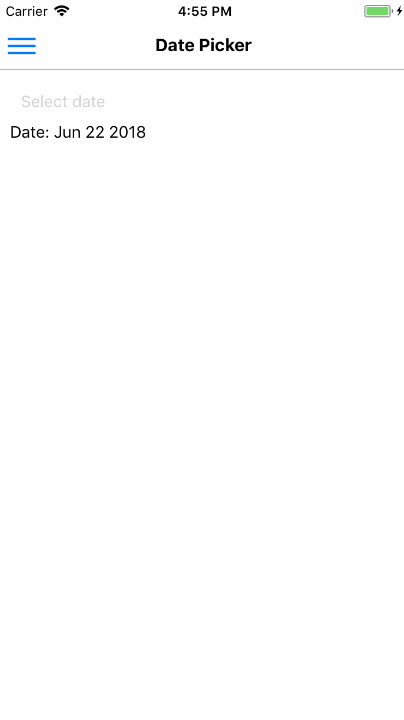
35. date-picker-def-headref
36. Date Picker
Date Picker allows the user to select a date from a time range.

Syntax
import React, { Component } from 'react';
import { Container, Header, Content, DatePicker, Text } from 'native-base';
export default class DatePickerExample extends Component {
  constructor(props) {
    super(props);
    this.state = { chosenDate: new Date() };
    this.setDate = this.setDate.bind(this);
  }
  setDate(newDate) {
    this.setState({ chosenDate: newDate });
  }
  render() {
    return (
      <Container>
        <Header />
        <Content>
          <DatePicker
            defaultDate={new Date(2018, 4, 4)}
            minimumDate={new Date(2018, 1, 1)}
            maximumDate={new Date(2018, 12, 31)}
            locale={"en"}
            timeZoneOffsetInMinutes={undefined}
            modalTransparent={false}
            animationType={"fade"}
            androidMode={"default"}
            placeHolderText="Select date"
            textStyle={{ color: "green" }}
            placeHolderTextStyle={{ color: "#d3d3d3" }}
            onDateChange={this.setDate}
            disabled={false}
            />
            <Text>
              Date: {this.state.chosenDate.toString().substr(4, 12)}
            </Text>
        </Content>
      </Container>
    );
  }
}
<template>
<nb-container>
<nb-header />
<nb-content>
<nb-date-picker
:defaultDate="defaultDate"
:minimumDate="minimumDate"
:maximumDate="maximumDate"
:modalTransparent="false"
animationType="fade"
androidMode="default"
placeHolderText="Select date"
:textStyle="{ color: 'green' }"
:placeHolderTextStyle="{ color: '#d3d3d3' }"
:onDateChange="setDate"
/>
<nb-text>
Date: {{chosenDate.toString().substr(4, 12)}}
</nb-text>
</nb-content>
</nb-container>
</template>
<script>
import React from "react";
export default {
data: function() {
return {
defaultDate: new Date('2018-06-04'),
minimumDate: new Date('2018-01-01'),
maximumDate: new Date('2018-12-31'),
chosenDate: new Date()
};
},
methods: {
setDate: function(newDate) {
this.chosenDate = newDate;
}
}
};
</script>Configuration
| Property | Default | Option | Description |
|---|---|---|---|
| defaultDate | - | Date Object | Sets default date in calendar |
| minimumDate | - | Date Object | Sets minimum date that can be set in calendar |
| maximumDate | - | Date Object | Sets maximum date that can be set in calendar |
| androidMode | - | string | can take either of values 'default','calendar','spinner' |
| animationType | - | string | can take either of values 'fade','slide','none' |
| disabled | true | boolean | Prevent user from making selection of date |
| supportedOrientations | - | Portrait, Landscape, Landscape-left, Landscape-right | Allows the modal to rotate to any of the specified orientations |
37. deckswiper-def-headref
38. Deck Swiper
Looking at data one piece at a time is more efficient when you consider people you might want to date, restaurants, streaming music, or local events you might want to check out.
NativeBase Deck Swiper helps you evaluate one option at a time, instead of selecting from a set of options.
Replacing Component: React Native View


Syntax
import React, { Component } from 'react';
import { Image } from 'react-native';
import { Container, Header, View, DeckSwiper, Card, CardItem, Thumbnail, Text, Left, Body, Icon } from 'native-base';
const cards = [
  {
    text: 'Card One',
    name: 'One',
    image: require('./img/swiper-1.png'),
  },
  .  .  .
];
export default class DeckSwiperExample extends Component {
  render() {
    return (
      <Container>
        <Header />
        <View>
          <DeckSwiper
            dataSource={cards}
            renderItem={item =>
              <Card style={{ elevation: 3 }}>
                <CardItem>
                  <Left>
                    <Thumbnail source={item.image} />
                    <Body>
                      <Text>{item.text}</Text>
                      <Text note>NativeBase</Text>
                    </Body>
                  </Left>
                </CardItem>
                <CardItem cardBody>
                  <Image style={{ height: 300, flex: 1 }} source={item.image} />
                </CardItem>
                <CardItem>
                  <Icon name="heart" style={{ color: '#ED4A6A' }} />
                  <Text>{item.name}</Text>
                </CardItem>
              </Card>
            }
          />
        </View>
      </Container>
    );
  }
}
<template>
<nb-container>
<nb-header />
<view :style="{flex: 1, padding: 12}">
<nb-deck-swiper
:dataSource="cardItemsArr"
:looping="isLoopingRequired"
:renderItem="handleCardRendering"
/>
</view>
</nb-container>
</template>
<script>
import React from "react";
import { View, Text } from "react-native";
import cardOne from "swiper-1.png";
import CardComponent from "../common/card";
export default {
data: function() {
return {
cardItemsArr: [
{
text: "Card One",
name: "One",
image: cardOne
},
. . .
],
isLoopingRequired: false
};
},
methods: {
handleCardRendering: function(item) {
return <CardComponent item={item} />;
}
}
};
</script>
// Card Component
<template>
<nb-card :style="{ elevation: 3 }">
<nb-cardItem>
<nb-left>
<nb-thumbnail :source="item.image" />
<nb-body>
<nb-text></nb-text>
<nb-text note>NativeBase</nb-text>
</nb-body>
</nb-left>
</nb-cardItem>
<nb-cardItem cardBody>
<image
:style="{
resizeMode: 'cover',
width: null,
flex: 1,
height: 300
}"
:source="item.image"
/>
</nb-cardItem>
<nb-cardItem>
<nb-icon-nb name="ios-heart" :style="{ color: '#ED4A6A' }" />
<nb-text></nb-text>
</nb-cardItem>
</nb-card>
</template>
<script>
export default {
props: {
item: {
type: Object
}
}
};
</script>Configuration
| Property | Default | Option | Description |
|---|---|---|---|
| dataSource | - | User defined object | Chunk of data(object) |
| renderEmpty | Function | - | Callback that is called when all the cards are swiped and dataSource is empty and returns a component. |
| renderItem | Function | - | Callback which takes a chunk of data and returns a component. |
| renderTop | Function | - | Callback which takes a chunk of data and returns top layer component. |
| renderBottom | Function | - | Callback which takes a chunk of data and returns bottom layer component. |
| looping | true | boolean | Loop through the data |
| onSwipeRight | Function | - | Callback that is called when the Card is swiped Right |
| onSwipeLeft | Function | - | Callback that is called when the Card is swiped Left |
39. deckswiper-adv-headref
39.0.1. Advanced Deck Swiper
Swipe Deck with callback function.


Syntax
import React, { Component } from 'react';
import { Image } from 'react-native';
import { Container, Header, View, DeckSwiper, Card, CardItem, Thumbnail, Text, Left, Body, Icon } from 'native-base';
const cards = [
  {
    text: 'Card One',
    name: 'One',
    image: require('./img/swiper-1.png'),
  },
  .  .  .
];
export default class DeckSwiperAdvancedExample extends Component {
  render() {
    return (
      <Container>
        <Header />
        <View>
          <DeckSwiper
            ref={(c) => this._deckSwiper = c}
            dataSource={cards}
            renderEmpty={() =>
              <View style={{ alignSelf: "center" }}>
                <Text>Over</Text>
              </View>
            }
            renderItem={item =>
              <Card style={{ elevation: 3 }}>
                <CardItem>
                  <Left>
                    <Thumbnail source={item.image} />
                    <Body>
                      <Text>{item.text}</Text>
                      <Text note>NativeBase</Text>
                    </Body>
                  </Left>
                </CardItem>
                <CardItem cardBody>
                  <Image style={{ height: 300, flex: 1 }} source={item.image} />
                </CardItem>
                <CardItem>
                  <Icon name="heart" style={{ color: '#ED4A6A' }} />
                  <Text>{item.name}</Text>
                </CardItem>
              </Card>
            }
          />
        </View>
        <View style={{ flexDirection: "row", flex: 1, position: "absolute", bottom: 50, left: 0, right: 0, justifyContent: 'space-between', padding: 15 }}>
          <Button iconLeft onPress={() => this._deckSwiper._root.swipeLeft()}>
            <Icon name="arrow-back" />
            <Text>Swipe Left</Text>
          </Button>
          <Button iconRight onPress={() => this._deckSwiper._root.swipeRight()}>
            <Icon name="arrow-forward" />
            <Text>Swipe Right</Text>
          </Button>
        </View>
      </Container>
    );
  }
}
<template>
<nb-container>
<nb-header />
<view :style="{flex: 1, padding: 12}">
<nb-deck-swiper
ref="_deckSwiper"
:dataSource="cardItemsArr"
:looping="isLoopingRequired"
:renderEmpty="handleCardEmpty"
:renderItem="handleCardRendering"
/>
</view>
<view :style="stylesObj.bottomBtnContainer">
<nb-button iconLeft :onPress="handleDeckSwiperBackBtn">
<nb-icon name="arrow-back" />
<nb-text>Swipe Left</nb-text>
</nb-button>
<nb-button iconRight :onPress="handleDeckSwiperForwardBtn">
<nb-text>Swipe Right</nb-text>
<nb-icon name="arrow-forward" />
</nb-button>
</View>
</nb-container>
</template>
<script>
import React from "react";
import { View, Text } from "react-native";
import cardOne from "../../../../assets/swiper-1.png";
import CardComponent from "../common/card";
export default {
data: function() {
return {
cardItemsArr: [
{
text: "Card One",
name: "One",
image: cardOne
},
. . .
],
isLoopingRequired: false,
stylesObj: {
bottomBtnContainer: {
flexDirection: "row",
flex: 1,
position: "absolute",
bottom: 50,
left: 0,
right: 0,
justifyContent: "space-between",
padding: 15
}
}
};
},
methods: {
handleCardEmpty: function() {
return (
<View>
<Text>Over </Text>
</View>
);
},
handleCardRendering: function(item) {
return <CardComponent item={item} />;
},
handleDeckSwiperBackBtn: function() {
this.$refs._deckSwiper._root.swipeLeft();
},
handleDeckSwiperForwardBtn: function() {
this.$refs._deckSwiper._root.swipeRight();
}
}
};
</script>
// Card Component
<template>
<nb-card :style="{ elevation: 3 }">
<nb-cardItem>
<nb-left>
<nb-thumbnail :source="item.image" />
<nb-body>
<nb-text></nb-text>
<nb-text note>NativeBase</nb-text>
</nb-body>
</nb-left>
</nb-cardItem>
<nb-cardItem cardBody>
<image
:style="{
resizeMode: 'cover',
width: null,
flex: 1,
height: 300
}"
:source="item.image"
/>
</nb-cardItem>
<nb-cardItem>
<nb-icon-nb name="ios-heart" :style="{ color: '#ED4A6A' }" />
<nb-text></nb-text>
</nb-cardItem>
</nb-card>
</template>
<script>
export default {
props: {
item: {
type: Object
}
}
};
</script>
40. fabs-def-headref
41. FABs
FABs (Floating Action Buttons) are used for a special type of promoted action. They are distinguished by a circled icon floating above the UI in a fixed position and have special motion behaviors. When clicked, it may contain more related actions.
Replacing Component: React Native Animated


Syntax
import React, { Component } from 'react';
import { Container, Header, View, Button, Icon, Fab } from 'native-base';
export default class FABExample extends Component {
  constructor(props) {
    super(props)
    this.state = {
      active: false
    };
  }
  render() {
    return (
      <Container>
        <Header />
        <View style={{ flex: 1 }}>
          <Fab
            active={this.state.active}
            direction="up"
            containerStyle={{ }}
            style={{ backgroundColor: '#5067FF' }}
            position="bottomRight"
            onPress={() => this.setState({ active: !this.state.active })}>
            <Icon name="share" />
            <Button style={{ backgroundColor: '#34A34F' }}>
              <Icon name="logo-whatsapp" />
            </Button>
            <Button style={{ backgroundColor: '#3B5998' }}>
              <Icon name="logo-facebook" />
            </Button>
            <Button disabled style={{ backgroundColor: '#DD5144' }}>
              <Icon name="mail" />
            </Button>
          </Fab>
        </View>
      </Container>
    );
  }
}
<template>
<nb-container>
<nb-header />
<view :style="{flex: 1}">
<nb-fab
:active="isFabIconActive"
:onPress="handleFabIconPress"
direction="up"
position="bottomRight"
>
<nb-icon-nb name="md-share"></nb-icon-nb>
<nb-button :style="{backgroundColor: '#34A34F'}">
<nb-icon-nb name="logo-whatsapp"></nb-icon-nb>
</nb-button>
<nb-button :style="{backgroundColor: '#3B5998'}">
<nb-icon-nb name="logo-facebook"></nb-icon-nb>
</nb-button>
<nb-button :style="{backgroundColor: '#DD5144'}">
<nb-icon-nb name="ios-mail"></nb-icon-nb>
</nb-button>
</nb-fab>
</view>
</nb-container>
</template>
<script>
export default {
data: function() {
return {
isFabIconActive: false,
stylesObj: {
fabContainer: {
position: "bottomRight"
}
}
};
},
methods: {
handleFabIconPress: function() {
this.isFabIconActive = !this.isFabIconActive;
}
}
};
</script>Configuration
| Property | Default | Option | Description |
|---|---|---|---|
| active | true | boolean | Toggle status of FAB |
| direction | up | up, down, left, right | Direction of buttons that popup on click of FAB |
| position | bottomRight |
topLeft, topRight bottomLeft, bottomRight |
Position of FAB on screen |
| containerStyle | - | user-defined | Padding options to render FAB |
42. fabs-multiple-headref
42.0.1. Multiple FABs


Syntax
import React, { Component } from 'react';
import { Container, Header, View, Fab, Button, Icon } from 'native-base';
export default class FABMultipleExample extends Component {
constructor(props) {
super(props)
this.state = {
active: false
};
}
render() {
return (
<Container>
<Header />
<View style={{ flex: 1 }}>
<Fab
active={this.state.active}
direction="up"
containerStyle={{ }}
style={{ backgroundColor: '#5067FF' }}
position="bottomRight"
onPress={() => this.setState({ active: !this.state.active })}>
....
</Fab>
<Fab direction="left" position="topRight">
....
</Fab>
<Fab direction="down" position="topLeft">
....
</Fab>
<Fab direction="right" position="bottomLeft">
....
</Fab>
</View>
</Container>
);
}
}<template>
<nb-container>
<nb-header />
<view :style="{flex: 1}">
<nb-fab
:active="isFabIconActive"
:onPress="isFabIconActive"
direction="up"
position="bottomRight"
>
. . .
</nb-fab>
<nb-fab direction="left" position="topRight">
. . .
</nb-fab>
<nb-fab direction="down" position="topLeft">
. . .
</nb-fab>
<nb-fab direction="right" position="bottomLeft">
. . .
</nb-fab>
</view>
</nb-container>
</template>
<script>
export default {
data: function() {
return {
isFabIconActive1: true,
};
}
};
</script>
Note: Always prefer to place FAB inside NativeBase <Container/>. Placing FAB inside <Content/> is not encouraged, as <Content/> is an implementation of <ScrollView/>.
43. footer-tabs-def-headref
44. Footer Tabs
Tabs are a horizontal region of buttons or links that allow for a consistent navigation experience between screens. It can contain any combination of text and icons, and is a popular method for enabling mobile navigation.
Replacing Component: React Native View
Contents


Syntax
import React, { Component } from 'react';
import { Container, Header, Content, Footer, FooterTab, Button, Text } from 'native-base';
export default class FooterTabsExample extends Component {
  render() {
    return (
      <Container>
        <Header />
        <Content />
        <Footer>
          <FooterTab>
            <Button>
              <Text>Apps</Text>
            </Button>
            <Button>
              <Text>Camera</Text>
            </Button>
            <Button active>
              <Text>Navigate</Text>
            </Button>
            <Button>
              <Text>Contact</Text>
            </Button>
          </FooterTab>
        </Footer>
      </Container>
    );
  }
}
<template>
<nb-container>
<nb-header />
<nb-content />
<nb-footer>
<nb-footer-tab>
<nb-button>
<nb-text>Apps</nb-text>
</nb-button>
<nb-button>
<nb-text>Camera</nb-text>
</nb-button>
<nb-button :active="true">
<nb-text>Navigate</nb-text>
</nb-button>
<nb-button>
<nb-text>Contact</nb-text>
</nb-button>
</nb-footer-tab>
</nb-footer>
</nb-container>
</template>
Configuration
| Property | Default | Option | Description |
|---|---|---|---|
| active | true | boolean |
This is button prop (applicable with FooterTab only). Sets a Footer Button active.
|
| badge | true | boolean |
This is button prop (applicable with FooterTab only). Set to true if using Badges.
|
| vertical | true | boolean |
This is button prop (applicable with FooterTab only). Use this prop to vertically align footer elements like icons and text. Necessary when using Badge in Footer Tabs.
|
45. footer-tabs-icon-headref
45.0.1. Icon Footer
Syntax
import React, { Component } from 'react';
import { Container, Header, Content, Footer, FooterTab, Button, Icon } from 'native-base';
export default class FooterTabsIconExample extends Component {
  render() {
    return (
      <Container>
        <Header />
        <Content />
        <Footer>
          <FooterTab>
            <Button>
              <Icon name="apps" />
            </Button>
            <Button>
              <Icon name="camera" />
            </Button>
            <Button active>
              <Icon active name="navigate" />
            </Button>
            <Button>
              <Icon name="person" />
            </Button>
          </FooterTab>
        </Footer>
      </Container>
    );
  }
}
<template>
<nb-container>
<nb-header />
<nb-content />
<nb-footer>
<nb-footer-tab>
<nb-button>
<nb-icon name="apps" />
</nb-button>
<nb-button>
<nb-icon name="camera" />
</nb-button>
<nb-button :active="true">
<nb-icon name="apps" :active="true"/>
</nb-button>
<nb-button>
<nb-icon name="person" />
</nb-button>
</nb-footer-tab>
</nb-footer>
</nb-container>
</template>
46. footer-tabs-icon-text-headref
46.0.1. Icon Footer with Text
Syntax
import React, { Component } from 'react';
import { Container, Header, Content, Footer, FooterTab, Button, Icon, Text } from 'native-base';
export default class FooterTabsIconTextExample extends Component {
  render() {
    return (
      <Container>
        <Header />
        <Content />
        <Footer>
          <FooterTab>
            <Button vertical>
              <Icon name="apps" />
              <Text>Apps</Text>
            </Button>
            <Button vertical>
              <Icon name="camera" />
              <Text>Camera</Text>
            </Button>
            <Button vertical active>
              <Icon active name="navigate" />
              <Text>Navigate</Text>
            </Button>
            <Button vertical>
              <Icon name="person" />
              <Text>Contact</Text>
            </Button>
          </FooterTab>
        </Footer>
      </Container>
    );
  }
}
<template>
<nb-container>
<nb-header />
<nb-content />
<nb-footer>
<nb-footer-tab>
<nb-button>
<nb-icon name="apps" />
<nb-text>Apps</nb-text>
</nb-button>
<nb-button>
<nb-icon name="camera" />
<nb-text>Camera</nb-text>
</nb-button>
<nb-button :active="true">
<nb-icon name="navigate" :active="true" />
<nb-text>Navigate</nb-text>
</nb-button>
<nb-button>
<nb-icon name="person" />
<nb-text>Contact</nb-text>
</nb-button>
</nb-footer-tab>
</nb-footer>
</nb-container>
</template>
47. footer-tabs-badge-headref
47.0.1. Footer with badge
Syntax
import React, { Component } from 'react';
import { Container, Header, Content, Footer, FooterTab, Button, Icon, Text, Badge } from 'native-base';
export default class FooterTabsBadgeExample extends Component {
  render() {
    return (
      <Container>
        <Header />
        <Content />
        <Footer>
          <FooterTab>
            <Button badge vertical>
              <Badge><Text>2</Text></Badge>
              <Icon name="apps" />
              <Text>Apps</Text>
            </Button>
            <Button vertical>
              <Icon name="camera" />
              <Text>Camera</Text>
            </Button>
            <Button active badge vertical>
              <Badge ><Text>51</Text></Badge>
              <Icon active name="navigate" />
              <Text>Navigate</Text>
            </Button>
            <Button vertical>
              <Icon name="person" />
              <Text>Contact</Text>
            </Button>
          </FooterTab>
        </Footer>
      </Container>
    );
  }
}
<template>
<nb-container>
<nb-header />
<nb-content />
<nb-footer>
<nb-footer-tab>
<nb-button vertical badge>
<nb-badge>
<nb-text>2</nb-text>
</nb-badge>
<nb-icon name="apps" />
<nb-text>Apps</nb-text>
</nb-button>
<nb-button >
<nb-icon name="camera" />
<nb-text>Camera</nb-text>
</nb-button>
<nb-button vertical badge :active="true">
<nb-badge :style="{background-color: 'green'}">
<nb-text>51</nb-text>
</nb-badge>
<nb-icon name="navigate" :active="true" />
<nb-text>Navigate</nb-text>
</nb-button>
<nb-button>
<nb-icon name="contact" />
<nb-text>Contact</nb-text>
</nb-button>
</nb-footer-tab>
</nb-footer>
</nb-container>
</template>
48. Form
NativeBase makes use of List to design Forms that include group of related input components. Include any combination of NativeBase components to make up your form.
Input is a NativeBase component built on top of React Native's TextInput. A foundational component for inputting text into the app via a keyboard. Item component wrapper around it that apply specific styles.
Props provide configurability for several features, such as auto-correction, auto-capitalization, placeholder text, and different keyboard types, such as a numeric keypad.
Provides a number of attributes that follows styling and interaction guidelines for each platform, so that they are intuitive for users to interact with.
Replacing Component:
- Form: React Native View
- Item: React Native TouchableOpacity
- Input: React Native TextInput
- Label: React Native Text
Contents:
- Fixed Label
- Inline Label
- Floating Label
- Stacked Label
- Picker Input
- Regular Textbox
- Underlined Textbox
- Rounded Textbox
- Icon Textbox
- Success Input Textbox
- Error Input Textbox
- Disabled Textbox
- Textarea


Syntax
import React, { Component } from 'react';
import { Container, Header, Content, Form, Item, Input } from 'native-base';
export default class FormExample extends Component {
  render() {
    return (
      <Container>
        <Header />
        <Content>
          <Form>
            <Item>
              <Input placeholder="Username" />
            </Item>
            <Item last>
              <Input placeholder="Password" />
            </Item>
          </Form>
        </Content>
      </Container>
    );
  }
}
<template>
<nb-container>
<nb-header />
<nb-content>
<nb-form>
<nb-item>
<nb-input placeholder="Username" />
</nb-item>
<nb-item last>
<nb-input placeholder="Password" />
</nb-item>
</nb-form>
</nb-content>
</nb-container>
</template>Configuration
| Property | Default | Option | Description |
|---|---|---|---|
| fixedLabel | true | boolean | Label is fixed to the left of Input and does not hide when text is entered. |
| floatingLabel | true | boolean | Label that animates upward when input is selected and animates downward when input is erased. |
| inlineLabel | - | boolean | Label placed to the left of input element and does not hide when text is entered. This can also be used along with placeholder. |
| stackedLabel | - | - | Places the label on top of input element which appears like a stack. This can also be used along with placeholder. |
| bordered | - | - | Includes border with the textbox |
| rounded | - | - | Includes rounded border with the textbox. |
| regular | - | - | Includes rectangular border with the textbox. |
| underline | true | - | Includes underline border with the textbox |
| disabled | - | - | Disables inputting data |
| placeholderLabel | - | - | Renders the same way the TextInput does with the form styling of NativeBase |
| placeholder | - | - | String that renders before text input is entered |
| placeholderTextColor | - | - | Color of the Input placeholder |
| last | - | - | Styles last Item of the Form |
| error | - | - | Border color of textbox for invalid input |
| success | - | - | Border color of textbox for valid input |
| picker | - | - | Styles picker field with Input |
Note: Form in NativeBase is just a wrapper around the inputs and hence has no onSubmit function.
49. fixed-label-headref
49.0.1. Fixed Label
The fixedLabel property creates an Input component, whose Label is fixed at the left of Input and does not hide when text is entered. The input aligns on the same position, regardless of the length of the label. It can be used with placeholder as well.


Syntax
import React, { Component } from 'react';
import { Container, Header, Content, Form, Item, Input, Label } from 'native-base';
export default class FixedLabelExample extends Component {
  render() {
    return (
      <Container>
        <Header />
        <Content>
          <Form>
            <Item fixedLabel>
              <Label>Username</Label>
              <Input />
            </Item>
            <Item fixedLabel last>
              <Label>Password</Label>
              <Input />
            </Item>
          </Form>
        </Content>
      </Container>
    );
  }
}
<template>
<nb-container>
<nb-header />
<nb-content>
<nb-form>
<nb-item fixedLabel>
<nb-label>Username</nb-label>
<nb-input />
</nb-item>
<nb-item fixedLabel last>
<nb-label>Password</nb-label>
<nb-input />
</nb-item>
</nb-form>
</nb-content>
</nb-container>
</template>
50. inline-label-headref
50.0.1. Inline Label
The inlineLabel property creates an Input component, whose Label is in-line with Input and does not hide when text is entered. It can be used with placeholder as well.


Syntax
import React, { Component } from 'react';
import { Container, Header, Content, Form, Item, Input, Label } from 'native-base';
export default class InlineLabelExample extends Component {
  render() {
    return (
      <Container>
        <Header />
        <Content>
          <Form>
            <Item inlineLabel>
              <Label>Username</Label>
              <Input />
            </Item>
            <Item inlineLabel last>
              <Label>Password</Label>
              <Input />
            </Item>
          </Form>
        </Content>
      </Container>
    );
  }
}
<template>
<nb-container>
<nb-header />
<nb-content>
<nb-form>
<nb-item inlineLabel>
<nb-label>Username</nb-label>
<nb-input />
</nb-item>
<nb-item inlineLabel last>
<nb-label>Password</nb-label>
<nb-input />
</nb-item>
</nb-form>
</nb-content>
</nb-container>
</template>
51. floating-label-headref
51.0.1. Floating Label
The floatingLabel property creates an Input component, whose Label animates upward when input is selected and animates downward when input is erased.


Syntax
import React, { Component } from 'react';
import { Container, Header, Content, Form, Item, Input, Label } from 'native-base';
export default class FloatingLabelExample extends Component {
  render() {
    return (
      <Container>
        <Header />
        <Content>
          <Form>
            <Item floatingLabel>
              <Label>Username</Label>
              <Input />
            </Item>
            <Item floatingLabel last>
              <Label>Password</Label>
              <Input />
            </Item>
          </Form>
        </Content>
      </Container>
    );
  }
}
<template>
<nb-container>
<nb-header />
<nb-content>
<nb-form>
<nb-item floatingLabel>
<nb-label>Username</nb-label>
<nb-input />
</nb-item>
<nb-item floatingLabel last>
<nb-label>Password</nb-label>
<nb-input />
</nb-item>
</nb-form>
</nb-content>
</nb-container>
</template>
When using floatingLabel, use getRef to get the reference of <Input/> component. Always wrap floatingLabel component with <Form/>.
52. stacked-label-headref
52.0.1. Stacked Label
The stackedLabel property creates an Input component that places the label on top of input element which appears like a stack. This can also be used along with placeholder.


Syntax
import React, { Component } from 'react';
import { Container, Header, Content, Form, Item, Input, Label } from 'native-base';
export default class StackedLabelExample extends Component {
  render() {
    return (
      <Container>
        <Header />
        <Content>
          <Form>
            <Item stackedLabel>
              <Label>Username</Label>
              <Input />
            </Item>
            <Item stackedLabel last>
              <Label>Password</Label>
              <Input />
            </Item>
          </Form>
        </Content>
      </Container>
    );
  }
}
<template>
<nb-container>
<nb-header />
<nb-content>
<nb-form>
<nb-item stackedLabel>
<nb-label>Username</nb-label>
<nb-input />
</nb-item>
<nb-item stackedLabel last>
<nb-label>Password</nb-label>
<nb-input />
</nb-item>
</nb-form>
</nb-content>
</nb-container>
</template>
53. picker-input-headref
53.0.1. Picker Input
Include picker prop with <Item> to have picker type of input field.


Syntax
import React, { Component } from 'react';
import { Container, Header, Content, Form, Item, Picker } from 'native-base';
export default class PickerInputExample extends Component {
    constructor(props) {
    super(props);
    this.state = {
      selected2: undefined
    };
  }
  onValueChange2(value: string) {
    this.setState({
      selected2: value
    });
  }
  render() {
    return (
      <Container>
        <Header />
        <Content>
          <Form>
            <Item picker>
              <Picker
                mode="dropdown"
                iosIcon={<Icon name="arrow-down" />}
                style={{ width: undefined }}
                placeholder="Select your SIM"
                placeholderStyle={{ color: "#bfc6ea" }}
                placeholderIconColor="#007aff"
                selectedValue={this.state.selected2}
                onValueChange={this.onValueChange2.bind(this)}
              >
                <Picker.Item label="Wallet" value="key0" />
                <Picker.Item label="ATM Card" value="key1" />
                <Picker.Item label="Debit Card" value="key2" />
                <Picker.Item label="Credit Card" value="key3" />
                <Picker.Item label="Net Banking" value="key4" />
              </Picker>
            </Item>
          </Form>
        </Content>
      </Container>
    );
  }
}
<template>
<nb-container>
<nb-header />
<nb-content>
<nb-form>
<nb-item picker>
<nb-picker
mode="dropdown"
:iosIcon="getIosIcon()"
:style="{ width: 350 }"
placeholder="Select your SIM"
placeholderStyle="{ color: '#bfc6ea' }"
placeholderIconColor="#007aff"
:selectedValue="selected"
:onValueChange="onValueChange"
>
<item label="Wallet" value="key0" />
<item label="ATM Card" value="key1" />
<item label="Debit Card" value="key2" />
<item label="Credit Card" value="key3" />
<item label="Net Banking" value="key4" />
</nb-picker>
</nb-item>
</nb-form>
</nb-content>
</nb-container>
</template>
<script>
import React from "react";
import { Picker, Icon } from "native-base";
export default {
components: { Item: Picker.Item },
data: function() {
return {
selected: ""
};
},
methods: {
onValueChange: function(value) {
this.selected = value;
},
getIosIcon: function() {
return <Icon name="ios-arrow-down-outline" />;
}
}
};
</script>
54. regular-textbox-headref
54.0.1. Regular Textbox
To use the regular textbox which is rectangular in shape, include the regular prop with Item.


Syntax
import React, { Component } from 'react';
import { Container, Header, Content, Input, Item } from 'native-base';
export default class RegularTextboxExample extends Component {
  render() {
    return (
      <Container>
        <Header />
        <Content>
          <Item regular>
            <Input placeholder='Regular Textbox' />
          </Item>
        </Content>
      </Container>
    );
  }
}
<template>
<nb-container>
<nb-header />
<nb-content>
<nb-form>
<nb-item regular>
<nb-input placeholder="Regular Textbox" />
</nb-item>
</nb-form>
</nb-content>
</nb-container>
</template>
55. underlined-textbox-headref
55.0.1. Underlined Textbox
To use the underlined textbox, include the underline prop with Item.


Syntax
import React, { Component } from 'react';
import { Container, Header, Content, Item, Input } from 'native-base';
export default class UnderlinedTextboxExample extends Component {
  render() {
    return (
      <Container>
        <Header />
        <Content>
          <Item>
            <Input placeholder="Underline Textbox" />
          </Item>
        </Content>
      </Container>
    );
  }
}
<template>
<nb-container>
<nb-header />
<nb-content>
<nb-form>
<nb-item>
<nb-input placeholder="Underline Textbox" />
</nb-item>
</nb-form>
</nb-content>
</nb-container>
</template>
56. rounded-textbox-headref
56.0.1. Rounded Textbox
To have a textbox with round type border, include the rounded prop with Item.


Syntax
import React, { Component } from 'react';
import { Container, Header, Content, Item, Input } from 'native-base';
export default class RoundedTextboxExample extends Component {
  render() {
    return (
      <Container>
        <Header />
        <Content>
          <Item rounded>
            <Input placeholder='Rounded Textbox'/>
          </Item>
        </Content>
      </Container>
    );
  }
}
<template>
<nb-container>
<nb-header />
<nb-content>
<nb-form>
<nb-item rounded>
<nb-input placeholder="Rounded Textbox" />
</nb-item>
</nb-form>
</nb-content>
</nb-container>
</template>

57. icon-textbox-headref
57.0.1. Icon Textbox
Icons can be easily added to the NativeBase Textbox. To do so, include an icon within the <Item>.
The icons render in the order of its definition within Item.
Syntax
import React, { Component } from 'react';
import { Container, Header, Content, Item, Input, Icon } from 'native-base';
export default class IconTextboxExample extends Component {
  render() {
    return (
      <Container>
        <Header />
        <Content>
          // Text input box with icon aligned to the left
          <Item>
            <Icon active name='home' />
            <Input placeholder='Icon Textbox'/>
          </Item>
          // Text input box with icon aligned to the right
          <Item>
            <Input placeholder='Icon Alignment in Textbox'/>
            <Icon active name='swap' />
          </Item>
        </Content>
      </Container>
    );
  }
}
<template>
<nb-container>
<nb-header />
<nb-content>
<nb-form>
<nb-item>
<nb-icon active name="home" />
<nb-input placeholder="Icon Textbox" />
</nb-item>
<nb-item>
<nb-input placeholder="Icon Alignment in Textbox" />
<nb-icon active name="swap" />
</nb-item>
</nb-form>
</nb-content>
</nb-container>
</template>
58. success-textbox-headref
58.0.1. Success Input Textbox
To display textbox with valid data, include the success prop with Item.

Syntax
import React, { Component } from 'react';
import { Container, Header, Content, Item, Input, Icon } from 'native-base';
export default class SuccessInputTextboxExample extends Component {
  render() {
    return (
      <Container>
        <Header />
        <Content>
          <Item success>
            <Input placeholder='Textbox with Success Input'/>
            <Icon name='checkmark-circle' />
          </Item>
        </Content>
      </Container>
    );
  }
}
<template>
<nb-container>
<nb-header />
<nb-content>
<nb-form>
<nb-item success>
<nb-input placeholder='Textbox with Success Input' />
<nb-icon name="checkmark-circle" />
</nb-item>
</nb-form>
</nb-content>
</nb-container>
</template>59. error-textbox-headref
59.0.1. Error Input Textbox
To display textbox with invalid data, include the error prop with Item.


Syntax
import React, { Component } from 'react';
import { Container, Header, Content, Item, Input, Icon } from 'native-base';
export default class ErrorInputTextboxExample extends Component {
  render() {
    return (
      <Container>
        <Header />
        <Content>
          <Item error>
            <Input placeholder='Textbox with Error Input'/>
            <Icon name='close-circle' />
          </Item>
        </Content>
      </Container>
    );
  }
}
<template>
<nb-container>
<nb-header />
<nb-content>
<nb-form>
<nb-item error>
<nb-input placeholder='Textbox with Error Input' />
<nb-icon name="close-circle" />
</nb-item>
</nb-form>
</nb-content>
</nb-container>
</template>
60. disabled-textbox-headref
60.0.1. Disabled Textbox
To restrict inputting data into textbox, include the disabled prop with Item and Input.


Syntax
import React, { Component } from 'react';
import { Container, Header, Content, Item, Input, Icon } from 'native-base';
export default class DisabledTextboxExample extends Component {
  render() {
    return (
      <Container>
        <Header />
        <Content>
          <Item disabled>
            <Input disabled placeholder='Disabled Textbox'/>
            <Icon name='information-circle' />
          </Item>
        </Content>
      </Container>
    );
  }
}
<template>
<nb-container>
<nb-header />
<nb-content>
<nb-form>
<nb-item disabled>
<nb-input disabled placeholder='Disabled Textbox' />
<nb-icon name="information-circle" />
</nb-item>
</nb-form>
</nb-content>
</nb-container>
</template>
61. textarea-textbox-headref
61.0.1. Textarea
Creates a text area to input multiline text.


Syntax
import React, { Component } from "react";
import { Container, Header, Content, Textarea, Form } from "native-base";
export default class TextArea extends Component {
  render() {
    return (
      <Container>
        <Header />
        <Content padder>
          <Form>
            <Textarea rowSpan={5} bordered placeholder="Textarea" />
          </Form>
        </Content>
      </Container>
    );
  }
}
<template>
<nb-container>
<nb-header />
<nb-content>
<nb-form>
<nb-textarea :rowSpan="5" bordered placeholder="Textarea" />
</nb-form>
</nb-content>
</nb-container>
</template>
62. header-def-headref
63. Header
- NativeBase component that renders as Header (navbar) for your screen.
- There can be a single Header component into your Container.
- To have Header for your screen, include
Headercomponent withinContainer. - Header takes input as:
Left,BodyandRight, and expects all three of them. - The components those are defined within
Headerwill be rendered in the same order that you define them. - Header provides you with stylesheet.
- User can add custom styles while defining
Headerwithin their app. - Replacing Component: React Native View
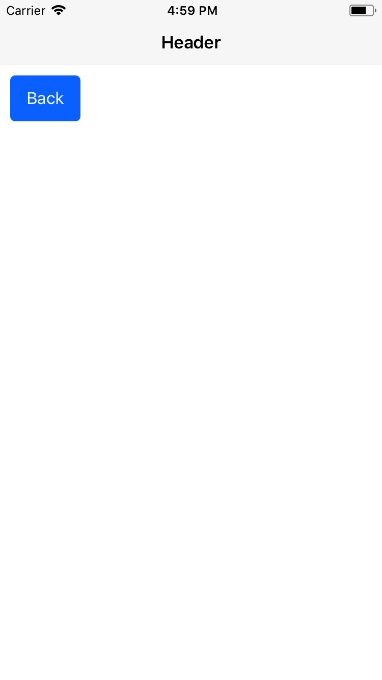
Contents:
- Header with only title
- Header with Title and Subtitle
- Header with Icon Buttons
- Header with Text Buttons
- Header with Icon Button and Text Button
- Header with Icon and Text Button
- Header with Multiple Icon Button
- Header Span
- Header No Shadow
- Header No Left
- Header Transparent
Syntax
import React, { Component } from 'react';
import { Container, Header, Left, Body, Right, Button, Icon, Title } from 'native-base';
export default class HeaderExample extends Component {
  render() {
    return (
      <Container>
        <Header>
          <Left>
            <Button transparent>
              <Icon name='arrow-back' />
            </Button>
          </Left>
          <Body>
            <Title>Header</Title>
          </Body>
          <Right>
            <Button transparent>
              <Icon name='menu' />
            </Button>
          </Right>
        </Header>
      </Container>
    );
  }
}
<template>
<nb-container>
<nb-header>
<nb-left>
<nb-button transparent>
<nb-icon name="arrow-back" />
</nb-button>
</nb-left>
<nb-body>
<nb-title>Header</nb-title>
</nb-body>
<nb-right>
<nb-button transparent>
<nb-icon name="menu" />
</nb-button>
</nb-right>
</nb-header>
</nb-container>
</template>Configuration
| Property | Default | Option | Description |
|---|---|---|---|
| Left | - | - | Components render to the left in Header |
| Body | - | - | Components render at the center of Header |
| Right | - | - | Components render to the right in Header |
| iosBarStyle | - | light-content, dark-content, default | Set iOS barStyle |
| androidStatusBarColor | - | - | Set background color for status bar in android |
| noShadow | - | boolean | Removes elevation from android |
| searchBar | - | boolean | Add searchbar to header or not |
| rounded | - | boolean | Make header searchbar rounded |
| hasSubtitle | - | boolean | Add subtitle to header |
| hasSegment | - | boolean | Add segments to header |
| hasTabs | - | boolean | Add tabs to header |
| hasText | - | boolean | This is button prop. Adds necessary padding when Text button defined in Left / Right of Header (iOS) |
| noLeft | - | boolean | Eliminates Left component and moves Title towards left (Android) |
| span | - | boolean | Doubles the header size |
| transparent | - | boolean | removes border of Header,shadow from iOS Header and elevation from Android Header. |
64. title-header-headref
64.0.1. Header with only title


Syntax
import React, { Component } from 'react';
import { Container, Header, Left, Body, Right, Title } from 'native-base';
export default class HeaderTitleExample extends Component {
  render() {
    return (
      <Container>
        <Header>
          <Left/>
          <Body>
            <Title>Header</Title>
          </Body>
          <Right />
        </Header>
      </Container>
    );
  }
}
<template>
<nb-container>
<nb-header>
<nb-left/>
<nb-body>
<nb-title>Header</nb-title>
</nb-body>
<nb-right/>
</nb-header>
</nb-container>
</template>65. header-title-subtitle-headref
65.0.1. Header with Title and Subtitle


Syntax
import React, { Component } from 'react';
import { Container, Header, Left, Body, Right, Title, Subtitle } from 'native-base';
export default class HeaderTitleSubtitleExample extends Component {
  render() {
    return (
      <Container>
        <Header>
          <Left />
          <Body>
            <Title>Title</Title>
            <Subtitle>Subtitle</Subtitle>
          </Body>
          <Right />
        </Header>
      </Container>
    );
  }
}
<template>
<nb-container>
<nb-header>
<nb-left/>
<nb-body>
<nb-title>Title</nb-title>
<nb-subtitle>Subtitle</nb-subtitle>
</nb-body>
<nb-right/>
</nb-header>
</nb-container>
</template>
66. header-icon-headref
66.0.1. Header with Icon Buttons
Syntax
import React, { Component } from 'react';
import { Container, Header, Left, Body, Right, Button, Icon, Title } from 'native-base';
export default class HeaderIconExample extends Component {
  render() {
    return (
      <Container>
        <Header>
          <Left>
            <Button transparent>
              <Icon name='arrow-back' />
            </Button>
          </Left>
          <Body>
            <Title>Header</Title>
          </Body>
          <Right>
            <Button transparent>
              <Icon name='menu' />
            </Button>
          </Right>
        </Header>
      </Container>
    );
  }
}
<template>
<nb-container>
<nb-header>
<nb-left>
<nb-button transparent>
<nb-icon name="arrow-back" />
</nb-button>
</nb-left>
<nb-body>
<nb-title>Header</nb-title>
</nb-body>
<nb-right>
<nb-button transparent>
<nb-icon name="menu" />
</nb-button>
</nb-right>
</nb-header>
</nb-container>
</template>
67. header-text-button-headref
67.0.1. Header with Text Buttons


Syntax
import React, { Component } from 'react';
import { Container, Header, Left, Body, Right, Button, Title, Text } from 'native-base';
export default class HeaderTextExample extends Component {
  render() {
    return (
      <Container>
        <Header>
          <Left>
            <Button hasText transparent>
              <Text>Back</Text>
            </Button>
          </Left>
          <Body>
            <Title>Header</Title>
          </Body>
          <Right>
            <Button hasText transparent>
              <Text>Cancel</Text>
            </Button>
          </Right>
        </Header>
      </Container>
    );
  }
}
<template>
<nb-container>
<nb-header>
<nb-left>
<nb-button transparent>
<nb-text>Back</nb-text>
</nb-button>
</nb-left>
<nb-body>
<nb-title>Header</nb-title>
</nb-body>
<nb-right>
<nb-button transparent>
<nb-text>Cancel</nb-text>
</nb-button>
</nb-right>
</nb-header>
</nb-container>
</template>
68. header-icon-button-text-button-headref
68.0.1. Header with Icon Button and Text Button
Syntax
import React, { Component } from 'react';
import { Container, Header, Left, Body, Right, Button, Icon, Title, Text } from 'native-base';
export default class HeaderIconButtonTextButtonExample extends Component {
  render() {
    return (
      <Container>
        <Header>
          <Left>
            <Button transparent>
              <Icon name='arrow-back' />
            </Button>
          </Left>
          <Body>
            <Title>Header</Title>
          </Body>
          <Right>
            <Button transparent>
              <Text>Cancel</Text>
            </Button>
          </Right>
        </Header>
      </Container>
    );
  }
}
<template>
<nb-container>
<nb-header>
<nb-left>
<nb-button transparent>
<nb-icon name="arrow-back" />
</nb-button>
</nb-left>
<nb-body>
<nb-title>Header</nb-title>
</nb-body>
<nb-right>
<nb-button transparent>
<nb-text>Cancel</nb-text>
</nb-button>
</nb-right>
</nb-header>
</nb-container>
</template>
69. header-icon-text-button-headref
69.0.1. Header with Icon and Text Button
Syntax
import React, { Component } from 'react';
import { Container, Header, Left, Body, Right, Button, Icon, Title, Text } from 'native-base';
export default class HeaderIconTextButtonExample extends Component {
  render() {
    return (
      <Container>
        <Header>
          <Left>
            <Button transparent>
              <Icon name='arrow-back' />
              <Text>Back</Text>
            </Button>
          </Left>
          <Body>
            <Title>Header</Title>
          </Body>
          <Right>
            <Button transparent>
              <Text>Cancel</Text>
            </Button>
          </Right>
        </Header>
      </Container>
    );
  }
}
<template>
<nb-container>
<nb-header>
<nb-left>
<nb-button transparent>
<nb-icon name="arrow-back" />
<nb-text>Back</nb-text>
</nb-button>
</nb-left>
<nb-body>
<nb-title>Header</nb-title>
</nb-body>
<nb-right>
<nb-button transparent>
<nb-text>Cancel</nb-text>
</nb-button>
</nb-right>
</nb-header>
</nb-container>
</template>
70. header-multiple-icon-headref
70.0.1. Header with Multiple Icon Buttons
Syntax
import React, { Component } from 'react';
import { Container, Header, Left, Body, Right, Button, Icon, Title } from 'native-base';
export default class HeaderMultipleIconExample extends Component {
  render() {
    return (
      <Container>
        <Header>
          <Left>
            <Button transparent>
              <Icon name='arrow-back' />
            </Button>
          </Left>
          <Body>
            <Title>Header</Title>
          </Body>
          <Right>
            <Button transparent>
              <Icon name='search' />
            </Button>
            <Button transparent>
              <Icon name='heart' />
            </Button>
            <Button transparent>
              <Icon name='more' />
            </Button>
          </Right>
        </Header>
      </Container>
    );
  }
}
<template>
<nb-container>
<nb-header>
<nb-left>
<nb-button transparent>
<nb-icon name="arrow-back" />
</nb-button>
</nb-left>
<nb-body>
<nb-title>Header</nb-title>
</nb-body>
<nb-right>
<nb-button transparent>
<nb-icon name="search" />
</nb-button>
<nb-button transparent>
<nb-icon name="heart" />
</nb-button>
<nb-button transparent>
<nb-icon name="more" />
</nb-button>
</nb-right>
</nb-header>
</nb-container>
</template>
71. header-span-headref
71.0.1. Header Span
Syntax
import React, { Component } from "react";
import { Container, Header, Title, Button, Icon, Left, Right, Body } from "native-base";
export default class HeaderSpan extends Component {
  render() {
    return (
      <Container>
        <Header span>
          <Left>
            <Button transparent>
              <Icon name="arrow-back" />
            </Button>
          </Left>
          <Body>
            <Title>Header Span</Title>
          </Body>
          <Right />
        </Header>
      </Container>
    );
  }
}
<template>
<nb-container>
<nb-header span>
<nb-left>
<nb-button transparent>
<nb-icon name="arrow-back" />
</nb-button>
</nb-left>
<nb-body>
<nb-title>Header Span</nb-title>
</nb-body>
<nb-right/>
</nb-header>
</nb-container>
</template>
72. header-no-shadow-headref
72.0.1. Header NoShadow
The noShadow prop of Header removes shadow from iOS Header and elevation from Android Header.
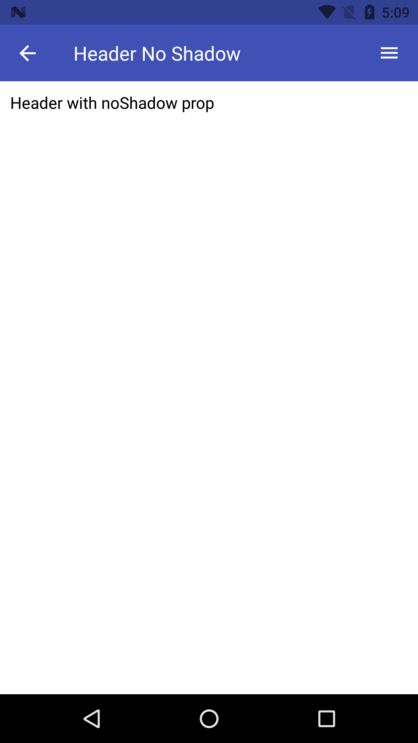
Syntax
import React, { Component } from "react";
import { Container, Header, Title, Button, Icon, Left, Right, Body } from "native-base";
export default class HeaderNoShadow extends Component {
  render() {
    return (
      <Container>
        <Header noShadow>
          <Left>
            <Button transparent>
              <Icon name="arrow-back" />
            </Button>
          </Left>
          <Body>
            <Title>Header No Shadow</Title>
          </Body>
          <Right>
            <Button transparent>
              <Icon name="menu" />
            </Button>
          </Right>
        </Header>
      </Container>
    );
  }
}
<template>
<nb-container>
<nb-header noShadow>
<nb-left>
<nb-button transparent>
<nb-icon name="arrow-back" />
</nb-button>
</nb-left>
<nb-body>
<nb-title>Header No Shadow</nb-title>
</nb-body>
<nb-right>
<nb-button transparent>
<nb-icon name="menu" />
</nb-button>
</nb-right>
</nb-header>
</nb-container>
</template>
73. header-no-left-headref
73.0.1. Header NoLeft
The noLeft prop of Header removes <Left> from Android Header.
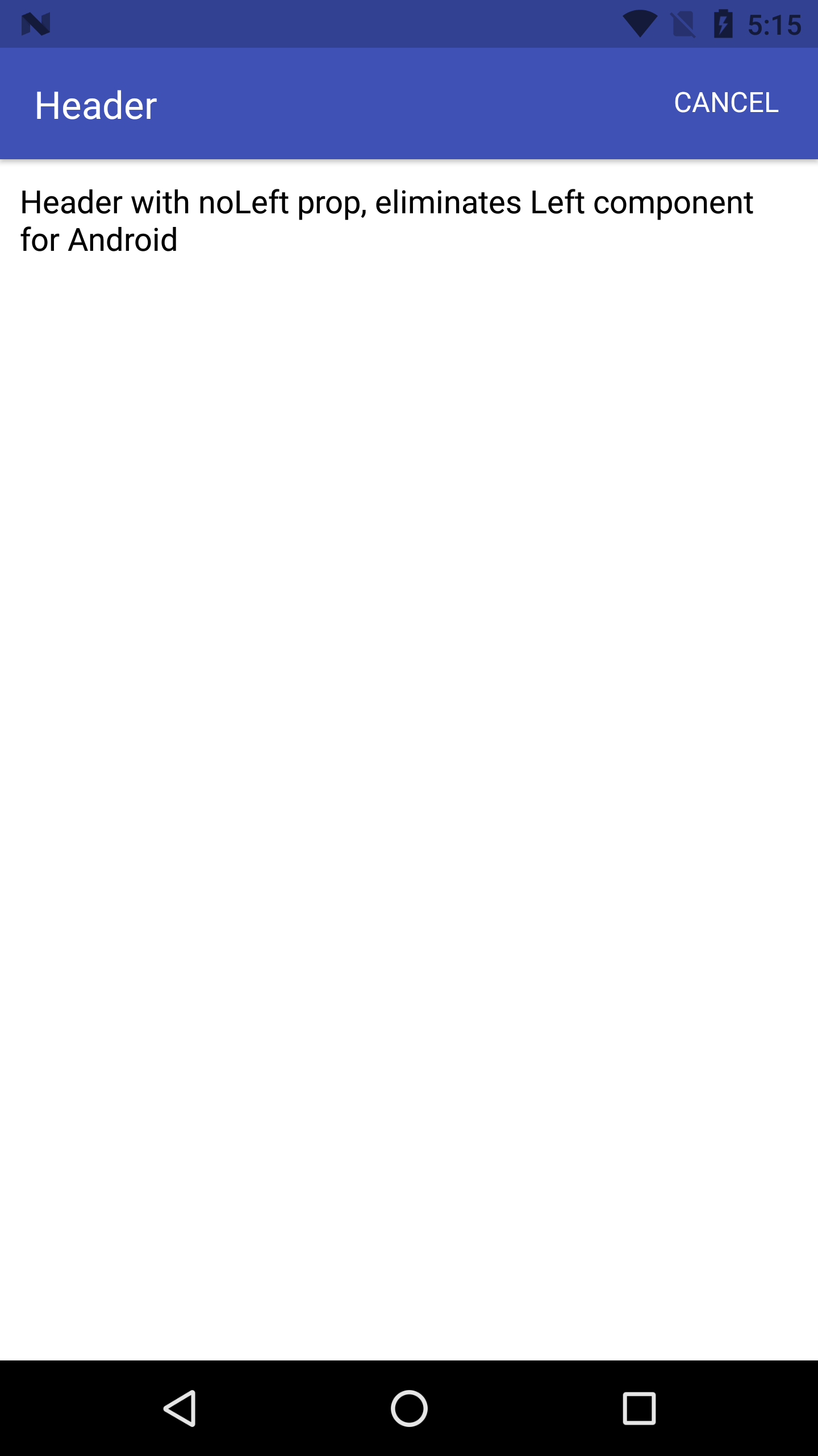
Syntax
import React, { Component } from "react";
import { Container, Header, Title, Content, Button, Icon, Left, Right, Body, Text } from "native-base";
export default class HeaderNoLeft extends Component {
  render() {
    return (
      <Container>
        <Header noLeft>
          <Left>
            <Button transparent>
              <Icon name="arrow-back" />
            </Button>
          </Left>
          <Body>
            <Title>Header</Title>
          </Body>
          <Right>
            <Button transparent>
              <Text>Cancel</Text>
            </Button>
          </Right>
        </Header>
        <Content padder>
          <Text>
            Header with noLeft prop, eliminates Left component for Android
          </Text>
        </Content>
      </Container>
    );
  }
}
<template>
<nb-container>
<nb-header noLeft>
<nb-left>
<nb-button transparent>
<nb-icon name="arrow-back" />
</nb-button>
</nb-left>
<nb-body>
<nb-title>Header</nb-title>
</nb-body>
<nb-right>
<nb-button transparent>
<nb-text>Cancel</nb-text>
</nb-button>
</nb-right>
</nb-header>
<nb-content padder>
<nb-text>Header with noLeft prop, eliminates Left component for Android</nb-text>
</nb-content>
</nb-container>
</template>
74. header-transparent-headref
74.0.1. Header Transparent
The transparent prop of Header removes border, shadow from iOS Header and elevation from Android Header.
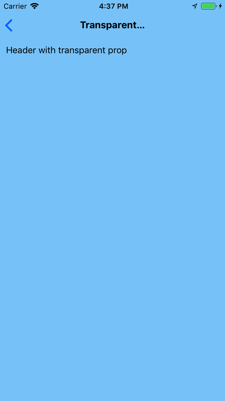
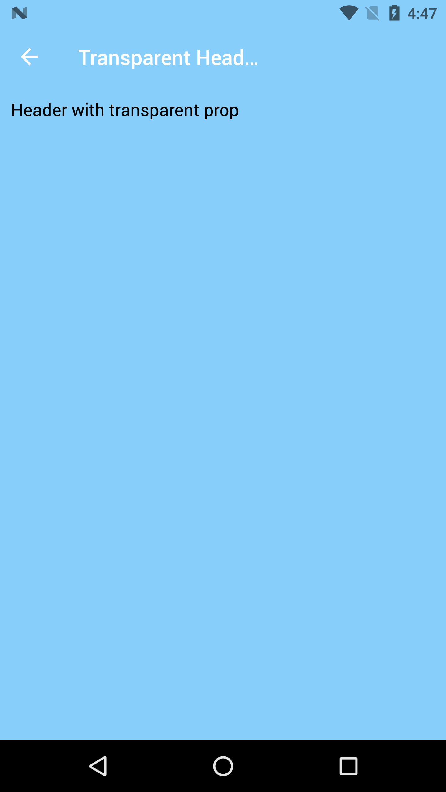
Syntax
import React, { Component } from "react";
import { Container, Header, Title, Content, Button, Icon, Left, Body, Text } from "native-base";
export default class HeaderTransparent extends Component {
  render() {
    return (
      <Container style={{backgroundColor: "#87cefa"}}>
        <Header transparent>
          <Left>
            <Button transparent>
              <Icon name="arrow-back" />
            </Button>
          </Left>
          <Body>
            <Title>Transparent</Title>
          </Body>
          <Right>
            <Button transparent>
              <Text>Cancel</Text>
            </Button>
          </Right>
        </Header>
        <Content padder>
          <Text>
            Header with transparent prop
          </Text>
        </Content>
      </Container>
    );
  }
}
<template>
<nb-container :style="{backgroundColor: '#87cefa'}">
<nb-header transparent>
<nb-left>
<nb-button transparent>
<nb-icon name="arrow-back" />
</nb-button>
</nb-left>
<nb-body>
<nb-title>Header</nb-title>
</nb-body>
<nb-right>
<nb-button transparent>
<nb-text>Cancel</nb-text>
</nb-button>
</nb-right>
</nb-header>
<nb-content padder>
<nb-text>Header with transparent prop</nb-text>
</nb-content>
</nb-container>
</template>
75. icon-def-headref
76. Icon
Perfect, crisp, high definition icons and pixel ideal fonts powered by NativeBase to preserve matters very high first-rate. You will continually have pixel perfect icons on your initiatives.
Here is a repo that lists down icons of available react-native-vector-icons icon families. Repo
Uses Ionicons from React Native Vector Icons
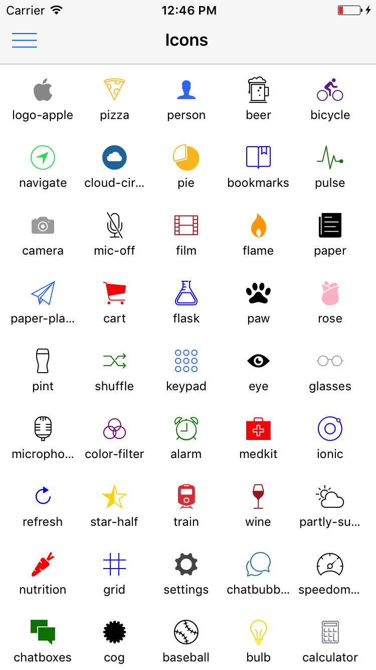
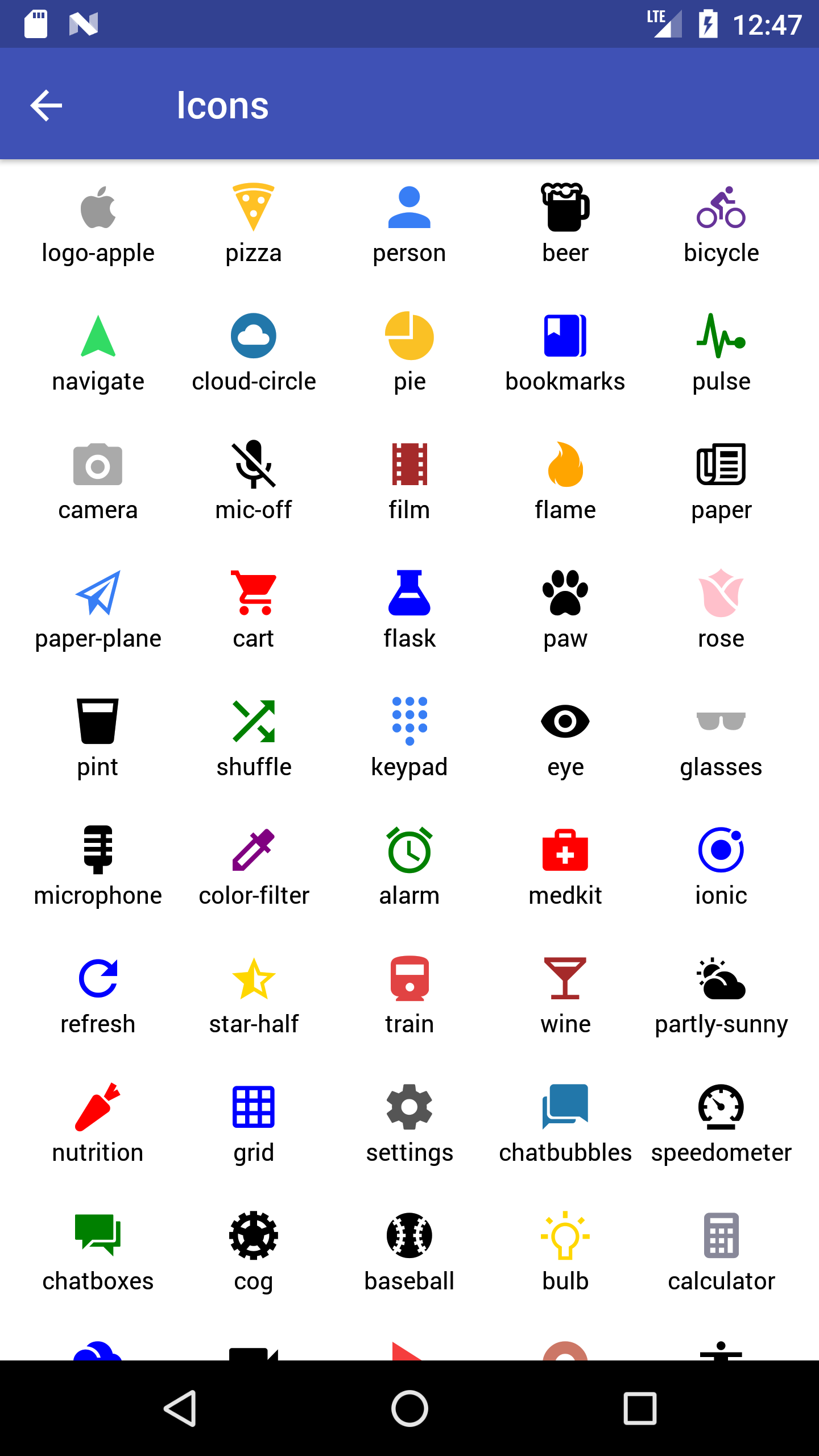
Syntax
import React, { Component } from 'react';
import { Container, Header, Content, Icon } from 'native-base';
export default class IconExample extends Component {
  render() {
    return (
      <Container>
        <Header />
        <Content>
          <Icon name='home' />
          <Icon ios='ios-menu' android="md-menu" style={{fontSize: 20, color: 'red'}}/>
          <Icon type="FontAwesome" name="home" />
        </Content>
      </Container>
    );
  }
}
<template>
<nb-container>
<nb-header />
<nb-content>
<nb-icon name='home' />
<nb-icon ios="ios-menu" android="md-menu" :style="{ fontSize: 20, color: 'red' }" />
<nb-icon type="FontAwesome" name="home"/>
</nb-content>
</nb-container>
</template>Iconcan take any two of the following attributes: name, ios, android.- In case if you want to include icon with custom color, size etc then that should go into
style. - All the icons in the icon libraries of NativeBase, are scalable vector icons that can be customized in terms of size, color, etc.
Configuration
| Property | Default | Option | Description |
|---|---|---|---|
| name | - | - | Name of the icon. |
| ios | - | - | Name of the icon for iOS devices. |
| android | - | - | Name of the icon for Android devices. |
| active | true | boolean | Renders filled icons |
| color | black | user-defined |
Renders icon with defined color. Include this prop within style
|
| fontSize | 27 | user-defined |
Renders icon with defined icon-size. Include this prop within style
|
| type | Ionicons | AntDesign, Ionicons, Entypo, EvilIcons, Feather, FontAwesome, FontAwesome5, Foundation, MaterialIcons, MaterialCommunityIcons, Octicons, Roboto, rubicon-icon-font, SimpleLineIcons, Zocial | Specifies icon family from IonIcons |
77. Layout
The layout system is an essential concept that needs to be mastered in order to create great layouts and UIs. React Native uses Flexbox to create the layouts, which is great when we need to accommodate our components and views in different screen sizes or even different devices. Flexbox is awesome but it could be tiresome for newbies.
Not being very good at Flexbox?
Here comes the Easy Grid of NativeBase, a wrapper of Flexbox.
The layout system in NativeBase is very powerful and flexible. No more worries about props of Flexbox such as alignItems, flexDirection, justifyContent, margin, padding, position, width etc. You can create any layout with all the available options that we have. In order to build custom layouts and components, understanding how layout works in NativeBase is not as hard as Flexbox.
Flexbox makes it look like percentages, however what actually is happening is just ratios. On the easier part, ratios are easier to represent than percentage / decimals. For this reason, the Easy Grid takes in ratios in place of percentage.
Performance wise, Easy Grid is noteworthy and works as fine as Flexbox, not much of calculation.


Syntax
import React, { Component } from 'react';
import { Container, Header } from 'native-base';
import { Col, Row, Grid } from 'react-native-easy-grid';
export default class LayoutExample extends Component {
  render() {
    return (
      <Container>
        <Header />
        <Grid>
          <Col style={{ backgroundColor: '#635DB7', height: 200 }}></Col>
          <Col style={{ backgroundColor: '#00CE9F', height: 200 }}></Col>
        </Grid>
      </Container>
    );
  }
}
<template>
<nb-container>
<nb-header />
<nb-grid>
<nb-col :style="{ backgroundColor: '#635DB7' }"></nb-col>
<nb-col :style="{ backgroundColor: '#00CE9F' }"></nb-col>
</nb-grid>
</nb-container>
</template>
Note: If you're using <Row /> inside a <ScrollView />, the height of the component would be flexible according to the content, though you can always apply the height styling.
NativeBase <Content> component uses <ScrollView>. This is required by <Col> and <Row> elements of Easy-Grid to have a defined height.
Replacing Component for Grid, Col, Row: React Native View
78. list-def-headref
79. List
A base component for specifying lists of information. List must contain one or more list elements. Props provide configurability for several features. Provides a number of attributes that follow styling and interaction guidelines for each platform, so that they are intuitive for users to interact with.
NativeBase List extends React Native FlatList. So please use keyExtractor prop to remove missing key warning.


Contents:
- List Divider
- List Header
- ListItem Selected
- ListItem NoIndent
- List Icon
- List Avatar
- List Thumbnail
- Dynamic List
- List Separator
Syntax
import React, { Component } from 'react';
import { Container, Header, Content, List, ListItem, Text } from 'native-base';
export default class ListExample extends Component {
  render() {
    return (
      <Container>
        <Header />
        <Content>
          <List>
            <ListItem>
              <Text>Simon Mignolet</Text>
            </ListItem>
            <ListItem>
              <Text>Nathaniel Clyne</Text>
            </ListItem>
            <ListItem>
              <Text>Dejan Lovren</Text>
            </ListItem>
          </List>
        </Content>
      </Container>
    );
  }
}
<template>
<nb-container>
<nb-header />
<nb-content>
<nb-list>
<nb-list-item>
<nb-text>Simon Mignolet</nb-text>
</nb-list-item>
<nb-list-item>
<nb-text>Nathaniel Clyne</nb-text>
</nb-list-item>
<nb-list-item>
<nb-text>Dejan Lovren</nb-text>
</nb-list-item>
</nb-list>
</nb-content>
</nb-container>
</template>List: This component defines a section to include your list items.ListItem:- This is the child component of
List. - Defines a list item.
- Adds border at bottom of each ListItem.
- List takes any number of ListItem.
- Takes input such as: Text, Badge, Thumbnail, Icon.
- This is the child component of
Replacing Component
- List: React Native View
- ListItem:
- React Native TouchableHighlight for iOS
- React Native TouchableNativeFeedback for Android
Configuration
| Property | Default | Option | Description |
|---|---|---|---|
| button | - | boolean | To navigate on click of a list item. |
| dataArray | Array | user-defined array | Array of data chunks to render iteratively. |
| selected | true | boolean | Highlights the selected item |
| noIndent | true | boolean |
Removes margin from left Useful incase of setting backgroundColor for ListItem. |
| itemDivider | - | boolean | Helps to organize and group the list items. |
| itemHeader | - | - | Style the item as header for ListItems |
| first | - | - | Adds style of first ListItem |
| last | - | - | Adds style of last ListItem |
| icon | - | - | To have list styling of icons |
| avatar | - | - | Style the list to have Avatars |
| thumbnail | - | - | Style the list to have Thumbnails |
| renderRow | Function | - | Callback which takes a chunk of data from dataArray and return as a component |
| enableEmptySections | - | boolean | Flag indicating whether empty section headers should be rendered |
Note: List is deprecated. Use of List for dynamic list generation is discouraged.For more advanced implementation of rendering list dynamically, take a look at nativebase-tutorial. Use Flatlist instead.
80. list-divider-headref
80.0.1. List Divider
The List Divider component creates a list separator, which can be used for grouping list items. To create a divider for any child element of the list, include itemDivider prop with ListItem component.
The List Divider of NativeBase comes with default style which is easily customisable.


Syntax
import React, { Component } from 'react';
import { Container, Header, Content, List, ListItem, Text } from 'native-base';
export default class ListDividerExample extends Component {
  render() {
    return (
      <Container>
        <Header />
        <Content>
          <List>
            <ListItem itemDivider>
              <Text>A</Text>
            </ListItem>
            <ListItem>
              <Text>Aaron Bennet</Text>
            </ListItem>
            <ListItem>
              <Text>Ali Connors</Text>
            </ListItem>
            <ListItem itemDivider>
              <Text>B</Text>
            </ListItem>
            <ListItem>
              <Text>Bradley Horowitz</Text>
            </ListItem>
          </List>
        </Content>
      </Container>
    );
  }
}
<template>
<nb-container>
<nb-header />
<nb-content>
<nb-list>
<nb-list-item itemDivider>
<nb-text>A</nb-text>
</nb-list-item>
<nb-list-item>
<nb-text>Aaron Bennet</nb-text>
</nb-list-item>
<nb-list-item>
<nb-text>Ali Connors</nb-text>
</nb-list-item>
<nb-list-item itemDivider>
<nb-text>B</nb-text>
</nb-list-item>
<nb-list-item>
<nb-text>Bradley Horowitz</nb-text>
</nb-list-item>
</nb-list>
</nb-content>
</nb-container>
</template>
81. list-header-headref
81.0.1. List Header
The List Header component creates a list header, which can be used for grouping list items. To create a header for any child element of the list, include itemHeader prop with ListItem component. The List Header of NativeBase comes with default style which is easily customisable.


Syntax
import React, { Component } from 'react';
import { Container, Header, Content, List, ListItem, Text } from 'native-base';
export default class ListHeaderExample extends Component {
  render() {
    return (
      <Container>
        <Header />
        <Content>
          <List>
            <ListItem itemHeader first>
              <Text>COMEDY</Text>
            </ListItem>
            <ListItem >
              <Text>Hangover</Text>
            </ListItem>
            <ListItem last>
              <Text>Cop Out</Text>
            </ListItem>
            <ListItem itemHeader>
              <Text>ACTION</Text>
            </ListItem>
            <ListItem>
              <Text>Terminator Genesis</Text>
            </ListItem>
          </List>
        </Content>
      </Container>
    );
  }
}
<template>
<nb-container>
<nb-header />
<nb-content>
<nb-list>
<nb-list-item itemHeader first>
<nb-text>COMEDY</nb-text>
</nb-list-item>
<nb-list-item>
<nb-text>Hangover</nb-text>
</nb-list-item>
<nb-list-item last>
<nb-text>Cop Out</nb-text>
</nb-list-item>
<nb-list-item itemHeader>
<nb-text>ACTION</nb-text>
</nb-list-item>
<nb-list-item>
<nb-text>Terminator Genesis</nb-text>
</nb-list-item>
</nb-list>
</nb-content>
</nb-container>
</template>
82. listitem-selected-headref
82.0.1. ListItem Selected
The ListItem's Selected component highlights the current listitem which is selected. Include selected prop with ListItem component. This prop comes with default style which is easily customisable.


Syntax
import React, { Component } from 'react';
import { Container, Header, Content, List, ListItem, Text, Left, Right, Icon } from 'native-base';
export default class ListItemSelectedExample extends Component {
  render() {
    return (
      <Container>
        <Header />
        <Content>
          <List>
            <ListItem selected>
              <Left>
                <Text>Simon Mignolet</Text>
              </Left>
              <Right>
                <Icon name="arrow-forward" />
              </Right>
            </ListItem>
            <ListItem>
             <Left>
                <Text>Nathaniel Clyne</Text>
              </Left>
              <Right>
                <Icon name="arrow-forward" />
              </Right>
            </ListItem>
            <ListItem>
              <Left>
                <Text>Dejan Lovren</Text>
              </Left>
              <Right>
                <Icon name="arrow-forward" />
              </Right>
            </ListItem>
          </List>
        </Content>
      </Container>
    );
  }
}
<template>
<nb-container>
<nb-header />
<nb-content>
<nb-list>
<nb-list-item selected>
<nb-left>
<nb-text>Simon Mignolet</nb-text>
</nb-left>
<nb-right>
<nb-icon name="arrow-forward" />
</nb-right>
</nb-list-item>
<nb-list-item>
<nb-left>
<nb-text>Nathaniel Clyne</nb-text>
</nb-left>
<nb-right>
<nb-icon name="arrow-forward" />
</nb-right>
</nb-list-item>
<nb-list-item>
<nb-left>
<nb-text>Dejan Lovren</nb-text>
</nb-left>
<nb-right>
<nb-icon name="arrow-forward" />
</nb-right>
</nb-list-item>
</nb-list>
</nb-content>
</nb-container>
</template>
83. listitem-noIndent-headref
83.0.1. ListItem NoIndent


Syntax
import React, { Component } from 'react';
import { Container, Header, Content, List, ListItem, Text, Left, Right, Icon } from 'native-base';
export default class ListItemNoIndentExample extends Component {
  render() {
    return (
      <Container>
        <Header />
        <Content>
          <List>
            <ListItem noIndent style={{ backgroundColor: "#cde1f9" }}>
              <Left>
                <Text>Simon Mignolet</Text>
              </Left>
              <Right>
                <Icon name="arrow-forward" />
              </Right>
            </ListItem>
            <ListItem >
             <Left>
                <Text>Nathaniel Clyne</Text>
              </Left>
              <Right>
                <Icon name="arrow-forward" />
              </Right>
            </ListItem>
            <ListItem>
              <Left>
                <Text>Dejan Lovren</Text>
              </Left>
              <Right>
                <Icon name="arrow-forward" />
              </Right>
            </ListItem>
          </List>
        </Content>
      </Container>
    );
  }
}
<template>
<nb-container>
<nb-header />
<nb-content>
<nb-list>
<nb-list-item noIndent class="bg-style">
<nb-left>
<nb-text>Simon Mignolet</nb-text>
</nb-left>
<nb-right>
<nb-icon name="arrow-forward" />
</nb-right>
</nb-list-item>
<nb-list-item >
<nb-left>
<nb-text>Nathaniel Clyne</nb-text>
</nb-left>
<nb-right>
<nb-icon name="arrow-forward" />
</nb-right>
</nb-list-item>
<nb-list-item>
<nb-left>
<nb-text>Dejan Lovren</nb-text>
</nb-left>
<nb-right>
<nb-icon name="arrow-forward" />
</nb-right>
</nb-list-item>
</nb-list>
</nb-content>
</nb-container>
</template>
<style>
.bg-style {
background-color: #cde1f9;
}
</style>
84. list-icon-headref
84.0.1. List Icon
Lists can have icons assigned either to the left and/or right side of each list item.
Along with icons, list item can also have badges assigned.
To have note kind of text for list item, include note prop with Text component of ListItem.
Syntax
import React, { Component } from 'react';
import { Container, Header, Content, Button, ListItem, Text, Icon, Left, Body, Right, Switch } from 'native-base';
export default class ListIconExample extends Component {
  render() {
    return (
      <Container>
        <Header />
        <Content>
          <ListItem icon>
            <Left>
              <Button style={{ backgroundColor: "#FF9501" }}>
                <Icon active name="airplane" />
              </Button>
            </Left>
            <Body>
              <Text>Airplane Mode</Text>
            </Body>
            <Right>
              <Switch value={false} />
            </Right>
          </ListItem>
          <ListItem icon>
            <Left>
              <Button style={{ backgroundColor: "#007AFF" }}>
                <Icon active name="wifi" />
              </Button>
            </Left>
            <Body>
              <Text>Wi-Fi</Text>
            </Body>
            <Right>
              <Text>GeekyAnts</Text>
              <Icon active name="arrow-forward" />
            </Right>
          </ListItem>
          <ListItem icon>
            <Left>
              <Button style={{ backgroundColor: "#007AFF" }}>
                <Icon active name="bluetooth" />
              </Button>
            </Left>
            <Body>
              <Text>Bluetooth</Text>
            </Body>
            <Right>
              <Text>On</Text>
              <Icon active name="arrow-forward" />
            </Right>
          </ListItem>
        </Content>
      </Container>
    );
  }
}
<template>
<nb-container>
<nb-header />
<nb-content>
<nb-list-item icon>
<nb-left>
<nb-button :style="{ backgroundColor: '#FF9501' }">
<nb-icon active name="plane" />
</nb-button>
</nb-left>
<nb-body>
<nb-text>Airplane Mode</nb-Text>
</nb-body>
<nb-right>
<nb-switch :value="false" />
</nb-right>
</nb-list-item>
<nb-list-item icon>
<nb-left>
<nb-button :style="{ backgroundColor: '#007AFF' }">
<nb-icon active name="wifi" />
</nb-button>
</nb-left>
<nb-body>
<nb-text>Wi-Fi</nb-text>
</nb-body>
<nb-right>
<nb-text>GeekyAnts</nb-text>
<nb-icon active name="arrow-forward" />
</nb-right>
</nb-list-item>
<nb-list-item icon>
<nb-left>
<nb-button :style="{ backgroundColor: '#007AFF' }">
<nb-icon active name="bluetooth" />
</nb-button>
</nb-left>
<nb-body>
<nb-text>Bluetooth</nb-text>
</nb-body>
<nb-right>
<nb-text>On</nb-text>
<nb-icon active name="arrow-forward" />
</nb-right>
</nb-list-item>
</nb-content>
</nb-container>
</template>
Note: Switch included in above example is from React Native.
85. list-avatar-headref
85.0.1. List Avatar
List Avatars are medium to showcase an image with your list item whose dimension lays between icon and thumbnail. To create a avatar list, nest <Thumbnail> component within <ListItem> component with avatar prop.
Syntax
import React, { Component } from 'react';
import { Container, Header, Content, List, ListItem, Left, Body, Right, Thumbnail, Text } from 'native-base';
export default class ListAvatarExample extends Component {
  render() {
    return (
      <Container>
        <Header />
        <Content>
          <List>
            <ListItem avatar>
              <Left>
                <Thumbnail source={{ uri: 'Image URL' }} />
              </Left>
              <Body>
                <Text>Kumar Pratik</Text>
                <Text note>Doing what you like will always keep you happy . .</Text>
              </Body>
              <Right>
                <Text note>3:43 pm</Text>
              </Right>
            </ListItem>
          </List>
        </Content>
      </Container>
    );
  }
}
<template>
<nb-container>
<nb-header />
<nb-content>
<nb-list-item avatar>
<nb-left>
<nb-thumbnail small :source="img.png" />
</nb-left>
<nb-body>
<nb-text>Kumar Pratik</nb-Text>
<nb-text note :numberOfLines="1">Doing what you like will always keep you happy . .</nb-Text>
</nb-body>
<nb-right>
<nb-text note>3:43 pm</nb-text>
</nb-right>
</nb-list-item>
</nb-content>
</nb-container>
</template>
86. list-thumbnail-headref
86.0.1. List Thumbnail
List Thumbnails are the medium to exhibit an image with your list item. To create a thumbnail list, nest <Thumbnail> component within <ListItem> component with few props and style.


Syntax
import React, { Component } from 'react';
import { Container, Header, Content, List, ListItem, Thumbnail, Text, Left, Body, Right, Button } from 'native-base';
export default class ListThumbnailExample extends Component {
  render() {
    return (
      <Container>
        <Header />
        <Content>
          <List>
            <ListItem thumbnail>
              <Left>
                <Thumbnail square source={{ uri: 'Image URL' }} />
              </Left>
              <Body>
                <Text>Sankhadeep</Text>
                <Text note numberOfLines={1}>Its time to build a difference . .</Text>
              </Body>
              <Right>
                <Button transparent>
                  <Text>View</Text>
                </Button>
              </Right>
            </ListItem>
          </List>
        </Content>
      </Container>
    );
  }
}
<template>
<nb-container>
<nb-header />
<nb-content>
<nb-list-item thumbnail>
<nb-left>
<nb-thumbnail square :source="img.png" />
</nb-left>
<nb-body>
<nb-text>Sankhadeep</nb-Text>
<nb-text note :numberOfLines="1">Its time to build a difference . .</nb-Text>
</nb-body>
<nb-right>
<nb-button transparent>
<nb-text>View</nb-text>
</nb-button>
</nb-right>
</nb-list-item>
</nb-content>
</nb-container>
</template>
87. list-seperator-headref
87.0.1. List Separator
Separator component is a separator usually used in list, which can be used for grouping list items. Though it is used with List, you can use it anywhere in your app.
Replacing Component: React Native View


Syntax
import React, { Component } from 'react';
import { Container, Header, Content, List, ListItem, Text, Separator } from 'native-base';
export default class ListSeparatorExample extends Component {
  render() {
    return (
      <Container>
        <Header />
        <Content>
          <Separator bordered>
            <Text>MIDFIELD</Text>
          </Separator>
          <ListItem>
            <Text>Caroline Aaron</Text>
          </ListItem>
          <ListItem last>
            <Text>Lee Allen</Text>
          </ListItem>
          <Separator bordered>
            <Text>MIDFIELD</Text>
          </Separator>
          <ListItem>
            <Text>Caroline Aaron</Text>
          </ListItem>
          <ListItem last>
            <Text>Lee Allen</Text>
          </ListItem>
        </Content>
      </Container>
    );
  }
}
<template>
<nb-container>
<nb-header />
<nb-content>
<nb-list>
<nb-separator bordered>
<nb-text>MIDFIELD</nb-text>
</nb-separator>
<nb-list-item>
<nb-text>Caroline Aaron</nb-text>
</nb-list-item>
<nb-list-item last>
<nb-text>Lee Allen</nb-text>
</nb-list-item>
<nb-separator bordered>
<nb-text>MIDFIELD</nb-text>
</nb-separator>
<nb-list-item>
<nb-text>Caroline Aaron</nb-text>
</nb-list-item>
<nb-list-item last>
<nb-text>Lee Allen</nb-text>
</nb-list-item>
</nb-list>
</nb-content>
</nb-container>
</template>
Configuration
| Property | Default | Option | Description |
|---|---|---|---|
| bordered | - | - | Adds border to top and bottom of the separator |
88. picker-def-headref
89. Picker
Renders the native picker component on iOS and Android.
Replacing Component: React Native Picker


Contents:
- Picker with Icon
- Picker with Icon Style
- Placeholder Picker
- Placeholder Picker without Note
- Picker Text and Item Style
- Picker with Custom Back Button
- Picker with Custom Header
- Picker with Custom Header Style
Regular Syntax
import React, { Component } from "react";
import { Container, Header, Content, Picker, Form } from "native-base";

export default class PickerExample extends Component {
  constructor(props) {
    super(props);
    this.state = {
      selected: "key1"
    };
  }
  onValueChange(value: string) {
    this.setState({
      selected: value
    });
  }
  render() {
    return (
      <Container>
        <Header />
        <Content>
          <Form>
            <Picker
              note
              mode="dropdown"
              style={{ width: 120 }}
              selectedValue={this.state.selected}
              onValueChange={this.onValueChange.bind(this)}
            >
              <Picker.Item label="Wallet" value="key0" />
              <Picker.Item label="ATM Card" value="key1" />
              <Picker.Item label="Debit Card" value="key2" />
              <Picker.Item label="Credit Card" value="key3" />
              <Picker.Item label="Net Banking" value="key4" />
            </Picker>
          </Form>
        </Content>
      </Container>
    );
  }
}
<template>
<nb-container>
<nb-header />
<nb-content>
<nb-form>
<nb-picker
note
mode="dropdown"
:style="{ width: 120 }"
:selectedValue="selected"
:onValueChange="onValueChange"
>
<item label="Wallet" value="key0" />
<item label="ATM Card" value="key1" />
<item label="Debit Card" value="key2" />
<item label="Credit Card" value="key3" />
<item label="Net Banking" value="key4" />
</nb-picker>
</nb-form>
</nb-content>
</nb-container>
</template>
<script>
import { Picker } from "native-base";
export default {
components: { Item: Picker.Item },
data: function() {
return {
selected: "key1"
};
},
methods: {
onValueChange: function(value) {
this.selected = value;
}
}
};
</script>Configuration
| Property | Default | Option | Description |
|---|---|---|---|
| renderHeader | - | - | Makes component that appears as header of the Picker, comes with a backAction prop to close the picker. |
| headerStyle | - | - | Custom style for header (iOS) |
| iosHeader | - | - | Custom text for the header title (iOS) |
| headerBackButtonText | - | - | Custom text for the header back button (iOS) |
| headerBackButtonTextStyle | - | - | Custom text style for the header back button< (iOS)/td> |
| headerTitleStyle | - | - | Custom title style for the header title (iOS) |
| iosIcon | - | - | Icon with picker dropdown (iOS) |
| placeholder | - | - | Placeholder for Picker component (iOS) |
| placeholderStyle | - | - | Custom style for placeholder text (iOS) |
| placeholderIconColor | - | - | Set placeholder icon color (iOS) |
| itemStyle | - | - | Style of items in Picker (iOS) |
| itemTextStyle | - | - | Text style of item component in Picker (iOS) |
| textStyle | - | - | Text style of header (iOS) |
| supportedOrientations | - | Portrait, Landscape, Landscape-left, Landscape-right | Allows the modal to rotate to any of the specified orientations |
| enabled | - | boolean | Enable / disable Picker button |
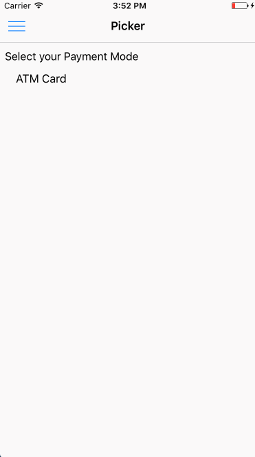
Note: Styling Picker is restricted to the style props provided in the table. NativeBase Picker wont support its styling to work out of the box. But one can always style the components as per requirements.
89.1. Advanced Pickers (iOS only)
90. picker-with-icon-headref
90.0.1. Picker with Icon
Syntax
import React, { Component } from "react";
import { Container, Header, Content, Icon, Picker, Form } from "native-base";

export default class PickerWithIcon extends Component {
  constructor(props) {
    super(props);
    this.state = {
      selected: "key1"
    };
  }
  onValueChange(value: string) {
    this.setState({
      selected: value
    });
  }
  render() {
    return (
      <Container>
        <Header />
        <Content>
          <Form>
            <Picker
              mode="dropdown"
              iosHeader="Select your SIM"
              iosIcon={<Icon name="arrow-down" />}
              style={{ width: undefined }}
              selectedValue={this.state.selected}
              onValueChange={this.onValueChange.bind(this)}
            >
              <Picker.Item label="Wallet" value="key0" />
              <Picker.Item label="ATM Card" value="key1" />
              <Picker.Item label="Debit Card" value="key2" />
              <Picker.Item label="Credit Card" value="key3" />
              <Picker.Item label="Net Banking" value="key4" />
            </Picker>
          </Form>
        </Content>
      </Container>
    );
  }
}
<template>
<nb-container>
<nb-header />
<nb-content>
<nb-form>
<nb-picker
mode="dropdown"
iosHeader="Select your SIM"
:iosIcon="getIosIcon()"
:selectedValue="selected"
:onValueChange="onValueChange"
>
<item label="Wallet" value="key0" />
<item label="ATM Card" value="key1" />
<item label="Debit Card" value="key2" />
<item label="Credit Card" value="key3" />
<item label="Net Banking" value="key4" />
</nb-picker>
</nb-form>
</nb-content>
</nb-container>
</template>
<script>
import React from "react";
import { Picker, Icon } from "native-base";
export default {
components: { Item: Picker.Item },
data: function() {
return {
selected: "key1"
};
},
methods: {
onValueChange: function(value) {
this.selected = value;
},
getIosIcon: function() {
return <Icon name="ios-arrow-down-outline" />;
}
}
};
</script>
91. picker-with-icon-style-headref
91.0.1. Picker with Icon Style
Syntax
import React, { Component } from "react";
import { Container, Header, Content, Icon, Picker, Form } from "native-base";

export default class PickerWithIconStyle extends Component {
  constructor(props) {
    super(props);
    this.state = {
      selected: "key1"
    };
  }
  onValueChange(value: string) {
    this.setState({
      selected: value
    });
  }
  render() {
    return (
      <Container>
        <Header />
        <Content>
          <Form>
            <Picker
              mode="dropdown"
              iosHeader="Select your SIM"
              iosIcon={<Icon name="arrow-dropdown-circle" style={{ color: "#007aff", fontSize: 25 }} />}
              style={{ width: undefined }}
              selectedValue={this.state.selected}
              onValueChange={this.onValueChange.bind(this)}
            >
              <Picker.Item label="Wallet" value="key0" />
              <Picker.Item label="ATM Card" value="key1" />
              <Picker.Item label="Debit Card" value="key2" />
              <Picker.Item label="Credit Card" value="key3" />
              <Picker.Item label="Net Banking" value="key4" />
            </Picker>
          </Form>
        </Content>
      </Container>
    );
  }
}
<template>
<nb-container>
<nb-header />
<nb-content>
<nb-form>
<nb-picker
mode="dropdown"
iosHeader="Select your SIM"
:iosIcon="getIosIcon()"
:selectedValue="selected"
:onValueChange="onValueChange"
>
<item label="Wallet" value="key0" />
<item label="ATM Card" value="key1" />
<item label="Debit Card" value="key2" />
<item label="Credit Card" value="key3" />
<item label="Net Banking" value="key4" />
</nb-picker>
</nb-form>
</nb-content>
</nb-container>
</template>
<script>
import React from "react";
import { Picker, Icon } from "native-base";
export default {
components: { Item: Picker.Item },
data: function() {
return {
selected: "key1"
};
},
methods: {
onValueChange: function(value) {
this.selected = value;
},
getIosIcon: function() {
return <Icon name="ios-arrow-dropdown-circle" style={{ color: "#007aff", fontSize: 25 }} />;
}
}
};
</script>
92. picker-placeholder-headref
92.0.1. Placeholder Picker

Syntax
import React, { Component } from "react";
import { Container, Header, Content, Icon, Picker, Form } from "native-base";

export default class PickerPlaceholderExample extends Component {
  constructor(props) {
    super(props);
    this.state = {
      selected: undefined
    };
  }
  onValueChange(value: string) {
    this.setState({
      selected: value
    });
  }
  render() {
    return (
      <Container>
        <Header />
        <Content>
          <Form>
            <Picker
              mode="dropdown"
              iosIcon={<Icon name="arrow-down" />}
              placeholder="Select your SIM"
              placeholderStyle={{ color: "#bfc6ea" }}
              placeholderIconColor="#007aff"
              style={{ width: undefined }}
              selectedValue={this.state.selected}
              onValueChange={this.onValueChange.bind(this)}
            >
              <Picker.Item label="Wallet" value="key0" />
              <Picker.Item label="ATM Card" value="key1" />
              <Picker.Item label="Debit Card" value="key2" />
              <Picker.Item label="Credit Card" value="key3" />
              <Picker.Item label="Net Banking" value="key4" />
            </Picker>
          </Form>
        </Content>
      </Container>
    );
  }
}
<template>
<nb-container>
<nb-header />
<nb-content>
<nb-form>
<nb-picker
mode="dropdown"
:iosIcon="getIosIcon()"
placeholder="Select your SIM"
placeholderStyle="{ color: '#bfc6ea' }"
placeholderIconColor="#007aff"
:selectedValue="selected"
:onValueChange="onValueChange"
>
<item label="Wallet" value="key0" />
<item label="ATM Card" value="key1" />
<item label="Debit Card" value="key2" />
<item label="Credit Card" value="key3" />
<item label="Net Banking" value="key4" />
</nb-picker>
</nb-form>
</nb-content>
</nb-container>
</template>
<script>
import React from "react";
import { Picker, Icon } from "native-base";
export default {
components: { Item: Picker.Item },
data: function() {
return {
selected: ""
};
},
methods: {
onValueChange: function(value) {
this.selected = value;
},
getIosIcon: function() {
return <Icon name="ios-arrow-down-outline" />;
}
}
};
</script>
93. picker-placeholder-without-note-headref
93.0.1. Placeholder Picker (without note)

import React, { Component } from "react";
import { Container, Header, Content, Icon, Picker, Form } from "native-base";

export default class PickerPlaceholderw/oNoteExample extends Component {
  constructor(props) {
    super(props);
    this.state = {
      selected: undefined
    };
  }
  onValueChange(value: string) {
    this.setState({
      selected: value
    });
  }
  render() {
    return (
      <Container>
        <Header />
        <Content>
          <Form>
            <Picker
              mode="dropdown"
              placeholder="Select One"
              placeholderStyle={{ color: "#2874F0" }}
              note={false}
              selectedValue={this.state.selected}
              onValueChange={this.onValueChange.bind(this)}
            >
              <Picker.Item label="Wallet" value="key0" />
              <Picker.Item label="ATM Card" value="key1" />
              <Picker.Item label="Debit Card" value="key2" />
              <Picker.Item label="Credit Card" value="key3" />
              <Picker.Item label="Net Banking" value="key4" />
            </Picker>
          </Form>
        </Content>
      </Container>
    );
  }
}
<template>
<nb-container>
<nb-header />
<nb-content>
<nb-form>
<nb-picker
mode="dropdown"
placeholder="Select one"
placeholderStyle="{ color: '#2874F0' }"
:note="false"
:selectedValue="selected"
:onValueChange="onValueChange"
>
<item label="Wallet" value="key0" />
<item label="ATM Card" value="key1" />
<item label="Debit Card" value="key2" />
<item label="Credit Card" value="key3" />
<item label="Net Banking" value="key4" />
</nb-picker>
</nb-form>
</nb-content>
</nb-container>
</template>
<script>
import React from "react";
import { Picker } from "native-base";
export default {
components: { Item: Picker.Item },
data: function() {
return {
selected: ""
};
},
methods: {
onValueChange: function(value) {
this.selected = value;
},
}
};
</script>
94. picker-text-and-item-text-styles-headref
94.0.1. Picker Text and Item Text Style

Syntax
import React, { Component } from "react";
import React, { Component } from "react";
import { Container, Header, Content, Icon, Picker, Form } from "native-base";

export default class PickerTextAndItemStyleExample extends Component {
  constructor(props) {
    super(props);
    this.state = {
      selected: undefined
    };
  }
  onValueChange(value) {
    this.setState({
      selected: value
    });
  }
  render() {
    return (
      <Container>
        <Header />
        <Content>
          <Form>
            <Picker
              mode="dropdown"
              placeholder="Select your SIM"
              iosIcon={<Icon name="arrow-down" />}
              placeholder="Select your SIM"
              textStyle={{ color: "#5cb85c" }}
              itemStyle={{
                backgroundColor: "#d3d3d3",
                marginLeft: 0,
                paddingLeft: 10
              }}
              itemTextStyle={{ color: '#788ad2' }}
              style={{ width: undefined }}
              selectedValue={this.state.selected}
              onValueChange={this.onValueChange.bind(this)}
            >
              <Picker.Item label="Wallet" value="key0" />
              <Picker.Item label="ATM Card" value="key1" />
              <Picker.Item label="Debit Card" value="key2" />
              <Picker.Item label="Credit Card" value="key3" />
              <Picker.Item label="Net Banking" value="key4" />
            </Picker>
          </Form>
        </Content>
      </Container >
    );
  }
}
<template>
<nb-container>
<nb-header />
<nb-content>
<nb-form>
<nb-picker
mode="dropdown"
:iosIcon="getIosIcon()"
placeholder="Select your SIM"
:textStyle="{ color: '#5cb85c' }"
:itemStyle="{
backgroundColor: '#d3d3d3',
marginLeft: 0,
paddingLeft: 10
}"
:itemTextStyle="{ color: '#788ad2' }"
:selectedValue="selected"
:onValueChange="onValueChange"
>
<item label="Wallet" value="key0" />
<item label="ATM Card" value="key1" />
<item label="Debit Card" value="key2" />
<item label="Credit Card" value="key3" />
<item label="Net Banking" value="key4" />
</nb-picker>
</nb-form>
</nb-content>
</nb-container>
</template>
<script>
import React from "react";
import { Picker, Icon } from "native-base";
export default {
components: { Item: Picker.Item },
data: function() {
return {
selected: "key1"
};
},
methods: {
onValueChange: function(value) {
this.selected = value;
},
getIosIcon: function() {
return <Icon name="ios-arrow-down-outline" />;
}
}
};
</script>
95. picker-with-custom-back-button-headref
95.0.1. Picker with Custom Back Button

import React, { Component } from "react";
import { Container, Header, Content, Icon, Picker, Form } from "native-base";

export default class PickerCustomBackButtonExample extends Component {
  constructor(props) {
    super(props);
    this.state = {
      selected: "key3"
    };
  }
  onValueChange(value: string) {
    this.setState({
      selected: value
    });
  }
  render() {
    return (
      <Container>
        <Header />
        <Content>
          <Form>
            <Picker
              mode="dropdown"
              iosIcon={<Icon name="arrow-down" />}
              headerBackButtonText="Baaack!"
              selectedValue={this.state.selected}
              onValueChange={this.onValueChange.bind(this)}
            >
              <Picker.Item label="Wallet" value="key0" />
              <Picker.Item label="ATM Card" value="key1" />
              <Picker.Item label="Debit Card" value="key2" />
              <Picker.Item label="Credit Card" value="key3" />
              <Picker.Item label="Net Banking" value="key4" />
            </Picker>
          </Form>
        </Content>
      </Container>
    );
  }
}
<template>
<nb-container>
<nb-header />
<nb-content>
<nb-form>
<nb-picker
mode="dropdown"
:iosIcon="getIosIcon()"
headerBackButtonText="Baaack!"
:selectedValue="selected"
:onValueChange="onValueChange"
>
<item label="Wallet" value="key0" />
<item label="ATM Card" value="key1" />
<item label="Debit Card" value="key2" />
<item label="Credit Card" value="key3" />
<item label="Net Banking" value="key4" />
</nb-picker>
</nb-form>
</nb-content>
</nb-container>
</template>
<script>
import React from "react";
import { Picker, Icon } from "native-base";
export default {
components: { Item: Picker.Item },
data: function() {
return {
selected: "key1"
};
},
methods: {
onValueChange: function(value) {
this.selected = value;
},
getIosIcon: function() {
return <Icon name="ios-arrow-down-outline" />;
}
}
};
</script>
96. picker-with-custom-header-headref
96.0.1. Picker with Custom Header

import React, { Component } from "react";
import { Container, Header, Title, Content, Button, Icon, Right, Body, Left, Picker, Form } from "native-base";

export default class PickerCustomHeaderExample extends Component {
  constructor(props) {
    super(props);
    this.state = {
      selected: "key1"
    };
  }
  onValueChange(value: string) {
    this.setState({
      selected: value
    });
  }
  render() {
    return (
      <Container>
        <Header />
        <Content>
          <Form>
            <Picker
              renderHeader={backAction =>
                <Header style={{ backgroundColor: "#f44242" }}>
                  <Left>
                    <Button transparent onPress={backAction}>
                      <Icon name="arrow-back" style={{ color: "#fff" }} />
                    </Button>
                  </Left>
                  <Body style={{ flex: 3 }}>
                    <Title style={{ color: "#fff" }}>Your Header</Title>
                  </Body>
                  <Right />
                </Header>}
              mode="dropdown"
              iosIcon={<Icon name="arrow-down" />}
              selectedValue={this.state.selected}
              onValueChange={this.onValueChange.bind(this)}
            >
              <Picker.Item label="Wallet" value="key0" />
              <Picker.Item label="ATM Card" value="key1" />
              <Picker.Item label="Debit Card" value="key2" />
              <Picker.Item label="Credit Card" value="key3" />
              <Picker.Item label="Net Banking" value="key4" />
            </Picker>
          </Form>
        </Content>
      </Container>
    );
  }
}
<template>
<nb-container>
<nb-header />
<nb-content>
<nb-form>
<nb-picker
:renderHeader="getPickerHeaderComp"
mode="dropdown"
:iosIcon="getIosIcon()"
:selectedValue="selected"
:onValueChange="onValueChange"
>
<item label="Wallet" value="key0" />
<item label="ATM Card" value="key1" />
<item label="Debit Card" value="key2" />
<item label="Credit Card" value="key3" />
<item label="Net Banking" value="key4" />
</nb-picker>
</nb-form>
</nb-content>
</nb-container>
</template>
<script>
import React from "react";
import { Picker, Icon, Header, Left, Button, Body, Title, Right } from "native-base";
export default {
components: { Item: Picker.Item },
data: function() {
return {
selected: "key1"
};
},
methods: {
onValueChange: function(value) {
this.selected = value;
},
getIosIcon: function() {
return <Icon name="ios-arrow-down-outline" />;
},
getPickerHeaderComp: function(backAction) {
return (
<Header style={{ backgroundColor: "#f44242" }}>
<Left>
<Button transparent onPress={backAction}>
<Icon name="arrow-back" style={{ color: "#fff" }} />
</Button>
</Left>
<Body style={{ flex: 3 }}>
<Title>Your Header</Title>
</Body>
<Right />
</Header>
);
}
}
};
</script>
97. picker-with-custom-header-style-headref
97.0.1. Picker with Custom Header Style

import React, { Component } from "react";
import { Container, Header, Content, Icon, Picker, Form } from "native-base";

export default class PickerCustomHeaderStyleExample extends Component {
  constructor(props) {
    super(props);
    this.state = {
      selected: "key2"
    };
  }
  onValueChange(value: string) {
    this.setState({
      selected: value
    });
  }
  render() {
    return (
      <Container>
        <Header />
        <Content>
          <Form>
            <Picker
              mode="dropdown"
              iosIcon={<Icon name="arrow-down" />}
              headerStyle={{ backgroundColor: "#b95dd3" }}
              headerBackButtonTextStyle={{ color: "#fff" }}
              headerTitleStyle={{ color: "#fff" }}
              selectedValue={this.state.selected}
              onValueChange={this.onValueChange.bind(this)}
            >
              <Picker.Item label="Wallet" value="key0" />
              <Picker.Item label="ATM Card" value="key1" />
              <Picker.Item label="Debit Card" value="key2" />
              <Picker.Item label="Credit Card" value="key3" />
              <Picker.Item label="Net Banking" value="key4" />
            </Picker>
          </Form>
        </Content>
      </Container>
    );
  }
}
<template>
<nb-container>
<nb-header />
<nb-content>
<nb-form>
<nb-picker
mode="dropdown"
:iosIcon="getIosIcon()"
:headerStyle="{ backgroundColor: '#b95dd3' }"
:headerBackButtonTextStyle="{ color: '#fff' }"
:headerTitleStyle="{ color: '#fff' }"
:selectedValue="selected"
:onValueChange="onValueChange"
>
<item label="Wallet" value="key0" />
<item label="ATM Card" value="key1" />
<item label="Debit Card" value="key2" />
<item label="Credit Card" value="key3" />
<item label="Net Banking" value="key4" />
</nb-picker>
</nb-form>
</nb-content>
</nb-container>
</template>
<script>
import React from "react";
import { Picker, Icon } from "native-base";
export default {
components: { Item: Picker.Item },
data: function() {
return {
selected: "key1"
};
},
methods: {
onValueChange: function(value) {
this.selected = value;
},
getIosIcon: function() {
return <Icon name="ios-arrow-down-outline" />;
},
}
};
</script>
98. radio-button-headref
99. Radio Button
Radio buttons let the user select any one from a set of options.
Replacing Component: React Native TouchableOpacity


Syntax
import React, { Component } from 'react';
import { Container, Header, Content, ListItem, Text, Radio, Right, Left } from 'native-base';
export default class RadioButtonExample extends Component {
  render() {
    return (
      <Container>
        <Header />
        <Content>
          <ListItem>
            <Left>
              <Text>Daily Stand Up</Text>
            </Left>
            <Right>
              <Radio selected={false} />
            </Right>
          </ListItem>
          <ListItem>
            <Left>
              <Text>Discussion with Client</Text>
            </Left>
            <Right>
              <Radio selected={true} />
            </Right>
          </ListItem>
        </Content>
      </Container>
    );
  }
}
<template>
<nb-container>
<nb-header />
<nb-content>
<nb-list-item :selected="true">
<nb-left>
<nb-text>Lunch Break</nb-text>
</nb-left>
<nb-right>
<nb-radio :selected="true" />
</nb-right>
</nb-list-item>
<nb-list-item :selected="false">
<nb-left>
<nb-text>Daily Stand Up</nb-text>
</nb-left>
<nb-right>
<nb-radio :selected="false"/>
</nb-right>
</nb-list-item>
</nb-content>
</nb-container>
</template>
Configuration
| Property | Default | Option | Description |
|---|---|---|---|
| selected | false | boolean | Represents the state value of an item from set of choices. |
| color | - | user-defined color | Inactive radio color |
| selectedColor | - | user-defined color | Active radio color |
100. custom-radio-headref
101. Custom Radio Button


Syntax
import React, { Component } from 'react';
import { Container, Header, Content, ListItem, Text, Radio, Right, Left } from 'native-base';
export default class CustomRadioButtonExample extends Component {
  render() {
    return (
      <Container>
        <Header />
        <Content>
          <ListItem selected={false} >
            <Left>
              <Text>Lunch Break</Text>
            </Left>
            <Right>
              <Radio
                color={"#f0ad4e"}
                selectedColor={"#5cb85c"}
                selected={false}
              />
            </Right>
          </ListItem>
          <ListItem selected={true}>
            <Left>
              <Text>Discussion with Client</Text>
            </Left>
            <Right>
              <Radio
                color={"#f0ad4e"}
                selectedColor={"#5cb85c"}
                selected={true}
              />
            </Right>
          </ListItem>
        </Content>
      </Container>
    );
  }
}
<template>
<nb-container>
<nb-header />
<nb-content>
<nb-list-item :selected="false">
<nb-left>
<nb-text>Lunch Break</nb-text>
</nb-left>
<nb-right>
<nb-radio
color='#f0ad4e'
selectedColor='#5cb85c'
:selected="false"
/>
</nb-right>
</nb-list-item>
<nb-list-item :selected="true">
<nb-left>
<nb-text>Discussion with Client</nb-text>
</nb-left>
<nb-right>
<nb-radio
color='#f0ad4e'
selectedColor='#5cb85c'
:selected="true"
/>
</nb-right>
</nb-list-item>
</nb-content>
</nb-container>
</template>
102. search-bar-headref
103. Search Bar
It’s kind of common on the Internet where – if we fail to get what we are looking for on a website, we resort to searching. Search box has always been an essential part of any application.


Syntax
import React, { Component } from 'react';
import { Container, Header, Item, Input, Icon, Button, Text } from 'native-base';
export default class SearchBarExample extends Component {
  render() {
    return (
      <Container>
        <Header searchBar rounded>
          <Item>
            <Icon name="ios-search" />
            <Input placeholder="Search" />
            <Icon name="ios-people" />
          </Item>
          <Button transparent>
            <Text>Search</Text>
          </Button>
        </Header>
      </Container>
    );
  }
}
<template>
<nb-container>
<nb-header searchBar rounded>
<nb-item>
<nb-icon active name="search" />
<nb-input placeholder="Search" />
<nb-icon active name="people" />
</nb-item>
<nb-button transparent>
<nb-text>Search</nb-text>
</nb-button>
</nb-header>
</nb-container>
</template>searchBar: Prop to be used with<Header>component to have Search bar onto the Header section of your screen.- Replacing Component: React Native View
Configuration
| Property | Default | Option | Description |
|---|---|---|---|
| rounded | regular | - | Wraps the search bar with predefined border options. |
104. segment-inside-header-headref
105. Segment
Segments are best used as an alternative for tabs. Mainly used in iOS.
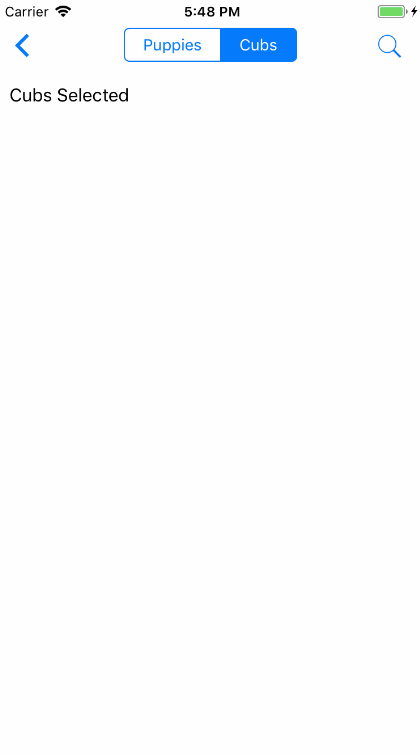
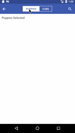
Syntax
import React, { Component } from 'react';
import { Container, Header, Left, Body, Right, Button, Icon, Segment, Content, Text } from 'native-base';
export default class SegmentExample extends Component {
  render() {
    return (
      <Container>
        <Header hasSegment>
          <Left>
            <Button transparent>
              <Icon name="arrow-back" />
            </Button>
          </Left>
          <Body>
            <Segment>
              <Button first><Text>Puppies</Text></Button>
              <Button last active><Text>Cubs</Text></Button>
            </Segment>
          </Body>
          <Right>
            <Button transparent>
              <Icon name="search" />
            </Button>
          </Right>
        </Header>
        <Content padder>
          <Text>Awesome segment</Text>
        </Content>
      </Container>
    );
  }
}
<template>
<nb-container>
<nb-header hasSegment>
<nb-left>
<nb-button transparent>
<nb-icon name="arrow-back" />
</nb-button>
</nb-left>
<nb-body>
<nb-segment>
<nb-button first><nb-text>Puppies</nb-text></nb-button>
<nb-button last :active="true"><nb-text>Cubs</nb-text></nb-button>
</nb-segment>
</nb-body>
<nb-right>
<nb-button transparent>
<nb-icon name="search" />
</nb-button>
</nb-right>
</nb-header>
<nb-content padder>
<nb-text>Awesome segment</nb-text>
</nb-content>
</nb-container>
</template>
Segment takes Button as children. The active Button should be given an active prop (implementation is totally up to you).
Also the first and last buttons should be given props first and last respectively.
Pro tip: It is advisable to use hasSegment prop with Header if you're using Segment below the header.
106. segment-outside-header-headref


Syntax (Outside Header)
import React, { Component } from 'react';
import { Container, Header, Left, Body, Right, Button, Icon, Title, Segment, Content, Text } from 'native-base';
export default class SegmentOutsideHeaderExample extends Component {
  render() {
    return (
      <Container>
        <Header hasSegment>
          <Left>
            <Button transparent>
              <Icon name="arrow-back" />
            </Button>
          </Left>
          <Body>
            <Title>Segments</Title>
          </Body>
          <Right>
            <Button transparent>
              <Icon name="search" />
            </Button>
          </Right>
        </Header>
        <Segment>
          <Button first>
            <Text>Puppies</Text>
          </Button>
          <Button>
            <Text>Kittens</Text>
          </Button>
          <Button last active>
            <Text>Cubs</Text>
          </Button>
        </Segment>
        <Content padder>
          <Text>Awesome segment</Text>
        </Content>
      </Container>
    );
  }
}
<template>
<nb-container>
<nb-header hasSegment>
<nb-left>
<nb-button transparent>
<nb-icon name="arrow-back" />
</nb-button>
</nb-left>
<nb-body>
<nb-title>Segments</nb-title>
</nb-body>
<nb-right>
<nb-button transparent>
<nb-icon name="search" />
</nb-button>
</nb-right>
</nb-header>
<nb-segment>
<nb-button first>
<nb-text>Puppies</nb-text>
</nb-button>
<nb-button>
<nb-text>Kittens</nb-text>
</nb-button>
<nb-button last :active="true">
<nb-text>Cubs</nb-text>
</nb-button>
</nb-segment>
<nb-content padder>
<nb-text>Awesome segment</nb-text>
</nb-content>
</nb-container>
</template>
107. segment-icon-headref
108. Segment Icon
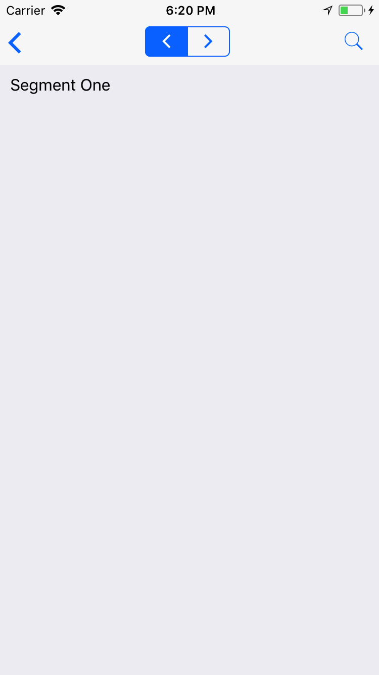
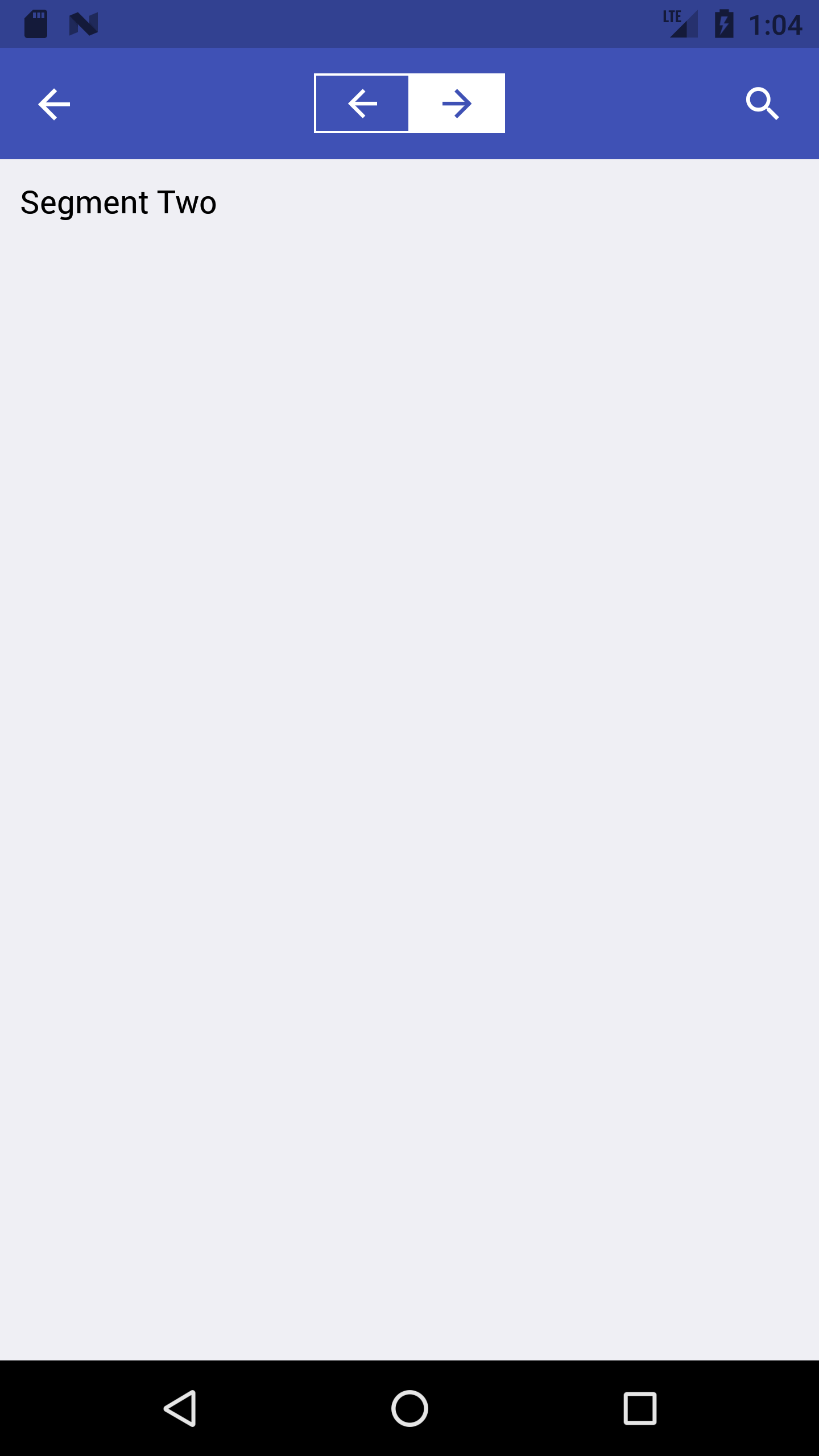
Syntax
import React, { Component } from 'react';
import { Container, Header, Left, Body, Right, Button, Icon, Segment, Content, Text } from 'native-base';
export default class SegmentIconExample extends Component {
  render() {
    return (
      <Container>
        <Header hasSegment>
          <Left>
            <Button transparent>
              <Icon name="arrow-back" />
            </Button>
          </Left>
          <Body>
            <Segment>
              <Button first active><Icon name="arrow-back" /></Button>
              <Button last><Icon name="arrow-forward" /></Button>
            </Segment>
          </Body>
          <Right>
            <Button transparent>
              <Icon name="search" />
            </Button>
          </Right>
        </Header>
        <Content padder>
          <Text>Segment One</Text>
        </Content>
      </Container>
    );
  }
}
<template>
<nb-container>
<nb-header hasSegment>
<nb-left>
<nb-button transparent>
<nb-icon name="arrow-back" />
</nb-button>
</nb-left>
<nb-body>
<nb-segment>
<nb-button first active><nb-icon name="arrow-back" /></nb-button>
<nb-button last><nb-icon name="arrow-forward" />
</nb-segment>
</nb-body>
<nb-right>
<nb-button transparent>
<nb-icon name="search" />
</nb-button>
</nb-right>
</nb-header>
<nb-content padder>
<nb-text>Segment One</nb-text>
</nb-content>
</nb-container>
</template>
109. Spinner
If you have certain screens of your app that take some time to load, you may want to consider a page loader. A page loader is any kind of animation that visually communicates to a visitor that the page is loading and to just sit tight for a few seconds. Without a page loader, user might think that the app is being unresponsive and just click away in frustration. A page loader also provides a small distraction which can actually makes the wait seem much shorter.
Replacing Component: React Native ActivityIndicator
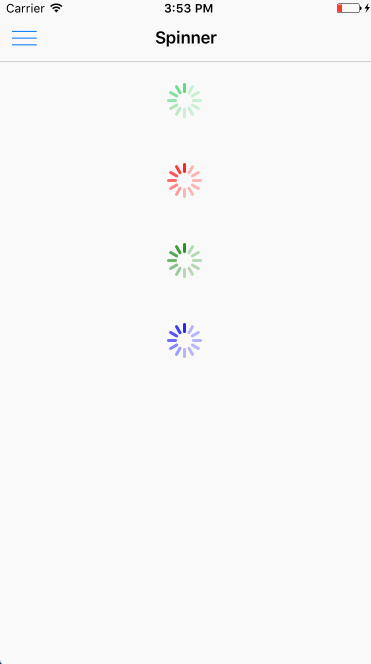
Syntax
import React, { Component } from 'react';
import { Container, Header, Content, Spinner } from 'native-base';
export default class SpinnerExample extends Component {
  render() {
    return (
      <Container>
        <Header />
        <Content>
          <Spinner />
          <Spinner color='red' />
          <Spinner color='green' />
          <Spinner color='blue' />
        </Content>
      </Container>
    );
  }
}
<template>
<nb-container>
<nb-header/>
<nb-content>
<nb-spinner />
<nb-spinner color="red" />
<nb-spinner color="green" />
<nb-spinner color="blue" />
</nb-content>
</nb-container>
</template>
Configuration
| Property | Default | Option | Description |
|---|---|---|---|
| color | #45D56E | user-defined | Color of Spinner |
110. swipeable-multi-def-headref
111. Swipeable List (removed)
We recommend react-native-swipe-list-view instead.
Swipeable List are ListItems that swipe open and close. Handles default native behavior such as closing rows when other rows are opened.
Syntax
import React, { Component } from 'react';
import { ListView } from 'react-native';
import { Container, Header, Content, Button, Icon, List, ListItem, Text } from 'native-base';
const datas = [
  'Simon Mignolet',
  'Nathaniel Clyne',
  'Dejan Lovren',
  'Mama Sakho',
  'Alberto Moreno',
  'Emre Can',
  'Joe Allen',
  'Phil Coutinho',
];
export default class SwipeableListExample extends Component {
  constructor(props) {
    super(props);
    this.ds = new ListView.DataSource({ rowHasChanged: (r1, r2) => r1 !== r2 });
    this.state = {
      basic: true,
      listViewData: datas,
    };
  }
  deleteRow(secId, rowId, rowMap) {
    rowMap[`${secId}${rowId}`].props.closeRow();
    const newData = [...this.state.listViewData];
    newData.splice(rowId, 1);
    this.setState({ listViewData: newData });
  }
  render() {
    const ds = new ListView.DataSource({ rowHasChanged: (r1, r2) => r1 !== r2 });
    return (
      <Container>
        <Header />
        <Content>
          <List
            leftOpenValue={75}
            rightOpenValue={-75}
            dataSource={this.ds.cloneWithRows(this.state.listViewData)}
            renderRow={data =>
              <ListItem>
                <Text> {data} </Text>
              </ListItem>}
            renderLeftHiddenRow={data =>
              <Button full onPress={() => alert(data)}>
                <Icon active name="information-circle" />
              </Button>}
            renderRightHiddenRow={(data, secId, rowId, rowMap) =>
              <Button full danger onPress={_ => this.deleteRow(secId, rowId, rowMap)}>
                <Icon active name="trash" />
              </Button>}
          />
        </Content>
      </Container>
    );
  }
}
<template>
<nb-container>
<nb-header />
<nb-content>
<nb-list
:leftOpenValue="75"
:rightOpenValue="-75"
:dataSource="getListArr()"
:renderRow="getListItemRow"
:renderLeftHiddenRow="getLeftHiddenRowComponet"
:renderRightHiddenRow="getRighttHiddenRowComponet"
>
</nb-list>
</nb-content>
</nb-container>
</template>
<script>
import React from "react";
import { ListView } from "react-native";
import { Button, Icon, Text, ListItem } from "native-base";
export default {
data: function() {
return {
ds: new ListView.DataSource({ rowHasChanged: (r1, r2) => r1 !== r2 }),
basic: true,
listViewData: [
"Simon Mignolet",
"Nathaniel Clyne",
"Dejan Lovren",
"Mama Sakho",
"Alberto Moreno",
"Emre Can",
"Joe Allen",
"Phil Coutinho"
]
};
},
methods: {
deleteRow: function(secId, rowId, rowMap) {
rowMap[`${secId}${rowId}`].props.closeRow();
const newData = [...this.listViewData];
newData.splice(rowId, 1);
this.listViewData = newData;
},
getLeftHiddenRowComponet: function(data) {
return (
<Button full onPress={() => alert(data)}>
<Icon active name="information-circle" />
</Button>
);
},
getRighttHiddenRowComponet: function(data, secId, rowId, rowMap) {
return (
<Button full danger onPress={_ => this.deleteRow(secId, rowId, rowMap)}>
<Icon active name="trash" />
</Button>
);
},
getListArr: function() {
return this.ds.cloneWithRows(this.listViewData);
},
getListItemRow: function(data) {
return (
<ListItem>
<Text>{data}</Text>
</ListItem>
);
}
}
};
</script>
Configuration
| Property | Default | Option | Description |
|---|---|---|---|
| dataSource | - | user defined object | data chunks to render iteratively |
| renderRow | - | Function | Callback which takes a chunk of data from dataSource and returns as a body component, which is visible. |
| renderLeftHiddenRow | - | Function | Callback which takes a chunk of data from dataSource and returns as a left component, which is hidden. |
| renderRightHiddenRow | - | Function | Callback which takes a chunk of data from dataSource and returns as a right component, which is hidden. |
| leftOpenValue | - | number | TranslateX value for opening the row to the left (Positive Value) |
| rightOpenValue | - | number | TranslateX value for opening the row to the right (Negative Value) |
| closeOnRowBeginSwipe | false | boolean | Open row be closed as soon as a row begin to swipe open |
| swipeToOpenPercent | 50% | % | Swipe percent of left/right component's width to trigger the row opening |
| disableLeftSwipe | false | boolean | Disable ability to swipe the row left |
| disableRightSwipe | false | boolean | Disable ability to swipe the row right |
| onRowOpen, onRowClose | - | Function | Callback function which triggers when a swipe row is animating open/close |
| onRowDidOpen, onRowDidClose | - | Function | Callback function which triggers when a swipe row has animated open/close |
Known Issues : Native behavior of closing row when List is scrolled doesn't work.
112. swipeable-single-def-headref
112.0.1. SwipeRow (removed)
We recommend react-native-swipe-list-view instead.
Single Swipeable ListItem (Outside List)
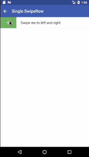
Syntax
import React, { Component } from 'react';
import { Container, Header, Content, SwipeRow, View, Text, Icon, Button } from 'native-base';
export default class SwipeRowExample extends Component {
render() {
return (
<Container>
<Header />
<Content scrollEnabled={false}>
<SwipeRow
leftOpenValue={75}
rightOpenValue={-75}
left={
<Button success onPress={() => alert('Add')}>
<Icon active name="add" />
</Button>
}
body={
<View>
<Text>SwipeRow Body Text</Text>
</View>
}
right={
<Button danger onPress={() => alert('Trash')}>
<Icon active name="trash" />
</Button>
}
/>
</Content>
</Container>
);
}
}<template>
<nb-container>
<nb-header />
<nb-content :scrollEnabled="false">
<nb-swipe-row
:leftOpenValue="75"
:rightOpenValue="-75"
:left="getSwipeLeftComponet()"
:body="getSwipeBodyComponet()"
:right="getSwipeRightComponet()"
/>
</nb-content>
</nb-container>
</template>
<script>
import React from "react";
import { Button, Icon, Text, View } from "native-base";
export default {
methods: {
getSwipeLeftComponet: function() {
return (
<Button success onPress={() => alert("Add")}>
<Icon active name="add" />
</Button>
);
},
getSwipeBodyComponet: function() {
return (
<View>
<Text>Swipe me to left and right</Text>
</View>
);
},
getSwipeRightComponet: function() {
return (
<Button danger onPress={() => alert("Trash")}>
<Icon active name="trash" />
</Button>
);
}
}
};
</script>
Configuration
| Property | Default | Option | Description |
|---|---|---|---|
| body | - | - | Native Base or React Native component(Visible Component). |
| left | - | - | Native Base or React Native component(Left hidden Component). |
| right | - | - | Native Base or React Native component(Right hidden Component). |
| leftOpenValue | - | number | TranslateX value for opening the row to the left (Positive Value) |
| rightOpenValue | - | number | TranslateX value for opening the row to the right (Negative Value) |
| stopLeftSwipe | - | number | TranslateX value to stop the row to the swipe left (Positive number) |
| stopRightSwipe | - | number | TranslateX value to stop the row to the swipe right (Negative number) |
| swipeToOpenPercent | 50% | % | Swipe percent of left/right component's width to trigger the row opening |
| disableLeftSwipe | false | boolean | Disable ability to swipe the row left |
| disableRightSwipe | false | boolean | Disable ability to swipe the row right |
| onRowOpen, onRowClose | - | Function | Callback function which triggers when a swipe row is animating open/close |
| openLeftRow, openRightRow | - | Function | Dynamically toggle SwipeRow |
| style | - | style object | Style body |
113. tabs-def-headref
114. Tabs
Tabs are a horizontal region of buttons or links that allow for a consistent navigation experience between screens. It can contain any combination of text and icons, and is a popular method for enabling mobile navigation.
Replacing Component: react-native-scrollable-tab-view <ScrollableTabView>


Syntax
import React, { Component } from 'react';
import { Container, Header, Content, Tab, Tabs } from 'native-base';
import Tab1 from './tabOne';
import Tab2 from './tabTwo';
import Tab3 from './tabThree';
export default class TabsExample extends Component {
  render() {
    return (
      <Container>
        <Header hasTabs />
        <Tabs>
          <Tab heading="Tab1">
            <Tab1 />
          </Tab>
          <Tab heading="Tab2">
            <Tab2 />
          </Tab>
          <Tab heading="Tab3">
            <Tab3 />
          </Tab>
        </Tabs>
      </Container>
    );
  }
}
<template>
<nb-container>
<nb-header hasTabs/>
<nb-tabs>
<nb-tab heading="Tab1">
<tab-one />
</nb-tab>
<nb-tab heading="Tab2">
<tab-two />
</nb-tab>
<nb-tab heading="Tab3">
<tab-three />
</nb-tab>
</nb-tabs>
</nb-container>
</template>
<script>
import TabOne from "./components/tabOne";
import TabTwo from "./components/tabTwo";
import TabThree from "./components/tabThree";
export default {
components: { TabOne, TabTwo, TabThree }
};
</script>
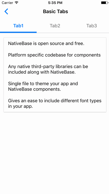
Configuration(Tabs)
| Property | Default | Option | Description |
|---|---|---|---|
| scrollWithoutAnimation | false | boolean | Disable Tab Change Animation |
| locked | false | boolean | Disable swipe |
| initialPage | - | integer | Set default active tab |
| page | - | - | Set selected tab |
| tabBarPosition | top | top, bottom, overlayTop, overlayBottom | Set position of Tabs |
| tabBarUnderlineStyle | - | - | Style of the default tab bar's underline |
| onChangeTab | Function | - | Function to call when tab changes |
| onScroll | Function | - | Function to call when pages are sliding |
Configuration(Tab,TabHeading)
| Property | Default | Option | Description |
|---|---|---|---|
| disabled(only for Tab) | false | boolean | Disables click option for tab |
| heading(only for Tab) | - | string | Label String, or Component |
| style(only for TabHeading) | - | style object | Style for TabHeading Component |
| tabStyle | - | style object | Style for tab bar |
| activeTabStyle | - | style object | Style for active tab bar |
| textStyle | - | style object | Style for text |
| activeTextStyle | - | style object | Style for active text |
Known Issues : Custom tabHeading is not yet supported for ScrollableTab heading only accepts a string.
Pro-Tip : It is advisable to use hasTabs prop with Header while using Tabs.
115. tabs-advanced-headref
115.0.1. Advanced Tabs


Syntax
import React, { Component } from 'react';
import { Container, Header, Tab, Tabs, TabHeading, Icon, Text } from 'native-base';
import Tab1 from './tabOne';
import Tab2 from './tabTwo';
import Tab3 from './tabThree';
export default class TabsAdvancedExample extends Component {
  render() {
    return (
      <Container>
        <Header hasTabs/>
        <Tabs>
          <Tab heading={ <TabHeading><Icon name="camera" /><Text>Camera</Text></TabHeading>}>
            <Tab1 />
          </Tab>
          <Tab heading={ <TabHeading><Text>No Icon</Text></TabHeading>}>
            <Tab2 />
          </Tab>
          <Tab heading={ <TabHeading><Icon name="apps" /></TabHeading>}>
            <Tab3 />
          </Tab>
        </Tabs>
      </Container>
    );
  }
}
<template>
<nb-container>
<nb-header hasTabs/>
<nb-tabs>
<nb-tab :heading="getHeadingCompForTab1()">
<tab-one />
</nb-tab>
<nb-tab :heading="getHeadingCompForTab2()">
<tab-two />
</nb-tab>
<nb-tab :heading="getHeadingCompForTab3()">
<tab-three />
</nb-tab>
</nb-tabs>
</nb-container>
</template>
<script>
import React from "react";
import { TabHeading, Icon, Text } from "native-base";
import TabOne from "./components/tabOne";
import TabTwo from "./components/tabTwo";
import TabThree from "./components/tabThree";
export default {
components: { TabOne, TabTwo, TabThree },
methods: {
getHeadingCompForTab1: function() {
return (
<TabHeading>
<Icon name="camera" />
<Text>Camera</Text>
</TabHeading>
);
},
getHeadingCompForTab2: function() {
return (
<TabHeading>
<Text>No Icon</Text>
</TabHeading>
);
},
getHeadingCompForTab3: function() {
return (
<TabHeading>
<Icon name="apps" />
</TabHeading>
);
}
}
};
</script>
116. tabs-scrollable-headref
116.0.1. Scrollable Tabs


Syntax
import React, { Component } from 'react';
import { Container, Header, Tab, Tabs, ScrollableTab } from 'native-base';
import Tab1 from './tabOne';
. . .
import Tab5 from './tabFive';
export default class TabsScrollableExample extends Component {
  render() {
    return (
      <Container>
        <Header hasTabs/>
        <Tabs renderTabBar={()=> <ScrollableTab />}>
          <Tab heading="Tab1">
            <Tab1 />
          </Tab>
          <Tab heading="Tab2">
            <Tab2 />
          </Tab>
          <Tab heading="Tab3">
            <Tab3 />
          </Tab>
          <Tab heading="Tab4">
            <Tab4 />
          </Tab>
          <Tab heading="Tab5">
            <Tab5 />
          </Tab>
        </Tabs>
      </Container>
    );
  }
}
<template>
<nb-container>
<nb-header hasTabs/>
<nb-tabs :renderTabBar="getScollableTabComp">
<nb-tab heading="Tab1">
<tab-one />
</nb-tab>
<nb-tab heading="Tab2">
<tab-two />
</nb-tab>
<nb-tab heading="Tab3">
<tab-three />
</nb-tab>
<nb-tab heading="Tab4">
<tab-four />
</nb-tab>
<nb-tab heading="Tab5">
<tab-five />
</nb-tab>
</nb-tabs>
</nb-container>
</template>
<script>
import React from "react";
import { ScrollableTab } from "native-base";
import TabOne from "./components/tabOne";
. . .
import TabFive from "./components/tabFive";
export default {
components: { TabOne, TabTwo, TabThree, TabFour, TabFive },
methods: {
getScollableTabComp: function() {
return <ScrollableTab />;
}
}
};
</script>
Configuration(ScrollableTab)
| Property | Default | Option | Description |
|---|---|---|---|
| style | - | style object | Style for ScrollableTab |
| tabsContainerStyle | - | style object | Style for tabs within ScrollableTab |
| underlineStyle | - | style object | Style of the Scrollable Tab's underline |
| onScroll | - | Function | Function to call when pages are sliding |
117. Thumbnail
Thumbnail component works very similar to Image. It helps you to showcase an image with various dimensions and shapes. By default, Thumbnail renders an image in circular shape.
Replacing Component: React Native Image


Syntax
import React, { Component } from 'react';
import { Container, Header, Content, Thumbnail, Text } from 'native-base';
export default class ThumbnailExample extends Component {
  render() {
    const uri = "https://facebook.github.io/react-native/docs/assets/favicon.png";
    return (
      <Container>
        <Header />
        <Content>
          <Text>Square Thumbnail</Text>
          <Thumbnail square small source={{uri: uri}} />
          <Thumbnail square source={{uri: uri}} />
          <Thumbnail square large source={{uri: uri}} />
          <Text>Circular Thumbnail</Text>
          <Thumbnail small source={{uri: uri}} />
          <Thumbnail source={{uri: uri}} />
          <Thumbnail large source={{uri: uri}} />
        </Content>
      </Container>
    );
  }
}
<template>
<nb-container>
<nb-header />
<nb-content>
<nb-text>Square Thumbnail</nb-text>
<nb-thumbnail square small :source="logo" />
<nb-thumbnail square :source="logo" />
<nb-thumbnail square large :source="logo" />
<nb-text>Circular Thumbnail</nb-text>
<nb-thumbnail small :source="logo" />
<nb-thumbnail :source="logo" />
<nb-thumbnail large :source="logo" />
</nb-content>
</nb-container>
</template>
<script>
import logo from "favicon.png";
export default {
data: function() {
return {
logo: logo,
};
}
};
</script>
Note: To have Thumbnail of custom size, specify height, width and borderRadius within style.
Configuration
| Property | Default | Option | Description |
|---|---|---|---|
| source | - | - | Image path for thumbnail. |
| circle | true | - |
Represents shape of thumbnail. By default thumbnail is circle in shape. |
| square | - | - | Represents shape of thumbnail |
| small | - | - | Small thumbnail with width and height of 36px |
| large | - | - | Large thumbnail with width and height of 80px |
118. toast-def-headref
119. Toast
NativeBase Toast can be used to display quick warning or error messages.
For Toast to work, you need to wrap your topmost component inside <Root> from native-base.
Replacing Component: React Native View.


Contents:
Syntax
import { Root } from "native-base";
import { StackNavigator } from "react-navigation";
const AppNavigator = StackNavigator(
{
Page: { screen: Page },
}
);
export default () =>
<Root>
<AppNavigator />
</Root>;<template>
<root>
<app-navigation></app-navigation>
</root>
</template>
<script>
import { Root } from "native-base";
import { StackNavigator } from "vue-native-router";
const AppNavigation = StackNavigator(
{
Page: { screen: Page },
}
);
export default {
components: { Root, AppNavigation }
};
</script>import React, { Component } from 'react';
import { Container, Header, Content, Toast, Button, Text } from 'native-base';
export default class ToastExample extends Component {
render() {
return (
<Container>
<Header />
<Content padder>
<Button onPress={()=> Toast.show({
text: 'Wrong password!',
buttonText: 'Okay'
})}>
<Text>Toast</Text>
</Button>
</Content>
</Container>
);
}
}<template>
<nb-container>
<nb-header />
<nb-content padder>
<nb-button :onPress="handleBtnPress">
<nb-text>Toast</nb-text>
</nb-button>
</nb-content>
</nb-container>
</template>
<script>
import React from "react";
import { Toast } from "native-base";
export default {
methods: {
handleBtnPress: function() {
Toast.show({
text: "Wrong password!",
buttonText: "Okay"
});
}
}
};
</script>
Configuration
| Key | Value | Option | Description |
|---|---|---|---|
| text | - | string | Text content to be shown in the toast |
| textStyle | - | - | Style text content for toast |
| buttonText | - | string, blank | Text to be displayed inside the button |
| buttonTextStyle | - | - | Style button text for toast |
| buttonStyle | - | - | Style button for toast |
| position | bottom | top, bottom | Sets position for the toast |
| type | - | danger, success, warning | Sets context to the Toast |
| duration | 1500 | user defined (integer) | Milliseconds after which Toast disappears |
| onClose(reason) | - | function | Called just before the toast hides. reason can be "user" when the user click on the button; "timeout" when timeout. |
| show() | - | function | Displays the Toast |
| hide() | - | function | Hides the Toast |
| style | - | style object | Style for the Toast |
120. toast-with-duration-headref
120.0.1. Toast with duration


Syntax
import React, { Component } from "react";
import { Container, Header, Content, Text, Button, Toast } from "native-base";
export default class ToastDuration extends Component {
constructor(props) {
super(props);
this.state = {
showToast: false
};
}
render() {
return (
<Container>
<Header />
<Content padder>
<Button
onPress={() =>
Toast.show({
text: "Wrong password!",
buttonText: "Okay",
duration: 3000
})}
>
<Text>Toast</Text>
</Button>
</Content>
</Container>
);
}
}<template>
<nb-container>
<nb-header />
<nb-content padder>
<nb-button :onPress="handleBtnPress">
<nb-text>Toast</nb-text>
</nb-button>
</nb-content>
</nb-container>
</template>
<script>
import React from "react";
import { Toast } from "native-base";
export default {
methods: {
handleBtnPress: function() {
Toast.show({
text: "Wrong password!",
buttonText: "Okay",
duration: 3000
});
}
}
};
</script>
121. toast-position-headref
121.0.1. Toast position


Syntax
import React, { Component } from "react";
import { Container, Header, Content, Text, Button, Toast } from "native-base";
class ToastPosition extends Component {
constructor(props) {
super(props);
this.state = {
showToast: false
};
}
render() {
return (
<Container>
<Header />
<Content padder>
<Button
onPress={() =>
Toast.show({
text: "Wrong password!",
buttonText: "Okay",
position: "top"
})}
>
<Text>Top Toast</Text>
</Button>
<Button
onPress={() =>
Toast.show({
text: "Wrong password!",
buttonText: "Okay",
position: "bottom"
})}
>
<Text>Bottom Toast</Text>
</Button>
</Content>
</Container>
);
}
}<template>
<nb-container>
<nb-header />
<nb-content padder>
<nb-button :onPress="handleBtnPress1">
<nb-text>Top Toast</nb-text>
</nb-button>
<nb-button :onPress="handleBtnPress2">
<nb-text>Bottom Toast</nb-text>
</nb-button>
</nb-content>
</nb-container>
</template>
<script>
import React from "react";
import { Toast } from "native-base";
export default {
methods: {
handleBtnPress1: function() {
Toast.show({
text: "Wrong password!",
buttonText: "Okay",
position: "top"
});
},
handleBtnPress2: function() {
Toast.show({
text: "Wrong password!",
buttonText: "Okay",
position: "bottom"
});
}
}
};
</script>
122. toast-type-headref
122.0.1. Toast types


Syntax
import React, { Component } from "react";
import { Container, Header, Content, Text, Button, Toast } from "native-base";
class ToastType extends Component {
constructor(props) {
super(props);
this.state = {
showToast: false
};
}
render() {
return (
<Container>
<Header />
<Content padder>
<Button
onPress={() =>
Toast.show({
text: "Wrong password!",
buttonText: "Okay"
})}
>
<Text>Default Toast</Text>
</Button>
<Button success
onPress={() =>
Toast.show({
text: "Wrong password!",
buttonText: "Okay",
type: "success"
})}
>
<Text>Success Toast</Text>
</Button>
<Button warning
onPress={() =>
Toast.show({
text: "Wrong password!",
buttonText: "Okay",
type: "warning"
})}
>
<Text>Warning Toast</Text>
</Button>
<Button danger
onPress={() =>
Toast.show({
text: "Wrong password!",
buttonText: "Okay",
type: "danger"
})}
>
<Text>Danger Toast</Text>
</Button>
</Content>
</Container>
);
}
}<template>
<nb-container>
<nb-header />
<nb-content padder>
<nb-button :onPress="handleBtnPress1">
<nb-text>Default Toast</nb-text>
</nb-button>
<nb-button success :onPress="handleBtnPress2">
<nb-text>Success Toast</nb-text>
</nb-button>
<nb-button warning :onPress="handleBtnPress3">
<nb-text>Warning Toast</nb-text>
</nb-button>
<nb-button danger :onPress="handleBtnPress4">
<nb-text>Danger Toast</nb-text>
</nb-button>
</nb-content>
</nb-container>
</template>
<script>
import React from "react";
import { Toast } from "native-base";
export default {
methods: {
handleBtnPress1: function() {
Toast.show({
text: "Wrong password!",
buttonText: "Okay"
});
},
handleBtnPress2: function() {
Toast.show({
text: "Wrong password!",
buttonText: "Okay",
type: "success"
});
},
handleBtnPress3: function() {
Toast.show({
text: "Wrong password!",
buttonText: "Okay",
type: "warning"
});
},
handleBtnPress4: function() {
Toast.show({
text: "Wrong password!",
buttonText: "Okay",
type: "danger"
});
}
}
};
</script>
123. toast-text-style-headref
123.0.1. Toast text style


Syntax
import React, { Component } from "react";
import { Container, Header, Content, Text, Button, Toast } from "native-base";
export default class ToastText extends Component {
constructor(props) {
super(props);
this.state = {
showToast: false
};
}
render() {
return (
<Container>
<Header />
<Content padder>
<Button
onPress={() =>
Toast.show({
text: "Wrong password!",
textStyle: { color: "yellow" },
buttonText: "Okay"
})
}
>
<Text>Toast</Text>
</Button>
</Content>
</Container>
);
}
}<template>
<nb-container>
<nb-header />
<nb-content padder>
<nb-button :onPress="handleBtnPress">
<nb-text>Toast</nb-text>
</nb-button>
</nb-content>
</nb-container>
</template>
<script>
import React from "react";
import { Toast } from "native-base";
export default {
methods: {
handleBtnPress: function() {
Toast.show({
text: "Wrong password!",
textStyle: { color: "yellow" },
buttonText: "Okay"
});
}
}
};
</script>
124. toast-button-style-headref
124.0.1. Toast button style


Syntax
import React, { Component } from "react";
import { Container, Header, Content, Text, Button, Toast } from "native-base";
class ToastButton extends Component {
constructor(props) {
super(props);
this.state = {
showToast: false
};
}
render() {
return (
<Container>
<Header />
<Content padder>
<Button
onPress={() =>
Toast.show({
text: "Wrong password!",
buttonText: "Okay",
buttonTextStyle: { color: "#008000" },
buttonStyle: { backgroundColor: "#5cb85c" }
})}
>
<Text>Toast</Text>
</Button>
</Content>
</Container>
);
}
}<template>
<nb-container>
<nb-header />
<nb-content padder>
<nb-button :onPress="handleBtnPress">
<nb-text>Toast</nb-text>
</nb-button>
</nb-content>
</nb-container>
</template>
<script>
import React from "react";
import { Toast } from "native-base";
export default {
methods: {
handleBtnPress: function() {
Toast.show({
text: "Wrong password!",
buttonText: "Okay",
buttonTextStyle: { color: "#008000" },
buttonStyle: { backgroundColor: "#5cb85c" }
});
}
}
};
</script>
125. Typography
NativeBase provides you with the Heading Tags, namely H1, H2 and H3 components. These Heading tags helps you prioritize the content of your screen.
Replacing Component for H1, H2, H3, Text: React Native Text


Syntax
import React, { Component } from 'react';
import { Container, Header, Content, H1, H2, H3, Text } from 'native-base';
export default class TypographyExample extends Component {
render() {
return (
<Container>
<Header />
<Content>
<H1>Header One</H1>
<H2>Header Two</H2>
<H3>Header Three</H3>
<Text>Default</Text>
</Content>
</Container>
);
}
}<template>
<nb-container>
<nb-header />
<nb-content>
<nb-h1>Header One</nb-h1>
<nb-h2>Header Two</nb-h2>
<nb-h3>Header Three</nb-h3>
<nb-text>Default</nb-text>
</nb-content>
</nb-container>
</template>
Configuration
| Property | Default | Option | Description |
|---|---|---|---|
| H1 | font-size: 27 | string, number | Heading tag <H1> |
| H2 | font-size: 24 | string, number | Heading tag <H2> |
| H3 | font-size: 21 | string, number | Heading tag <H3> |
126. Drawer
Drawer for both iOS and Android.
Drawer can be the perfect option to provide navigation options.
Replacing Component: React Native Drawer


Syntax
import React, { Component } from 'react';
import { Drawer } from 'native-base';
import SideBar from './yourPathToSideBar';
export default class DrawerExample extends Component {
closeDrawer () => {
this.drawer._root.close()
};
openDrawer () => {
this.drawer._root.open()
};
render() {
return (
<Drawer
ref={(ref) => { this.drawer = ref; }}
content={<SideBar navigator={this.navigator} />}
onClose={() => this.closeDrawer()} >
// Main View
</Drawer>
);
}
}
Note: You need to create your own SideBar component and import it.
Configuration
| Property | Default | Option | Description |
|---|---|---|---|
| type | overlay | - | type of drawer |
| tapToClose | true | boolean | Close drawer on tap |
| openDrawerOffset | 0.2 | number | Defines right hand margin when drawer open |
| panCloseMask | 0.2 | number | Defines the screen width for the start of pan close action |
| closedDrawerOffset | 0 | number | Defines left hand margin when drawer closed |
| tweenHandler | - | Function | Takes in pan ratio that represents the tween percent and returns an object of native props to be set on constituent views |
127. ref-components-headref
128. Ref to Components
- NativeBase is built on top of React Native. Hence, the components of NativeBase have respective replacing React Native elements.
- NativeBase has now made it easy for developers, to access the any of its components using ref, along with its associated React Native elements.
- After building your component, you may find yourself wanting to reach out and invoke methods on component instances returned from render().
- This can be achieved from refs. Refs are a great way to send a message to a particular child instance.
- The ref attribute takes a callback function, and the callback will be executed immediately after the component is mounted or unmounted.
Syntax
import React, { Component } from 'react';
import { Container, Header, Content, Button } from 'native-base';
export default class RefExample extends Component {
render() {
return (
<Container>
<Header />
<Content>
<Button ref={ (c) => this._button = c }>
Click Me
</Button>
</Content>
</Container>
);
}
}this._buttongets you the reference of NativeBase Button.this._button._rootgets you the reference of NativeBase Button's replacing React Native element i.e., TouchableOpacity.- This feature is accessible with all of NativeBase components.